Introduction
Have you ever wanted to drop your date information
onto a calendar? Leave, birthdays, order due dates, etc. look so much more
comprehensive on a calendar than in a list box. Or what about a
scheduler\planner to view appointments or tasks, and edit them?
Enter HotDates. Add HotDates to your program and using the powerful and
intuitive templates, you'll be able to view date related information in a
calendar, drilling down to month, week and\or day views in a few minutes.
Print your calendar straight to a printer, or edit date related
information from the calendar using Drag and Drop, Cut\Copy\Paste or a
traditional update.
Features
JumpStart in
adding HotDates to your Application
I've included a completed tutorial in the examples.
It's in the
clarion\examples\HotDates\Tutorial\Completed
directory. You can use the start app in the
clarion\examples\HotDates\Tutorial
folder if you want to test this first before applying to your application.
Adding the Colors and Settings tables to the application
The colors and settings tables aid us in setting up the colors styles and
translation of day and month names for the application. You would
typically require the Settings table if you're wanting to add translation
to your calendars and/or allow weeks to start on a different day. The
Colors table is very useful to have one style set that you can use across
all your calendars. Include these now, and you'll thank me later.
- Open your dictionary
- From the File menu, select the Import Text option.
- Using the file dialog window, find the HotDatesSettingsTables.dctx
file which is located in your clarion\accessory\libsrc\win
directory.
- Save and exit from the dictionary.
Adding a DatePicker and Settings windows to the application
If your application is not open - then open it in the Clarion IDE.
- From your Application menu, select the Template Utility... item.
- Select the ImportHotDatesDatePickerABC
template utility from the Select Utility
window
- From your Application menu, select the Template Utility... item.
- Select the ImportHotDatesSettingsProceduresABC
template utility from the Select Utility
window.
- Open the frame and add a Setup menu to your menubar
- Add a Calendar Colors item to your Setup menu, and call the
BrowseHotDates_Colors procedure from this item.
- Add a Calendar Settings item to your Setup menu and call the
BrowseHotDates_Settings procedure from this item.
Adding the Global Extension Template to the application
- Now you need to add the Global Extension Template. To do this:
- Open your application in the Clarion IDE, and click on the Global button.
- In the Global Properties window, click on the Extensions
button.
- Click on the Insert button and select
the Activate_HotDates extension template.
We do this after adding the DatePicker, so that the DatePicker procedure
field in the Global Extension template (Options tab) is automatically
populated.
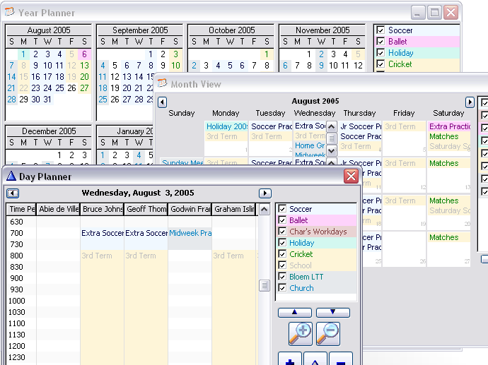
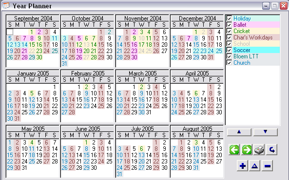
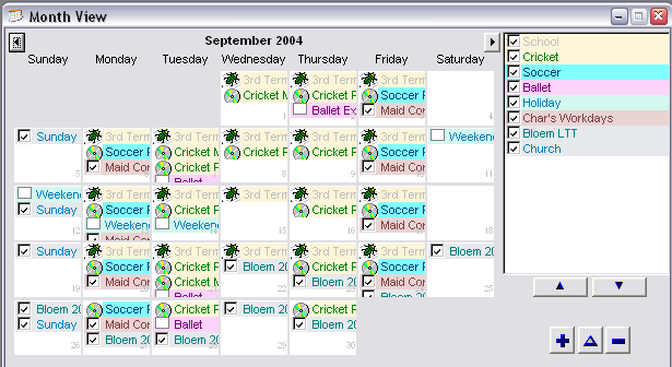
Adding a 1 to 12 Month Calendar to the BrowseTripLog window
A 1 to 12 month Calendar is a view that will show you very minimal detail
- basically no descriptions, just colorized dates. It is aimed at giving
you a broad spread of a wide date range of data into one summarized
calendar - up to a year (which is scrollable).
- Create a new window for your calendar (or add to your existing
browse if you would like the browse on the same screen as your
calendar). Right-click on the procedure name in the tree and select
the Window option. In the tutorial, we'd
use the BrowseTripLog window to add our calendar to the browse.
- Add a tab control to the sheet and call it 'Calendar'.
- Move the list from the window to the By VIN Number tab (so that we
have a clean tab to work with).
- Resize the sheet (and window) to about 400 by 240 to fit the
calendar nicely on it.
- Select Populate - Control Template...
from the menu.
- Select the HotDates_Calendar template
from the Control template list.
- Click the top left corner for the group of controls to be placed on
the window.
You will see 12 square list boxes (one for each month), the legend
controls, and a group of buttons (ScrollBack, ScrollForward, Print and
Refresh).
NOTE: In clarion 8 you will be prompted for the first column in each
list, click Cancel when you are presented with this list.
- Clarion 6: Right-Click on one of the controls and select the Actions menu item.
- Clarion 6: Click on the Tables button.
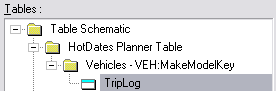
Clarion 8: click the Data /Tables tab
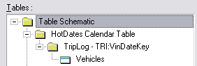
In this case, the TripLog file is the file that contains the date
data, so would be the primary file for the calendar. The Vehicles
contains the file that is used for the legend (on the right) and each
trip is colored to match the color of the style that is used to
highlight the vehicle in the legend, so that the eye will naturally
link the trip to the vehicle by the style. In your application, you
may have constants for the legend, and therefore there may not be an
additional table in the tree.
- Insert the tables in the tree as described above. For the tutorial,
insert the TripLog table, ordered by the TRI:VinDateKey and the
Vehicles table. You'll also need to add the HotDates_Colors table to
the Other tables.
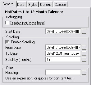
- Go to the General tab and set it up as
follows:
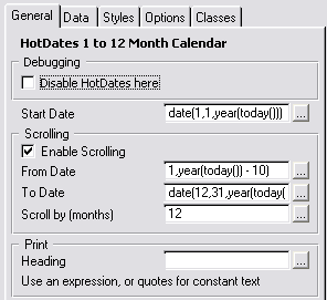
- The Start Date is the first date of
the calendar displayed.
- Check Enable Scrolling to allow the
calendar to scroll earlier than the start date, or later than the
startdaten + number of months.
- From Date lets you determine the date
that the user can scroll back to.
- To Date lets you determine the date
the user can scroll forward to.
- Scroll by (months) lets you set the
increment the calendar changes with each scroll.
- Heading lets you set the heading of
the calendar when it is printed.
- In the tutorial, we'll set the Start Date to
'date(1,1,year(today()))', check the Enable Scrolling checkbox and set
the From Date to 'date(1,1,year(today()) - 10)' and the To Date to
'date(12,31,year(today()) + 1)'.
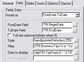
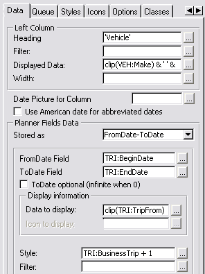
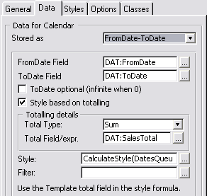
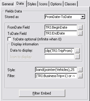
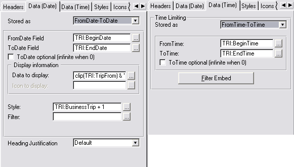
- Go to the Data tab and set it up as
follows:
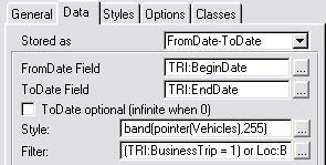
- Stored as allows you to select how the date data is stored in
your dates table. You can select FromDate-ToDate, Date (useful for
something like birthdays or public holidays where each entry is a
single date), Date-Duration (Startdate, and number of days long),
Handcoded (something else).
- Depending on your Stored As selection, would depend on the
fields presented, but for FromDate-Todate, you'd need to enter the
FromDate and ToDate fields. These are the fields in your table
that contain the date information. For info Stored As Date, you'd
have just the one Date field, and for info Stored as
Date-Duration, you'd have a FromDate and Duration fields.
- ToDate optional (infinite when 0) means that the calendar will
get highlighted from that date on if 0 date is set in the ToDate
field.
- Style is an expression (usually a style field - like an ID to
the legend table) to link to the style field in the next tab.
- Filter is used to discard unwanted records from being displayed
on the calendar
- View Filter is used to set the parent filter for the view. This
should not contain functions, but table fields and constants as in
a normal browse filter.
NOTE: Rather use an ID for the style. Using a pointer is not supported
in SQL. There are various ways of doing this discussed in the
Hotdates Training manual that will be better in different
scenarios
- In the tutorial, you will need to create a local data field:
Loc:BusinessOnly (a byte with a true value of 1 and a false of 0 that
has a checkbox as a screen control) to be used in the filter.
- The Filter field (for the tutorial) is: (TRI:BusinessTrip=1) or
~Loc:BusinessOnly (this is so we can restrict to BusinessTrips if we
check the checkbox)
- The Style field: band(pointer(Vehicles),255). There is no autonumber
on this file (which is what you could normally use) - so we'll use the
pointer instead. Note that there are only 255 styles available, so if
we have more that 255 records in the file, then these will be doubled
up (in style)
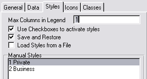
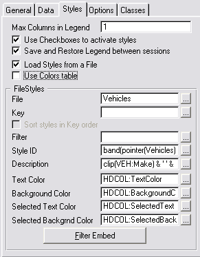
- Go to the Styles tab and set it up as
follows:
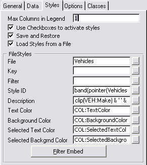
- Max Columns in Legend allows you to set how many columns you
want in the legend. If you'd like the legend on the left of the
calendar (usually), then you'll keep this to 1. This can be set to
a maximum of 5 columns.
- Use Checkboxes to activate styles. Check this to allow a user to
"turn off" a particular legend item from being displayed in the
calendar.
- Save and Restore. Check this to save the legend order and the
state of the legend checkboxes between sessions.
- Load Styles from a file. Check this if your legend data is in a
file, or leave unchecked to manually enter the items in the legend
list.
- FileStyles: You need to enter from which file the legend is
loaded, and the key used to populate the legend, as well as a
filter.
- Style ID: this is the legend ID that will be used to link the
legend style to the calendar data (so that the same colorization
will be used in the legend as the linked item in the calendar.
This is the other side of the relationship from that used in the
data tab (above).
- Description: the text used to describe the style in the legend
list.
- Color fields: the color fields used for the legend list.
NOTE: Rather use an ID for the style. Using a pointer is not supported
in SQL. There are various ways of doing this discussed in the
Hotdates Training manual that will be better in different
scenarios
- Note that we use the parent table
for the styles file.
- The StyleID for the legend matches the Style we set up on the
DataBase (so that the Style in the legend corrolates to that set in
the calendar)
- In the tutorial, the Description is indicative of the car that did
the trips: 'clip(VEH:Make) & ' ' & clip(VEH:Model) & ' '
& clip(VEH:Year)'
- Note that we use colors from the
HotDates_Colors table which is in a different table to that actual
style, so we'll need to put some handcode to get the correct color.
- Go to the Filter Embed and enter the following code in the 'Before
Adding Style to the palette' embed:
HDCOL:StyleID = band(pointer(Vehicles),255) !This is the
expression in the Style
access:HotDates_Colours.fetch(HDCOL:ByStyleID)
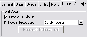
- Go to the Options Tab
- The procedure for the MonthViewer has not yet been created, so we'll
create that after we're finished with this window.
- Click OK to return to the Window Formatter.
- Populate the Loc:BusinessOnly checkbox on the window. (Populate -
Column and select Loc:BusinessOnly)
- Double-click on the checkbox to bring up the embeds and place a call
to reset the window in the Accepted embed:
self.reset(1)
Adding
Update buttons to the Calendar
- If you've exited out of the Window Formatter for the BrowseTripLog
window, then re-open it again.
- Select Populate - Control Template...
from the menu.
- Select the HotDates_CalendarUpdate
template (for adding update controls to your 1 to 12 month Calendar)
from the Control template list.
- Click the top left corner for the group of controls to be placed on
the window. You will see the Insert, Change and Delete buttons appear
on the window.
- Right-click on one of the buttons and select the Actions...option
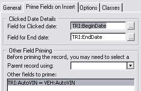
- Go to the Prime Fields on Insert tab to
the following: (Note you will need to wizard up a SelectVehicle
window)
- Basically what's happening here is that when you're inserting, you
want the trip to start at the date clicked, and you want it to be
attached to a selected variable (which is selected from the
BrowseVehicles procedure).
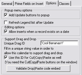
- Go to the Options tab and check the Add Update buttons to popup and the Allow
inserts when a record exists on a date checkboxes (i.e. we
want to be able to edit via popup and we also want to be able to
insert a record on a particular day - even if there is already a trip
allocated for another vehicle).
Before continuing we need to add a Select control to the BrowseVehicles
routine.
- If you've exited out of the Window Formatter for the BrowseTripLog
window, then re-open it again.
- Select Populate - Control Template...
from the menu.
- Select the BrowseSelectButton template
from the Control template list.
- Click the top left corner for the group of controls to be placed on
the window.
Adding a
MonthViewer to a new window
The MonthViewer is designed to show you a entire month's data - with more
detail than the 1 to 12 month Calendar. This will give you a description
attached to each colorization, and if more than one data exists for a
specific date, then it will show you more than the highest priority data
for that day.
- Double-Click on the MonthViewer (ToDo)
procedure and select Window - Generic Window
Handler from the Templateslist.
- Enter the Procedure's prototype and parameters fields as the
following:
(long pStartDate=0)
- Open the Window formatter (use the Simple Window template when
prompted) and resize the window to:
385x220. You'll also need to make sure that this is an MDI Child
window (the MDI Child checkbox on the Extra tab on the Window
Properties window).
- Select Populate - Control Template...
from the menu.
- Select the HotDates_MonthViewer template
from the Control template list. Click the top left corner for the
group of controls to be placed on the window.
You will see 2 buttons in a Group and the legend controls.
- Clarion 6: Right-click on one of the controls and select the Actions menu item.
- Clarion 6: Click on the Tables button.
Clarion 8: click the Data /Tables tab
- Enter 'pStartDate' into the Start At Date
field.

- Goto the Data tab and set it up as
follows:
- You will need to create a local data field: Loc:BusinessOnly (a byte
with a true value of 1 and a false of 0 that has a checkbox as a
screen control).
- The Filter field is: (TRI:BusinessTrip=1) or ~Loc:BusinessOnly (this
is so we can restrict to BusinessTrips if we check the checkbox)
- The Style field: band(pointer(Vehicles),255). There is no autonumber
on this file (which is what you could normally use) - so we'll use the
pointer instead. Note that there are only 255 styles available, so if
we have more that 255 records in the file, then these will be doubled
up (in style)
- Go to the Styles tab and set it up as
follows:
- Note that we use the parent table
for the styles file.
- The StyleID for the legend matches the Style we set up on the
DataBase (so that the Style in the legend corrolates to that set in
the MonthView)
- The Description is indicative of the car that did the trips:
'clip(VEH:Make) & ' ' & clip(VEH:Model) & ' ' &
clip(VEH:Year)'
- Note that we use colors from the
HotDates_Colors table which is in a different table to that actual
style, so we'll need to put some handcode to get the correct color.
- Go to the Filter Embed and enter the following code in the 'Before
Adding Style to the palette' embed:
HDCOL:StyleID = band(pointer(Vehicles),255)
access:HotDates_Colours.fetch(HDCOL:ByStyleID)
- Go to the Options Tab and leave the
default settings as they are. You can enter 'WeeklyPlanner' into the Drill down Procedure procedure.
- Place the Loc:BusinessOnly checkbox control on your window (not
inside the ?MonthViewGroup control)
- Double-click on the Loc:BusinessOnly checkbox control and in the
accepted event embed, place a call to a forced window reset:
self.reset(1)
Adding Update buttons to the MonthViewer
- If you've exited out of the Window Formatter for the MonthViewer
window, then re-open it again.
- Select Populate - Control Template...
from the menu.
- Select the HotDates_MonthViewerUpdate
template from the Control template list.
- Click the top left corner for the group of controls to be placed on
the window. You will see the Insert, Change and Delete buttons appear
on the window.
- Right-click on one of the buttons and select the Actions...option
- Go to the Prime Fields on Insert tab to
the following: (Note you will need to wizard up a SelectVehicle
window)
- Basically what's happening here is that when you're inserting, you
want the trip to start at the date clicked, and you want it to be
attached to a selected variable.
- Go to the Options tab and ensure the Add Update buttons to popup checkbox is checked
(i.e. we want to be able to edit via popup).
Adding
a 1 to 100 day Planner to a new window
The Planner gives you a bit more scope to work with than the MonthView.
The MonthView is a 2 dimensional - date and "activities", whereas the
Planner is 3 dimensional - Date, "activities" and parent data. I guess the
best would to show a pictorial example:
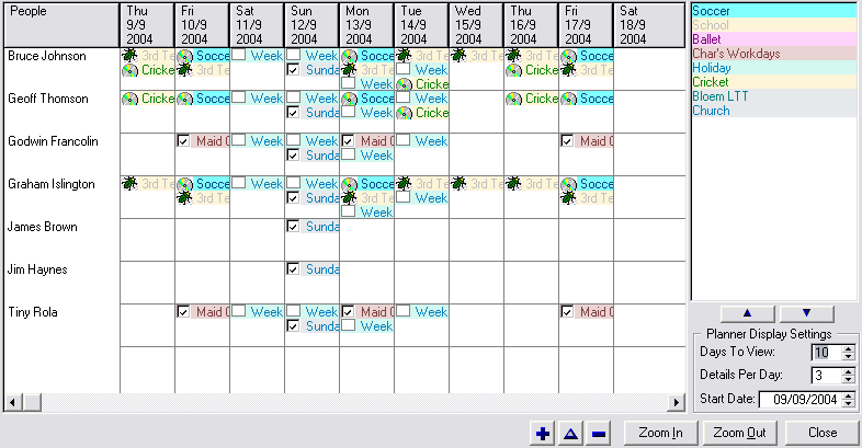
The left column contains the parent data (in this case the 'People'). Each
of the Day columns to the right of that contains activities that pertain
to that Person.
- Double-Click on the WeeklyPlanner (ToDo)
procedure and select Window - Generic Window
Handler from the Templates list.
- Enter the Procedure's prototype and parameters fields as the
following:
(long pStartDate=0)
- Open the Window formatter (use the Simple Window template when
prompted) and resize the window to:
525x255. You'll also need to make sure that this is an MDI Child
window (the MDI Child checkbox on the Extra tab on the Window
Properties window).
- Click the top left corner for the group of controls to be placed on
the window.
You will see 2 buttons in a Group and the legend controls.
- Delete the controls that you don't require. You must leave the
?Planner control.
- Clarion 6: Right-click on one of the controls and select the Actionsmenu item.
- Clarion 6: Click on the Tables button.
Clarion 8: click the Data /Tables tab
- Insert the tables that will contain the data to populate in the
ListBox. The Primary table is the table that contains the data for the
left column. (Note that we don't need the HotDates_Colors table here
as we'll be styling this calendar slightly differently)
- On the General tab:
- Go to the
Data tab.
- The Left Heading field contains the
heading (a constant, variable or expression) for the left-most column.
- The Displayed Data field contains the
data for the left most column.
- Note the Style field - instead of
colorizing the cells by vehicle, we now have the rows which identify
each vehicle. We'll colorize these cells with a different detail -
i.e. business or private (2 for business and 1 for private).
- The Data to Display field will contain
the field or expression to place the data in each item in the row.
- Go to the Styles tab and set the settings
there as follows (setup the styles with differing colors):
- Go to the Options tab and set the
settings there as follows:
- Save and quit out Window Formatter.
- Open the Embeds - and find the Local Objects | Abc Objects |
WindowManager | Init | CODE | ParentCall and enter the following
source immediately after the Parent Call:
if pStartDate then Loc:StartDate = pStartDate .
This will set the StartDate to the date that we've passed to
the window on startup.
Adding Update buttons to the WeeklyPlanner
- If you've exited out of the Window Formatter for the WeeklyPlanner
window, then re-open it again.
- Select Populate - Control Template...
from the menu.
- Select the HotDates_PlannerUpdate template
from the Control template list.
- Click the top left corner for the group of controls to be placed on
the window. You will see the Insert, Change and Delete buttons appear
on the window.
- Right-click on one of the buttons and select the Actions...
option
- Go to the Prime Fields on Insert tab to
the following: (Note you will need to wizard up a SelectVehicle
window)
- Basically what's happening here is that when you're inserting, you
want the trip to start at the date clicked, and you want it to be
attached to the Vehicle for that row.
- Go to the Options tab and ensure the Add Update buttons to popup checkbox is checked
(i.e. we want to be able to edit via popup).
Adding a DayScheduler
The DayScheduler will help us view the activities for each vehicle for the
day.
There are two places in the tutorial application where we need to add the
DatePicker
Lookup HotKey extension : UpdateVehicles and UpdateTripLog.
- Double-Click on the DayScheduler (ToDo)
procedure and select Window - Generic Window
Handler from the Templates list.
- Enter the Procedure's prototype and parameters fields as the
following:
(long pStartDate=0)
- Open the Window formatter (use the Simple Window template when
prompted) and resize the window to:
465x300. You'll also need to make sure that this is an MDI Child
window (the MDI Child checkbox on the Extra tab on the Window
Properties window).
- Click the top left corner for the group of controls to be placed on
the window.
You will see 2 buttons in a Group and the legend controls.
- Clarion 6: Right-click on one of the controls and select the Actions menu item.
- Clarion 6: Click on the Tables button.
Clarion 8: click the Data /Tables tab
- Insert the tables that will contain the data to populate in the
ListBox. The Primary table is the table that contains the data for the
left column. (Note that we don't need the HotDates_Colors table here
as we'l be styling this calendar slightly differently)
- On the General tab, set the Display
date to pStartDate.
- Go to the Headers tab and set the
following settings (besides the defaults):
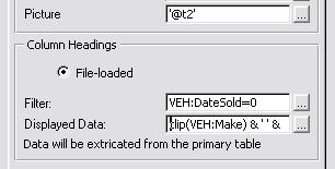
We've filtered out the vehicles that have a sold date (so the filter
is VEH:DateSold=0), as we're only
interested in current vehicles. Each vehicle will have it's own column
showing the day's scheduled activity. The Displayed
data shows the contents of the column heading (in this case clip(VEH:Make) & ' ' & clip(VEH:Model).
- Go to the Data tab and set the following
settings:
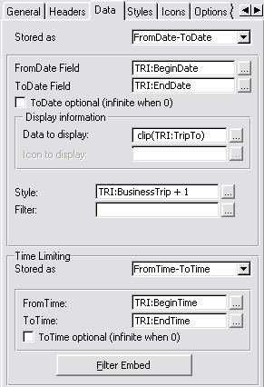
We have an additional Time Limiting group - because in this HotDates
view, we can view time detail. This is similar to the Date Stored as
settings.
- Go to the Styles tab and set the
following settings:
Adding Update buttons to the DayScheduler
- If you've exited out of the Window Formatter for the DayScheduler
window, then re-open it again.
- Select Populate - Control Template...
from the menu.
- Select the HotDates_SchedulerUpdatetemplate
from the Control template list.
- Click the top left corner for the group of controls to be placed on
the window. You will see the Insert, Change and Delete buttons appear
on the window.
- Right-click on one of the buttons and select the Actions...
option
- Go to the Prime Fields on Insert tab to
the following: (Note you will need to wizard up a SelectVehicle
window)
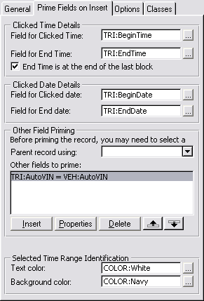
Basically what's happening here is that when you're inserting, you
want the trip to start and end at the time block selected, and you
want it to be attached to the Vehicle for that column. In this case
we've checked the End time is at the end of the
last block which means that the time selected is inclusive.
- Go to the Options tab and ensure the Add Update buttons to popup checkbox is checked
(i.e. we want to be able to edit via popup).
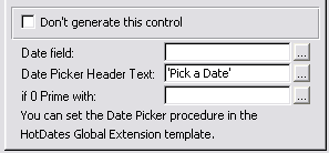
Adding the DatePicker Lookup Hotkey
- Go back to the application IDE tree window, and double click on the
UpdateVehicles procedure and click the Extensions
button.
- Select the HotDates_DatePickerHotKeyLookup
template from the Extension template list.
Repeat these 2 steps for the UpdateTripLog window.
Another addition - you can add the DayScheduler to the options in the Main
window, and then post an accepted event at startup to open the
DayScheduler automatically.
The HotDates Templates
(and how to add them to your Application)
The
Global Extension template and Adding a DatePicker window to your
application
Adding a 1
to 12 Month Calendar to your application
Adding Update
buttons to your Calendar/View
Adding a MonthViewer
to your application
The Weekly Planner Control
Template
Adding a Day
Scheduler to your application
Ways
to
use the DatePicker effectively (
the
Lookup
button, and
the
window HotKey)
If you would like to use the HotDates_Colors table in your application for
styling, then check this out in the
Useful
Tips
section.
- If you want to use the HotDates_Color tablem and the
Hotdates_Settings table, then import these into your dictionary. To do
this open your dictionary and import the clarion\accessory\libsrc\win\HotDatesSettingsTables.DCTX
file.
- Open the app. Add the Global Extension Template. To do this:
- Open your app in the Clarion IDE, and click on the Global
button.
- In the Global Properties window, click on the Extensions
button.
- Click on the Insert button and select
the Activate_HotDates extension
template.
- If this is the Data DLL, or this is a single-app system and this
is the EXE, click on the button to Import the DatePicker
procedure. If you imported the tables mentioned in step 1 then you
can also click the button to import the Settings procedures.
- Set the settings on the Options tab.
The following prompts are
available on the Options tab of the
Global Extension template:
- Setting a global Refresh Event means that when performing
operations between two calendar windows (like Drag and Drop or
Cut/Copy/Paste), the originating window can be refreshed on a
successful operation completed on the recipient window. You need
to set this event to a unique event in the user event range
(0400H-0FFFH). The default is 082EH.
- You can specify a Legend List row height
for all your legend lists here.
- If you imported the DatePicker procedure, then ensure the Date Picker Procedure field is pointing to
the DatePicker you required (otherwise leave it blank).
- To call the DatePicker procedure using a HotKey, specify the Date-Picker HotKey here. You will need to
add the DatePicker
HotKeyLookup extension to each window where you require the
use of the HotKey.
- If you have a Multi-DLL application, then you can place your
DatePicker procedure in a DLL, and all your other applications can
use the one DatePicker procedure in that DLL. In this case, check
the HotDates globals are in another app
checkbox and enter the name of the DatePicker procedure in the
string provided above that. Your DatePicker HotKey, First Weekday
and Refresh event will also be set only in the Multi-DLL.
- If you would like to manually map the DatePicker, then you can
check the Don't automatically map the
procedure checkbox. In this case, you will need to
manually code the Map to your DatePicker window in the Global map.
- You can set the Date-Field Alternator keys
in the fields provided. This simply means that all the Hotdates
DateEntry templates will use these settings for global date-entry
compatibility. If you don't require one (or more) of the HotKeys,
then clear the entry.
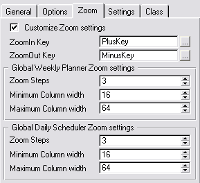
- If you'd like to customize your Planner and Scheduler zoom
settings, then you can check the Customize
Zoom Settings checkbox and the Zoom settings groups will
appear (otherwise the default will be used), allowing you to set:
- Zoom steps (i.e. the amount of times
to click the zoom out (or zoom in) to get from the lowest to
highest (or visa-versa) resolution of the column width.
- Minimum Column width - the narrowest
column width to zoom out to.
- Maximum Column width - the widest
column width to zoom in to.
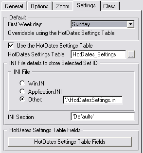
- You can select a first weekday (by default Sunday) using the First Weekday drop down. This will force the
left most day of all the calendars to the day you specify.
- If you want to enable the user to set the various global
HotDates settings on the fly, then you can do this using the
HotDates Settings Table. Check out the Using
the HotDatesSettingsTable (to store multiple sets of Translation
and other global settings) section of this doc for more
details.
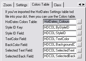
Setup the necessary information (required for HotDates to use the
Colours settings table in your application) on the Colors
Table tab if you're using the HotDates Colours table.
Adding
a 1 to 12 Month Calendar to your application
- Open the Window Formatter for the window that you are wanting to add
the Calendar to.
- Select Populate - Control Template...
from the menu.
- Select the HotDates_Calendar template
from the Control template list.
- Click the top left corner for the group of controls to be placed on
the window.
You will see 12 square list boxes (one for each month), the legend
controls, and a group of buttons (ScrollBack, ScrollForward, Print and
Refresh).
- Hide the controls that you don't require. These could include some
of the month list boxes (if you don't require a full 12 month
calendar) starting from the bottom right and proceeding left, the
legend priority buttons (two buttons one with the SortUp and the other
with the SortDown icons), the ScrollBack & ScrollForward buttons.
You must leave the ?CalendarGroup and at least one list control.
- Right-Click on one of the controls and select the Actions
menu item.
- Click on the Tables button.
- Insert the files that will contain the data to populate on the
Calendar. If there is more than one table required to extricate the
data, then use the one with the Date fields as the Primary file. This
will also be the file which gets primed for update when we add the
update buttons later. If you are using the HotDates_Colors table for
your style-colors, then you need to add the HotDates_Colors table to
your Other Tables.
- You can also enter an optimum key to sort the table by. This should
be a unique key (to obtain the correct record for updating).
- On the General tab:
- The StartDate field sets the month and
year of the top-left month in the calendar when the window is opened.
Leave it blank for today. Tip: You can enter date(1,1,year(today()))
to show the whole of this year starting at January.
- If you want to be able to scroll (i.e. back date or forward date),
then check the Enable Scrolling checkbox.
Otherwise the calendar will be fixed.
- Set the From Date to the date to
which you can scroll _back_ to. (leave blank for January last
year)
- Set the To Date to the date to which
you can scroll _forward_ to.(leave blank for December next year)
- Set the number of months to scroll by in the Scroll
by (months) entry (normally 1 - although you may want to
jump by up to an entire year - in which case you would enter 12).
- The Print group contains options that pertain to the calendar when
outputting to a printer:
Heading: (oddly enough) the heading that
appears at the top of the report.
- Goto the Data tab.
- Select the method by which the Data is stored (either a single date,
a Date Range [i.e. FromDate-ToDate], a Date Duration or handcoded).
- You'll need to enter a from date, an end date (for Date Ranges)
and/or a date duration (for DateDuration) expression depending on the
method that you selected in the 'Stored As' drop down.
- If you're using a ToDate (end date) option, and your end dates may
be blank, then you'll need to check the ToDate
optional (infinite when 0). Otherwise the EndDate will be
assumed to be correct at 0.
- If you have multiple records for days, and you would like to use
totaling to reflect a sum, count, average, maximum or minimum of the
values for those days, then you can check the Style
based on totaling checkbox.
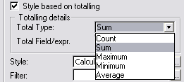
- If you checked Style based on totaling
checkbox, then pick a Total Type from the
drop combo. Count will count the records
that pertain to each calendar day; Sum will
add the Total Field/expr for each record
that pertains to a day; Maximum will
reflect the maximum to the Total Field/expr for
each record that pertains to a day; Minimum does the inverse, and
Average reflects the mean of the Total Field/expr
for all records for each day.
Note: The result (for each day) will be stored
in DatesQueue:<x>.Total (where x is the
ActiveTemplateInstance for this control template addition). You can
use this value in your Style expression.
- The Style entry needs to contain a field
or expression for the style of the data on the view. Check out the Useful Tips on more
possible uses. This Style ID is a numeric that references to the Style
ID in the styles (or legends) setup on the Styles tab.
- You can enter an expression to filter unwanted data in the Filter
field.
- To code a more in depth filter, you can use the Embeds, accessible
via the Filter Embed button. For more
details, check out the useful tips section on Coding
Manual Filters
- Go to the Styles tab.
- This tab is used to setup the details for the legend controls. You
can have up to 5 columns in the legend control (in case you want it
horizontally, rather than vertically)
- If you want to be able to optionally view styles at runtime, then
check the Use Checkboxes to activate styles
checkbox. Otherwise all styles will be displayed.
- To keep your style settings (style priority and active state)
between sessions, you can check the Save and
Restore checkbox.
- If your styles are stored in a style file, then you can check the Load Styles from a File checkbox. Otherwise you
can set them up in the Manual Styles list box.
- If the colours that you will use for the styles are in the Global
HotDates Colours table, then check the Use Colors
table checkbox.
- If your styles will be loaded from a file (and not the Global
HotDates Colours table), then you need to enter the Styles details.
The File, Key, StyleID to use, Colors and Description (which is the
text in the style entry in the legend list describing the style). The
StyleID must be a byte value (between 1 and 255) - which will be used
as a reference to the Style field on the Data tab. You don't have to
have a relationship between the table used for the styles and the
table for the data - although a Style reference in the data should
exist in the Styles table.
If you check the Sort styles in Key order
checkbox, then when the items initially appear in the listbox, they
will appear sorted in the order of the key specified in the Key
field - otherwise they will be sorted in StyleID order.
- Similarly with Manual styles, you can set the above settings from
the template.
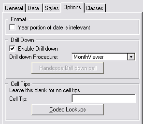
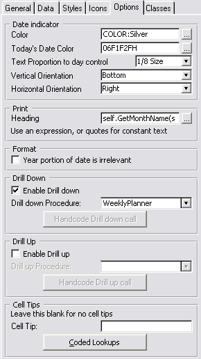
- Go to the Options Tab
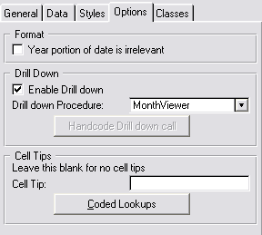
- If you don't want the year to be shown in the month header, then
check the Year portion of date is irrelevant checkbox.
This is useful for yearless calendars (like Birthday calendars, etc.).
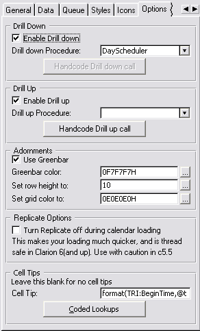
- You can Enable Drill Down and enter a
drill down procedure in the Drill down procedure
drop list. This will enable a day/week/month to be expanded. If your
drill down procedure takes more than one parameter, then you can
handcode the call to the drill down using the Handcode
Drill down call embed button. You need to pass the clickdate
property so that the receiving procedure will display the correct
start date. Example:
ViewMonth(ThisYear5.clickdate)
- The Cell Tips section lets you set up
cell tip information. You can leave this blank to omit cell tips. The
field provided is a formula in which you can use fields from files in
your HotDates tables. If you require the use of other fields (from
tables that are not in the HotDates tables) - then you can use the Coded Lookups button to handcode into the embed.
- If you have Replicate added to
this application, then you will be able to Turn
Replicate off during calendar loading. This is very useful if
your HotDates view has a lot of data, and the calendar takes a long
time to load. Please read the Clarion5.5
caveat in the FAQs.
- Go to the Classes tab and set the Based on Class to YearClass and the Object
Name to something unique and descriptive like ThisYear1.
Adding
Update buttons to your Calendar/View
- Open the Window Formatter for the Calendar/View window.
- Select Populate - Control Template...
from the menu.
- Select the HotDates_CalendarUpdate
template (for adding update controls to your 1 to 12 month Calendar),
HotDates_MonthViewerUpdate template (for
adding update controls to your MonthViewer) or HotDates_PlannerUpdate
template (for adding update controls to your Planner) from the Control
template list.
- Click the top left corner for the group of controls to be placed on
the window. You will see the Insert, Change and Delete buttons appear
on the window.
- Right-click on one of the buttons and select the Actions...option
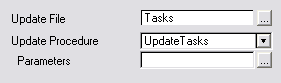
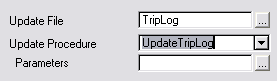
- Select the Update File - if there is no
unique key found, then you will need to enter a Key to access the file
by.
- Enter the Update Procedure that will be
used to update the record.
- If the procedure takes Parameters, then
you can enter those in the field provided.
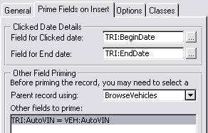
- Go to the Prime
Fields on Insert tab
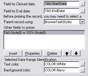
- Enter the field that will receive the date that is clicked in the Field for Clicked date entry.
- If your displayed data is stored as a date range (FromDate-Todate or
DateDuration), then you can enter the field that will receive the
ToDate (or Duration) that is clicked in the Field
for End date entry. This will allow a date range selection in
the calendar using ShiftMouseLeft.
- You may want to select a parent record to relate a clicked entry to.
You can enter the procedure used to select the parent in the Parent
record using: drop list.
- To prime other fields, use the Other fields to
prime list box to enter variables to be primed with their
respective values.
- If you have entered a End date field (i.e. you are allowing date
range selection), then you need to stipulate a identification for the
selection in the Selected Date Range
Identification group.
-
The following options are available for the Update buttons in a
DayScheduler as well:
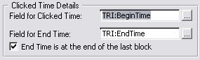
- Field for Clicked Time is the data field to receive the value of the
start of the clicked time range (if it's a range) or the clicked time
cell (if no range is selected).
- Field for End Time is the data field to receive the last time of the
time range selected. If you don't want to enable time range selection,
then leave this blank.
- You can use the checkbox End Time is at the end
of the last block to determine whether the End Time is at the
end of the last selected cell or at the beginning.
- Go to the Options
tab
- If you want to edit view Right-Click and popup, then check the Add Update buttons to popup checkbox.
- Your Legend is by default not refreshed after a table update (from
the calendar). However, in some cases your Legend may have changed
when your tables were updated, so you may like to check the Refresh
Legend list after Update checkbox in order to refresh the
legend list on the screen. Otherwise the legend will remain the same
as before a table edit.
- You may like to allow Inserts even if there is already a record on a
date. In this case check the Allow inserts when a
record exists on a date checkbox. Otherwise you will not be
able to insert a record if the date is styled.
- If you would like to support drag and drop on this calendar, then
enter a Unique Drag ID (which should match
your other calendars that you want to drag from and drop to). The Drag
and Drop ID is populated with a default, but you can change this to a
unique one if you'd like to.
- If you are supporting Cut|Copy|Paste, then it's a good idea to use
the Unique Drag ID for the Paste ID - in
order to prevent mismatched pasting from the clipboard.
- If you are supporting Cut|Copy|Paste and\or Drag and Drop, then
you'll need to handcode a validation routine to avoid duplication
occurring (Useful Tip: 11.
Validating Paste and Dropped data entries).
- Go to the Classes tab
- Go to the Classes tab and set the Based on Class to PopupClass and the Popup
Object Name to something unique and descriptive like
ThisPopup1.
Adding a
MonthViewer to your application
- Open the Window Formatter for the window that you are wanting to add
the Month Viewer to.
- Select Populate - Control Template...
from the menu.
- Select the HotDates_MonthViewer template
from the Control template list.
- Click the top left corner for the group of controls to be placed on
the window.
You will see 2 buttons in a Group and the legend controls.
- Delete the controls that you don't require. You must leave the
?MonthViewGroup.
- Right-click on one of the controls and select the Actions
menu item.
- Click on the Tables button.
- Insert the files that will contain the data to populate on the
Browse. If there is more than one table required to extricate the
data, then use the one with the StartDate as the Primary file. This
will also be the file which gets primed for update when we add the
update buttons later. If you are using the HotDates_Colors table for
your style-colors, then you need to add the HotDates_Colors table to
your Other Tables.
- You can also enter an optimum key to sort the table by. This should
be a unique key (to obtain the correct record for updating).
- Go to the Data tab.
- Select the method by which the Data is stored (either a single date,
a Date Range [i.e. FromDate-ToDate], a Date Duration or handcoded).
- You'll need to enter a from date, an end date (for Date Ranges)
and/or a date duration (for DateDuration) expression depending on the
method that you selected in the 'Stored As' drop down.
- If you're using a ToDate (end date) option, and your end dates may
be blank, then you'll need to check the ToDate
optional (infinite when 0). Otherwise the EndDate will be
assumed to be correct at 0.
- The Style entry needs to contain a field
or expression for the style of the data on the view. Check out the Useful Tips on more
possible uses. This Style ID is a numeric that references to the Style
ID in the styles (or legends) setup on the Styles tab.
- You can enter an expression to filter unwanted data in the Filter
field.
- To code a more indepth filter, you can use the Embeds, accessible
via the Filter Embed button. For more
details, check out the useful tips section on Coding
Manual Filters
- The Data to Display field will contain
the field or expression to place the data in each item in the daylist
in the month.
- The ID of the Icon to display is used to
tell HotDates which icon to place at the items entry in the daylist.
This is probably initially disabled - and will be enabled after you've
set the Icons up in the Icons tab. Similarly to the Style field, you
can place a formula to obtain the correct icon ID.
- Go to the Styles tab. Check out the Calendar
Control template for help in setting up styles.
- Go to the Icons
Tab
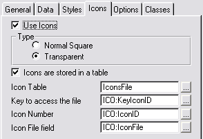
- If you are not going to use Icons, then leave the
Use Icons unchecked and move straight on to the Options
tab (below). Otherwise check the UseIcons checkbox.
- Select whether you want the Icons to be Transparent
or Normal Square icons (in the daylists)
- If your Icons are stored in a table, then
check this checkbox, otherwise leave it unchecked and manually enter
the icon files and their respective IDs in the list box on this tab.
- If your Icons are stored in a table, then enter the Icon
Table name, the Key to access the table,
the Icon Number field, and the Icon
File field that contains the Filename for the icon.
- Go to the Options
Tab
- The Date indicator is a numbered string
that floats ontop of the date data box. You can set the Color, the
proportional size (in relation to the ListBox), and the position
(Vertical and Horizontal Orientation). The Today's
Date Color field allows you to use a different color to
highlight today's date on the calendar. You can leave this blank if
you don't want Today's date to be highlighted.
- The Heading in the Print
group is the heading that will appear at the top of the MonthView
printout. (Check FAQ 6.1. for more detail on how
to print out the MonthView)
- If the Year portion of date is irrelevant
(i.e. this displays data like birthdays or anniversaries where data
must not be filtered out where the year does not match the current
year) then check this checkbox.
- You can Enable Drill Down and enter a
drill down procedure in the Drill down procedure
drop list. This will enable a day/week/month to be expanded. If your
drill down procedure takes more than one parameter, then you can
handcode the call to the drill down using the Handcode
Drill down call embed button. You need to pass the clickdate
property so that the receiving procedure will display the correct
start date. Example:
ViewMonth(ThisYear5.clickdate)
- The Drill Up follows the same principles
as Drill Down (immediately above).
- The Cell Tips section lets you set up
cell tip information. You can leave this blank to omit cell tips. The
field provided is a formula in which you can use fields from files in
your HotDates tables. If you require the use of other fields (from
tables that are not in the HotDates tables) - then you can use the Coded Lookups button to handcode into the embed.
- If you have Replicate added to this application, then you will be
able to Turn Replicate off during calendar loading.
This is very useful if your HotDates view has a lot of data, and the
calendar takes a long time to load. Please read the Clarion5.5
caveat in the FAQs.
- Go to the Classes tab and set the Based on Class to MonthListClass and the Object Name to something unique and descriptive
like ThisMonth1.
Check out the
Adding
Update buttons to your Calendar/View to add update buttons to your
Month View.
The Week/Month Planner
Control Template
The WeeklyPlanner gives you a bit more scope to work with than the
MonthView. The MonthView is a 2 dimensional - date and "activities",
whereas the Weekly Planner is 3 dimensional - Date, "activities" and
parent data. I guess the best would to show a pictorial example:
The left column contains the parent data (in this case the 'People'). Each
of the Day columns to the right of that contains activities that pertain
to that Person.
Your WeeklyPlanner procedure must be prototyped with at least a StartDate
if you're using the Drill down/up functionality in HotDates:
WeeklyPlanner procedure (long pStartDate=0)
- Open the Window Formatter for the window that you are wanting to add
the WeeklyPlanner to.
- Select Populate - Control Template...
from the menu.
- Select the HotDates_Planner template from
the Control template list.
- Click the top left corner for the group of controls to be placed on
the window.
You will see 2 buttons in a Group and the legend controls.
- Delete the controls that you don't require. You must leave the
?Planner control.
- Right-click on one of the controls and select the Actions
menu item.
- Click on the Tables button.
- Insert the tables that will contain the data to populate on the
Browse. You should make the Primary table the table that contains the
data for the left column. You can attach a keyed order to the Primary
table in order to sort the data. The table that contains the daily
details data should be added to this tree as well. If you are using
the HotDates_Colors table for your style-colors, then you need to add
the HotDates_Colors table to your Other Tables.
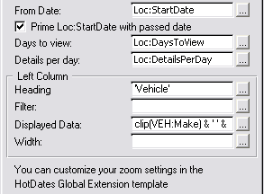
- On the General tab:
- The From Date indicates the date of the
2nd column. You can use the Loc:StartDate variable (which has an entry
control as part of the control template), a fixed date (like today())
or an expression.
- The Prime Loc:StartDate with passed date.
If you're using a variable startdate (in the FromDate), then you can
get the template to prime this variable with the parameter passed
(from drill-down/up).
- The Days to view indicates (oddly enough)
the number of days to view in the list. You can use the Loc:DaysToView
(which has an entry control as part of the control template), a fixed
number (like 7) or an expression (like
day(date(month(today())+1,1,year(today())))).
- The Details per day indicates the number
of detail rows to have per parent (left column) per day. You can use
the Loc:DetailsPerDay (which has an entry control as part of the
control template), a fixed number (like 3) or an expression.
- The Heading field contains the heading (a
constant, variable or expression) for the left-most column.
- The Filter field is used to filter out
obsolete records from being added to the queue.
- The Displayed Data field contains the
data for the left most column.
- The Width field contains the initial
width for the left most column.
- The Load Data the new way (see docs for details)
checkbox creates the cell data in a more efficient manner, using the
legend order to populate the style, rather than looping through styles
and generating the style based on the legend order. This is not
backward compatible (IRO which embed points are used for populating
the style data), and so this is off by default, but for new calendars,
this should be checked in order to use the more efficient mechanism
for loading data.
- Go to the Data
tab.
- The Date Picture for Column Headers is
the format in which the date must be displayed in the column heading
(from column 2 onwards)
- The Use American Date for abbreviated dates
checkbox is used to format the date into American date order when an
abbreviated date must be used in the column header because of space
limitations.
- Select the method by which the Data is stored (either a single date,
a Date Range [i.e. FromDate-ToDate], a Date Duration or handcoded).
- You'll need to enter a from date, an end date (for Date Ranges)
and/or a date duration (for DateDuration) expression depending on the
method that you selected in the 'Stored As' drop down.
- If you're using a ToDate (end date) option, and your end dates may
be blank, then you'll need to check the ToDate
optional (infinite when 0). Otherwise the EndDate will be
assumed to be correct at 0.
- The Style entry needs to contain a field
or expression for the style of the data on the view. Check out the Useful Tips on more
possible uses. This Style ID is a numeric that references to the Style
ID in the styles (or legends) setup on the Styles tab.
- You can enter an expression to filter unwanted data in the Filter
field.
- The Data to Display field will contain
the field or expression to place the data in each item in the row.
- The ID of the Icon to display is used to
tell HotDates which icon to place at the items entry in the row. This
is probably initially disabled - and will be enabled after you've set
the Icons up in the Icons tab. Similarly to the Style field, you can
place a formula to obtain the correct icon ID.
- The default Heading Justification drop
down can be used to select an alternative justification for the column
headers. Force to Left, Center, Right - or use the default.
- Go to the Queue
tab.
- You can sort the child data cells (in the rows) in 3 possible orders
- by the order that is in the Legend, in
the DisplayData order (which is simply
sorted by string), or in a customizable order (Other).
- If you selected Other in the Row Data
Ordered by drop down list, then you can enter a manual sort order in
the embed provided. Your primary sort fields, must always be those
used in the left column, and then in specific child fields. For
example:
sort(DatesQueue:1,DatesQueue:1.PEO:PeopleID,DatesQueue:1.TAS:TaskTime)
- If you are coding a manual filter (for populating data from the
template generated queue to the planner queue) - then you need to add
the fields to the template queue that you will use in the filter.
These will be the file fields, but in the coded filter, you must use
their queue field equivalents.
- To code a more in depth filter, you can use the Embeds, accessible
via the Filter Embed button. For more
details, check out the useful tips section on Coding
Manual Filters
- Go to the Styles tab. Check out the Calendar
Control template for help in setting up styles.
- Go to the Icons Tab.
- If you are not going to use Icons, then leave the
Use Icons unchecked and move straight on to the Classes
tab (below). Otherwise check the UseIcons checkbox.
- You can either select the Top Detail Cell Only
or All Detail Cells to display icons on.
The first option will only place one icon (on the top detail dell) per
parent row per day. Otherwise all day detail cells can be iconed.
- Select whether you want the Icons to be Transparent
or Normal Square icons (in the daylists)
- If your Icons are stored in a table, then
check this checkbox, otherwise leave it unchecked and manually enter
the icon files and their respective IDs in the list box on this tab.
- If your Icons are stored in a table, then enter the Icon
Table name, the Key to access the table,
the Icon Number field, and the Icon
File field that contains the File for the icon.
- You can Enable Drill Down and enter a
drill down procedure in the Drill down procedure
drop list. This will enable a day/week/month to be expanded. If your
drill down procedure takes more than one parameter, then you can
handcode the call to the drill down using the Handcode
Drill down call embed button. You need to pass the clickdate
property so that the receiving procedure will display the correct
start date. Example:
ViewMonth(ThisYear5.clickdate)
- The Drill Up follows the same principles
as Drill Down (immediately above).
- If you want to use Greenbarring
to make your planner more legible, then check the Use
Greenbar checkbox and enter an appropriate RGB color value
(or variable name) into the Greenbar color field
provided.
- If you would like to alter the height of the lines (or rows) in the
planner, then you can stipulate a Set row height
to value or variable.
- If you would like to customize the grid color of the planner
control, then you can do that here by entering an RGB color value (or
variable name) into the Set grid color to field.
- If you have Replicate added to this application, then you will be
able to Turn Replicate off during calendar loading.
This is very useful if your HotDates view has a lot of data, and the
calendar takes a long time to load. Please read the Clarion5.5
caveat in the FAQs.
- The Cell Tips section lets you set up
cell tip information. You can leave this blank to omit cell tips. The
field provided is a formula in which you can use fields from files in
your HotDates tables. If you require the use of other fields (from
tables that are not in the HotDates tables) - then you can use the Coded Lookups button to handcode into the embed.
- Go to the Classes tab and set the Based on Class to PlannerClass and the Object
Name to something unique and descriptive like ThisPlanner1.
Check out the
Adding
Update buttons to your Calendar/View to add update buttons to your
Planner.
Adding a Day
Scheduler to your application
The Scheduler gives you a bit more detail to work with than the MonthView
or Planner template. The Day scheduler breaks the day down into hours and
shows you in diary form the details for the day. I guess the best would to
show a pictorial example:
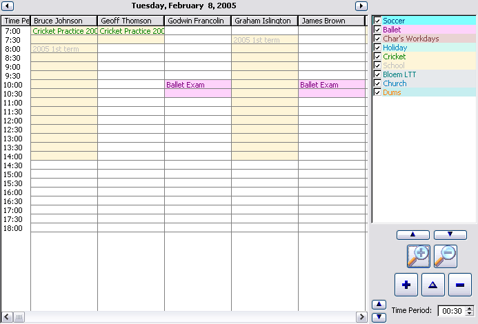
In the scheduler template, the data is arranged vertically. In this case,
we're viewing a single day's info. Each person is arranged along the
column headers and the Time is in the left most column data.
- Open the Window Formatter for the window that you are wanting to add
the WeeklyPlanner to.
- Select Populate - Control Template...
from the menu.
- Select the HotDates_Scheduler template
from the Control template list.
- Click the top left corner for the group of controls to be placed on
the window.
You will see:
- The legend controls (a list box on the right and 2 buttons below
with an up arrow on the one and a down arrow on the other).
- The SchedulerList control (which will display the data we're
wanting to see).
- 2 buttons, a region and a string control above the SchedulerList
that will be used to set and show the date of the data that we're
viewing.
- A set of 4 buttons and a spin control that can be used to adjust
the amount of rows displayed, and the time value of each row.
- Delete the controls that you don't require. You must leave the
?SchedulerList control.
- Right-click on one of the controls and select the Actions
menu item.
- Click on the Tables button.
- Insert the tables that will contain the data to populate on the
Browse. You should make the Primary table the table that contains the
data for the Column headings. You can attach a keyed order to the
Primary table in order to sort the data. The table that contains the
daily details data should be added to this tree as well. If you are
using the HotDates_Colors table for your style-colors, then you need
to add the HotDates_Colors table to your Other Tables.
- On the General tab:
- The Display date indicates the date that
will initially be displayed in the scheduler. You can pass a parameter
to the window and use that as the initial date.
- Go to the Headers
tab.
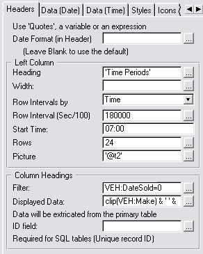
- The Date Format is the date picture
format of the header that appears above the Scheduler list box. Leave
this blank for the default (@d18)
- The Left Column Data group pertains to
the amount of rows and the left most data in those rows. The Left
Heading is the text that will be placed in the header for the
left column.
- The Row Intervals by drop list will
enable you (in future) to determine whether the Scheduler is rowed in
days or in time.
- The Row Interval (Sec/100) indicates the
time period in 100ths of a second of each row. In the above example
this is set to 30 minutes.
- The Start Time is the time that is
initially represented in the first row of the Scheduler list (this can
be changed at runtime if required).
- The Rows entry indicates the amount of
rows to initially display in the Scheduler List (this can be changed
at runtime if required).
- The Picture entry indicates the picture
token to use for the left column data. This must either be a string in
quotes or a variable.
- The Column Headings group pertains to
the data that must be used for the column headings. At this stage the
headings can only be file-loaded - but
we'll add pipe-list as well.
- The number of column headings will be determined by the records in
the primary table of the HotDates Scheduler (which you set earlier).
Each record will have a column of data. You can filter out unwanted
records using the Filter entry.
- The Displayed Data entry is the text to
display in the heading of the column. This should contain some unique
fields from the primary table to correctly identify the column that
pertains to that record.
- The ID field is not required for file
drivers that support the POINTER() function - but you'll need an
auto-incrementing LONG for drivers that don't support the POINTER()
function (SQL drivers).
- Go to the Data
tab.
- Select the method by which the Data is stored (either a single date,
a Date Range [i.e. FromDate-ToDate], a Date Duration or handcoded)
using the Stored as drop list. This
pertains to the data in the entire Scheduler list.
- You'll need to enter a FromDate, a ToDate (for Date Ranges) and/or a Date
Duration (for DateDuration) expression depending on the
method that you selected in the 'Stored As' drop down.
- If you're using a ToDate (end date)
option, and your end dates may be blank, then you'll need to check the
ToDate optional (infinite when 0). Otherwise
the EndDate will be assumed to be correct at 0.
- The Style entry needs to contain a field
or expression for the style of the data on the view. Check out the Useful Tips on more
possible uses. This Style ID is a numeric that references to the Style
ID in the styles (or legends) setup on the Styles tab.
- You can enter an expression to filter unwanted data in the Filter
field.
- The Data to Display field will contain
the field or expression to place the data in each item in the row.
- The ID of the Icon to display is used to
tell HotDates which icon to place at the items entry in the row. This
is probably initially disabled - and will be enabled after you've set
the Icons up in the Icons tab. Similarly to the Style field, you can
place a formula to obtain the correct icon ID.
- If you would like to add a column that totals the number of active
(or styled) cells in each row, then check the Add
a
Totaling �
(Counter) column checkbox.
- The default Heading Justification drop
down can be used to select an alternative justification for the column
headers. Force to Left, Center, Right - or use the default.
- For the data in each cell, we use the Time Limiting group. The data
can either be Stored as TimeDuration,
FromTime-ToTime or handcoded.
- You'll need to enter a FromTime and a ToTime (For FromTime-ToTime data) or a Duration
(for TimeDuration data)
- You can use the Filter embed to handcode a filter to filter out data
that must not be displayed in a specific cell.
- Go to the Styles tab. Check out the Calendar
Control template for help in setting up styles.
- Go to the Icons tab. Check out the MonthViewer
Control template for help in setting up icons.
- You can Enable Drill Up and enter a drill
up procedure in the Drill up procedure drop
list. This will enable a day/week/month to be expanded. If your drill
up procedure takes more than one parameter, then you can handcode the
call to the drill down using the Handcode Drill up
call embed button. You need to pass the clickdate property
so that the receiving procedure will display the correct start date.
Example:
ViewMonth(ThisYear5.clickdate)
- The Cell Tips section lets you set up
cell tip information. You can leave this blank to omit cell tips. The
field provided is a formula in which you can use fields from files in
your HotDates tables. If you require the use of other fields (from
tables that are not in the HotDates tables) - then you can use the Coded Lookups button to handcode into the embed.
- If you have Replicate added to this application, then you will be
able to Turn Replicate off during calendar loading.
This is very useful if your HotDates view has a lot of data, and the
calendar takes a long time to load. Please read the Clarion5.5
caveat in the FAQs.
- Check out the Planner template for the adornment
group details.
- Go to the Classes tab and set the Based on Class to SchedulerClass and the Object Name to something unique and descriptive
like ThisScheduler1.
Ways to use the DatePicker effectively (the Lookup button, and the
window HotKey)
There are many times you may want to quickly enter a date, which is where
a DatePicker can come in extremely useful. We've included 2 templates to
help you do this - you can either select using a lookup button next to the
field requiring the date, or you can use a HotKey (like CtrlD) to populate
a Date enter an entry field that has the focus.
Adding the Date
Picker Lookup Button
You need to add one button per entry field that requires the use of a
DatePicker.
- Open the Window Formatter for the window that you are wanting to add
the DatePicker lookup button to.
- Select Populate - Control Template...
from the menu.
- Select the HotDates_DatePickerLookup
template from the Control template list.
- Click the top left location for where you want to place the lookup
button on the window.
- Right-click on one of the controls and select the Actions
menu item.
- The Date Field must contain the field
that will receive the date returned from the DatePicker procedure
- The Date Picker Header Text contains the
text (either as a constant in quotes or a variable name) that must be
displayed at the top of the DatePicker.
- The if 0 Prime with: is self-explanitory.
It's an expression - so you can use variables or formulae (like
today())
Adding
the
DatePicker HotKey extension to your window
You need to add one extension per window that requires the use of the
HotKey. You can set the HotKey in the
Global
Extension template.
- Open the Extension and Control Templates window for the window that
you are wanting to add the DatePicker HotKey lookup extension to.
- Click the Insert button.
- Select the HotDates_DatePickerLookup
template from the Control template list.
- Go to the Options tab.
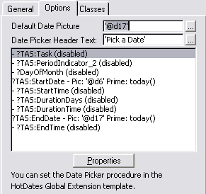
- The Default Date Picture must contain a
default picture for the date picker to return (can be overridden per
field).
- The Date Picker Header Text contains the
text (either as a constant in quotes or a variable name) that must be
displayed at the top of the DatePicker.
Each entry and spin box control on the window, is listed in the Date
Picker controls list. To change an item's properties, double-click on
the item.
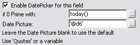
- Check the Enable the DatePicker for this field
checkbox if you want to allow the HotKey to operate when this field is
selected (Otherwise the HotKey will have no effect).
- The if 0 Prime with: is self-explanatory.
It's an expression - so you can use variables or formulae (like
today())
- The Date Picture must contain a default
picture for the date picker to return (can be overridden per field).
Using the
DateEntry Locator control template
This template is really useful for date limited browses. Populating this
control template will add the Date entry and lookup button as well as some
special
date incrementing and
decrementing ability (setup in the Global Extension template) -
while automatically refreshing the browse for you.
Open your Window Formatter of your browse and add the control template to
your window.
If you right-click on one of the controls and select the Actions tab, then
you can setup some of the options of the control template:
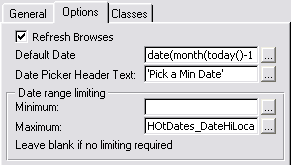
- The Refresh Browses checkbox (if checked)
will force browses to be refreshed when the date changes. You need to
place the limit in the filter of each browse though.
- The Default Date is the date that is
initialised when the window is opened.
- The Date Picker Header Text is the text
that is passed to the DatePicker when the DatePicker hotkey or Lookup
button is activated.
- The Date range limiting fields are useful
to limit the range of the selection of dates - both using the
incrementor/decrementor hotkeys, and in the DatePicker window.
Tip: You can use two fields for limiting
your browse to a range of dates - one for high limiting and one for low
limiting (obviously you'll need to create the second variable for the
second field - as HotDates will only create one variable). For the high
limiter (in the above template options), you can enter a Date range
limiting minimum of the initial variable (HotDates_DateLocator), and for
the low limiter, you can enter a Date range limiting maximum of the other
(new) variable (e.g. HotDates_DateHiLocator).
Don't forget to add the filter in your browse template prompts so that the
list will only show data in the date range specified in the locator
fields.
Useful Tips
Style
field formula examples
Coding Manual Filters
Tricks in linking
records for Updating
Refreshing the calendar
Implementing Translation
Making Printouts
Overriding
Global
Settings (like DatePickerHotKey and FirstDayofWeek) on the fly
Drag and drop across windows
Cut/Copy/Paste across
different windows
Creating
a
Style file (for themes and across-the-app colorization)
Validating Paste
and Dropped data entries
Using the
DateEntry Locator control template
Using the
HotDatesSettingsTable (to store multiple sets of Translation and other
global settings)
Styling a cell manually in the Weekly Planner
Style field formula
examples
The Style field entry in the control templates (on the Data tab) is an
expression that must result in a byte (1 - 255). The result of which
should be in the legend (which is setup on the Styles tab) and should
match one of the StyleIDs. Sometimes you can have a field in a datafile to
indicate the Style that should be used to display the data on the
calendar. But it's probably more likely to be a formula.
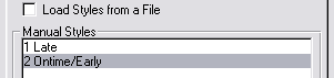
Example 1:
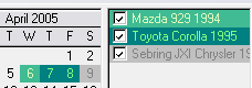
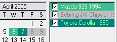
You may want to show orders that were shipped late in Red and those on
time or early in green. In this case you can Create the following in the
Stylefield:
choose(ORD:Shipped>ORD:ExpectedShipDate,1,2)
Your Style tab would be set up as follows:
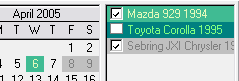
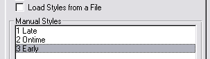
 Example 2:
You could create a Function to return the correct Style value in which
case your
Style field entry in your Control
Template would look something like:
CompareDates(ORD:Shipped,ORD:ExpectedShipDate) + 2
The procedure returns -1 for an early shipment, 0 for ontime or 1 for a
late shipment:
CompareDates procedure (Long pFirstDate,long
pSecondDate)
code
return(choose(pFirstDate=pSecondDate,0,1) *
choose(pFirstDate>pSecondDate,-1,1))
Your Style tab would be set up as follows:
Coding Manual Filters
One of the cases where you would want to code a manual filter, is if you
have a StartDate and EndDate that indicates a period start point and end
point. For example: in a diary, you may have a 3rd term (school entry)
which starts on 14 July and ends on 12 September. You would want to mark
the weekdays, but skip the weekends, even though the weekend dates are
valid dates in the range. What HotDates will do (unless you put a filter
in) is cycle from 14 July to 12 September and mark each day with the style
associated with school.
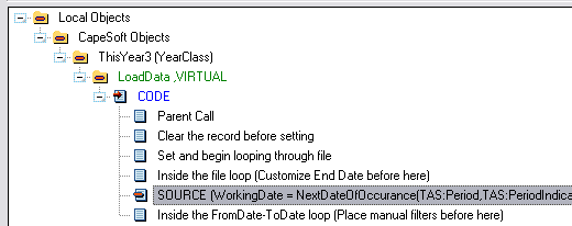
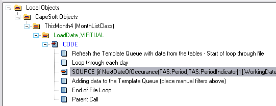
For the 1 to 12 month calendar:
You have 3 inbuilt template variable dates to work with (if you're using
the FromDate-ToDate or Date Duration template settings):
StartDate - the date at the beginning of the range
(e.g. 14 July)
EndDate - the date at the end of the range (e.g. 12 September)
WorkingDate - that is the date worked with
So if we want to skip the weekends:
if ~inrange(WorkingDate % 7,1,5) and (TAS:Type =
WeekDaysOnly) then cycle .
You need to put this code in the following embed (which you can get to
easily via the Filter Embed button on the Data tab of the YearCalendar
control
template) :
 For the MonthViewer:
You have a single variable which to use. The month viewer uses a fixed
range to cycle from (1st day to last day of the month), unlike the Year
calendar. But you can use the following date in the filter:
WorkingDate - that is the date worked with
You can put the same formula for the MonthViewer as the 1 to 12 month
calendar in the following embed (which you can get to easily via the
Filter Embed button on the Data tab of the Month Viewer control template):
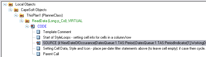
 For the Planner:
You have a single variable which to use. The month viewer uses a fixed
range to cycle from (1st day to last day of the month), unlike the Year
calendar.
WorkingDate - that is the date worked with
The big difference in the planner is that you're working with data from
the queue as apposed to working from data loaded directly from a file. And
so you will need to code it as follows:
if ~inrange(WorkingDate % 7,1,5) and
(DatesQueue:1.TAS:Type = WeekDaysOnly) then cycle .
DatesQueue:1 is the label of the queue in the
planner
control template, and you need to have added the TAS:Type variable
to the list in order to have this as a variable you can use in the manual
filter.
You can add this code to the following embed (which you can get to easily
via the Filter Embed button on the Data tab of the Planner control
template):
 For the Scheduler:
You have a single variable which to use. The Day Scheduler uses a single
day (at this stage). But you can use the following date in the filter:
self.FirstDate - that is the date worked with
You can put the same formula for the MonthViewer as the 1 to 12 month
calendar in the following embed (which you can get to easily via the
Filter Embed button on the Data tab of the Month Viewer control template):
Tricks in
linking records for Updating
Sometimes it can be a bit difficult to ensure that HotDates gets the
correct record for the user to update when they click on the change button
(or the insert if you are using the Planner template).
Tip 1:
Ensure that the file you are updating has a
unique key
- and preferably a primary key. The fewer fields in the key, the better.
HotDates will first use the Primary key, or if no Primary key, then a
unique key. If neither key is available, then you will be prompted for one
in the template. If you cannot have a unique key, then create a key with
as many fields in it - so that it can be as unique as possible.
Tip 2:
In your table structure (for your HotDates Year Calendar and Month Viewer
NOT your Planner and/or Scheduler), enter the table that you want to edit
as the
primary table (this is probably the
table that contains the dates for the range in any event).
Tip 3 (in the planner template):
The problem:
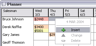
When the insert option is picked, the record needs to be related to both a
row and a column. In other words, it needs to be linked to the Salesman
(in the above case Bruce Johnson) and the date (Thu 4/3). HotDates does
the date bit for you, it's the linking back to the salesman which can be a
bit tricky.
In the above case, the sales table is a child of the parent (Salesman),
and so it's a one step process linking the new child to the parent, but in
many cases this will be a bit more complicated.
To help you, I've added some spare linking fields into the planner list
which you can use to get the correct row co-ordinate.
Firstly, you need to populate the link fields with their correct values,
which you can do in the following embed point (must be between the Setup
the Left Column Data and the Adding to the Column data Queue embed
points):
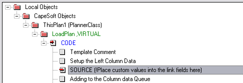
Example code:
self.plan.link3 = DAS:MyLinkField
self.plan.link4 = DAS:MyLinkField2
Secondly, you need to use these fields to load the correct record before
updating:
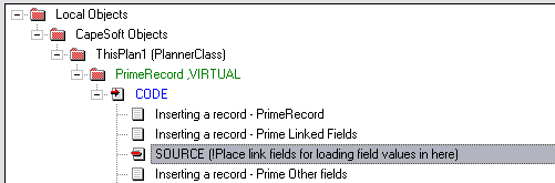
Example code:
DAS:MyLinkField = self.plan.link3
DAS:MylinkField2 = self.plan.link3
access:MyLinkTable.fetch(MyLinkFieldKey)
Tip 3 (in the Scheduler template):
Similarly to the planner template, you'll find that you want to prime a
parent record of a cell - particularly when inserting into a cell that
does not yet contain data. For non-SQL applications you can use the
following steps to get the record of the parent (i.e. the column record)
used to populate the header data:
In your Local Embeds (on that procedure) - find the Local Objects |
Capesoft Objects | ThisScheduler | Update (Long p_d),long | CODE | Get
record from the <filelabel> embed point. You need to put your code
to retrieve the header file record immediately after this embed point:
get(<MyHeaderdataFile>,self.ColumnHeaderID[self.clickcolumn]) �
!This
is a pointer to the file, so you can't use this for SQL tables.
if ~errorcode()
!Do priming here.
end
Refreshing the calendar
If you are wanting to have a runtime filter (like the calendar is linked
to a parent browse, and displays information related to the record that is
selected in the browse) that requires the calendar to be refreshed, then
at the appropriate code place, you can enter the following:
ThisWindow.reset(1)
or if your application is in legacy:
MyCalendarObject.reset(1)
So in the above scenario, you would trap the NewSelection event - set the
necessary variables to what they should be (i.e. those ones that are used
in the Filter for the calendar as set up in the Date tab of the HotDates
control template) and then reset the window.
Implementing Translation
The easiest way to do this is to
use
the HotDatesSettingsTable that comes included in HotDates. Otherwise
do the following:
While translation is not in the scope of HotDates - we've made it easy for
you to use another translation mechanism to translate some of the HotDates
text (like day and month names).
You can quite easily set translation on the fly as well - in case your
program supports multiple languages. Basically, wherever you would
normally translate your text you can place the following code to
accomplish translation in the HotDates windows (e.g. into Afrikaans):
HotDatesGlobalSettings.SetGlobalSetting('Sunday','Sondag')
HotDatesGlobalSettings.SetGlobalSetting('Monday','Maandag')
HotDatesGlobalSettings.SetGlobalSetting('Tuesday','Dinsdag')
HotDatesGlobalSettings.SetGlobalSetting('Wednesday','Woensdag')
HotDatesGlobalSettings.SetGlobalSetting('Thursday','Donderdag')
HotDatesGlobalSettings.SetGlobalSetting('Friday','Vrydag')
HotDatesGlobalSettings.SetGlobalSetting('Saturday','Saterdag')
HotDatesGlobalSettings.SetGlobalSetting('January','Januarie')
HotDatesGlobalSettings.SetGlobalSetting('February','Februarie')
HotDatesGlobalSettings.SetGlobalSetting('March','Maart')
HotDatesGlobalSettings.SetGlobalSetting('April','April')
HotDatesGlobalSettings.SetGlobalSetting('May','Mei')
HotDatesGlobalSettings.SetGlobalSetting('June','Junie')
HotDatesGlobalSettings.SetGlobalSetting('July','Julie')
HotDatesGlobalSettings.SetGlobalSetting('August','Augustus')
HotDatesGlobalSettings.SetGlobalSetting('October','Oktober')
HotDatesGlobalSettings.SetGlobalSetting('December','Desember')
You will notice that in the above example code September and November are
omitted. This is because these two months are the same in the two
languages, so there is no need to 'Translate' them.
If you are not using a Translation engine, then the best place to put the
above code is in the Program Setup global embed of your EXE application.
There's another method which you need to use to
translate miscellaneous text:
In your Global Embeds (on the DataDLL if this is a Multi-DLL application):
you can access the Translation Embed point (after the parent call):
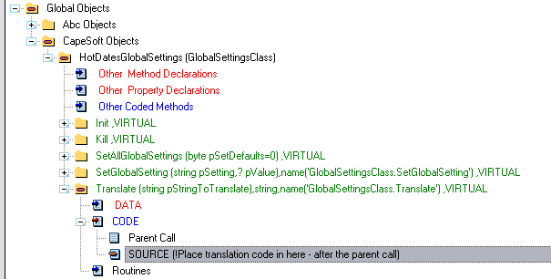
and place your translation text in for the respective text:
case pStringToTranslate
of 'Insert'
return 'Ny'
of 'Change'
..
of 'Delete'
..
of 'No Valid Tip'
..
of 'Quick Edit'
..
of 'Cut'
..
of 'Copy'
..
of 'Paste'
..
of 'Print'
..
of 'Drill Down'
..
of 'Drill Up'
..
end
Making Printouts
This is built in for the YearCalendar and the MonthViewer (check
FAQ
6.1. on how to do this). If you want to preview the report before
printing out, take a look at
FAQ3.5. To print out
the DayScheduler and\or the WeeklyPlanner you can use SendTo (
www.capesoft.com\accessories\sendtosp.htm).
Complete
the necessary steps laid out in the SendTo documentation to add the SendTo
control (for List boxes) for your DayScheduler (or Weekly Planner). Enter
the following for the Planner:
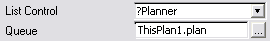
and for the DayScheduler:
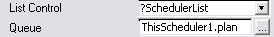
where ThisScheduler1 and ThisPlan1 are the names of the DayScheduler and
WeeklyPlanner objects.
Overriding
Global
Settings (like DatePickerHotKey and FirstDayofWeek) on the fly
The easiest way to do this is to
use
the HotDatesSettingsTable that comes included in HotDates. Otherwise
do the following:
You can set the DatePickerHotKey and FirstDayOfWeek in the HotDates global
extension template (if this is a Multi-DLL app, then in your data DLL) -
but you may like to allow the user to change these options on the fly. To
do this you can do the following:
HotDatesGlobalSettings.SetGlobalSetting('FirstDayOfWeek',UserSetting)
HotDatesGlobalSettings.SetGlobalSetting('DatePickerHotKey',UserSetting)
You'll need to save and restore the setting between sessions. You will
need to restore after the template has set the default (this is done in
the construct method, so you can put code into the ProgramSetup to
accomplish this).
Drag and drop across
windows
You can easily add Drag and drop support to you calendars so that entries
can be dragged across the windows. You need to ensure that the same drag
ID is assigned to both windows, and that the update tables are the same.
The graphic below shows the setup of a typical DragID which can be copied
across to your other calendar templates. This options tab appears in your
Calendar Update control template.
In order to make sure that your drop is valid you need to check out
11.
Validating Paste and Dropped data entries
To refresh the drag window, set the refresh event in the global extension
to a user event (> 400H). Post this refresh event from the drop window
to the thread of the drag window.
Cut/Copy/Paste
across different windows
If you created your application using HotDates v1.34 or older, then you
need to delete your UpdateCalendar control template and add it back in
again in order to make use of this functionality. Before deleting, make
sure you take a couple of snapshots of the template settings so that you
can set these up as they were. Calendars created with v1.35 or later will
automatically have this functionality built in. If you don't want to
support Cut/Copy/Paste, then you can simply delete the controls (without
deleting the control template of course <g>).
In order to make sure that your paste is valid you need to check out
11.
Validating Paste and Dropped data entries
Creating a Style file (for themes and across-the-app colorization)
For an example of this functionality, check out the MonthViewer procedure
in the
clarion\examples\HotDates\abc\abcdemo.app
Creating the Color table: You can import the
HotDates_Colors and
HotDates_Settings
table from the DCTX in the
clarion\accessory\libsrc\win
directory that ships with HotDates.
Editing the Color table: Once adding this to
your dictionary, you can open your application and run the
ImportHotDatesSettingsProcedures template utility (ABC only at this stage)
to import the necessary procedures into your application. A Color Setup
browse with an update form for adding and changing colors will be added to
your application (as well as a browse and form pair to set runtime options
like Day and month name translation and First Day of week - but you can
delete these procedures if you don't require them).
Implementing Styles using the Color table: In
our example app, we've setup the following Style attribute which the data
will use:
band(pointer(Vehicles),255)
This means that if there are more than 255 vehicles, the style is just
cycled 'round. In the Legend setup (on the Styles tab) - we do a lookup in
the Colors table to get the colors to use for the text, and use use these
variables for the Styles in the Legend. The ABC lookup is simply as
follows:
COL:StyleID = band(pointer(Vehicles),255)
access:Colours.fetch(COL:ByStyleID)
This code is inserted into the 'Before adding Styles to the palette' embed
point (accessed from the Filter Embed button on the Styles tab).
Using Themes: You could expand this concept to
use a Theme table as well. Your theme table could be a parent of the
Colors table - where multiple sets of colors could be selected from
depending on the user's preference (e.g. Rain Forest - 253 colors of deep
greens and browns, Palm beach - soft yellows, blue, etc).
To make this a SQL file:
The HotDates construct method calls the init method (which is called
before FM3 initializes). This will mean that you get a native Clarion
connect window, before the FM3 window has a chance to run.
2 things to do to correct this:
- in your HotDates global derived class (in the init method before
generated code and the parent call):
if ds_FMInited = 0
return
end
- make a call to the HotDates global init method after FM3 has
initialized:
in the 'FM3 - Just outside Init code loop' embed point:
HotDatesGlobalSettings.Init()
Validating
Paste and Dropped data entries
You need to create a general ValidatePaste procedure for all your
calendars (or each calendar set if you have calendars displaying different
data in your application) - unless you are only using the YearCalendar
with the
Allow inserts when a record exists on a date
checkbox is unchecked (which will do internal checking for you).
Otherwise you need to call your procedure in the ValidPaste derived method
in each of your calendars as follows:
For the Planner, MonthViewer and Calendar (you can use the
Validate
Drop|Paste code embed in the HotDatesUpdate template to get to
the right place) (Red is your code):
ThisPlan1.ValidPaste PROCEDURE ()
ReturnValue long
CODE
ReturnValue = PARENT.ValidPaste ()
if ReturnValue = 1
return CheckValidPaste()
end
Return ReturnValue
For the Scheduler (Red is your code):
case
self.CheckInRange(TRI:EndDate,TRI:EndTime,self.clickcolumn-1)
of 0
Return 1
of 1
Return 0
of -1
return CheckValidPaste()
ReturnValue = PARENT.ValidPaste ()
end
Your procedure should like something like this (which is taken from the
example) - it takes no parameters (as the record must already be loaded) -
and returns a 0 (invalid) if a duplicate exists, or a 1 if it's fine to
paste:
ReturnValue = 1
SAVED:TRI:Record = TRI:Record
SAVED:TRI:AutoVIN = TRI:AutoVIN
SAVED:TRI:BeginDate = TRI:BeginDate
SAVED:TRI:EndDate = TRI:EndDate
SAVED:TRI:BeginTime = TRI:BeginTime
SAVED:TRI:EndTime = TRI:EndTime
Loc:Ptr = pointer(TripLog)
set(TRI:VinDateKey,TRI:VinDateKey)
loop until access:TripLog.next()
if TRI:AutoVIN <> SAVED:TRI:AutoVIN then break .
if pointer(TripLog) = Loc:Ptr then cycle.
if TRI:BeginDate > SAVED:TRI:EndDate then break .
if (TRI:BeginDate = SAVED:TRI:EndDate) and (TRI:BeginTime >
SAVED:TRI:EndTime) then break .
ReturnValue = 0 end
TRI:Record = SAVED:TRI:Record
set(TRI:VinDateKey,TRI:VinDateKey)
loop until access:TripLog.previous()
if TRI:AutoVIN <> SAVED:TRI:AutoVIN then break .
if pointer(TripLog) = Loc:Ptr then cycle.
if SAVED:TRI:BeginDate > TRI:EndDate then break .
if (SAVED:TRI:BeginDate = TRI:EndDate) and (SAVED:TRI:BeginTime >
TRI:EndTime) then break .
ReturnValue = 0
end
get(TripLog,Loc:Ptr)
TRI:Record = SAVED:TRI:Record
return ReturnValue
Using the
HotDatesSettingsTable
The HotDates settings table that comes in the box, provides a mechanism
for setting some global settings as defaults. There’s a browse and a form
that makes it easy for you to get a starting point of using and editing
these settings.
Contained in this file are:
- Translation settings (weekday and month names)
- First day of the week.
You can add a record for each language/setting that you want to support
and ship the file with your application.
Steps to add this functionality into your application:
- Import the HotDatesSettings tables into your dictionary (you may
already have done this):
Open your dictionary, select the Import Text from the File menu, and
select the HotDatesSettingsTables.dctx
which is found in your Clarion\accessory\libsrc\win
directory.
- Open your application, and run the Template Utility ImportHotDatesSettingsProcedures
from the Application | Template Utility menu item. This will add the
necessary procedures to your application to edit the settings.
- Add a menu item in your frame (or somewhere in your application) to
point to the BrowseHotDates_Settings procedure. Call
it something like 'Calendar Settings'.
- Open your HotDates global Extension template and check the 'Use
the HotDates Settings Table' checkbox and enter the HotDates_Settings
table into the field provided immediately below this.
- Use the HotDates Settings Table Fields button to ensure that the
fields are correctly populated with the ones that are in the imported
table (these should all be correct be default).
- Set the ini file entry and section where you want to store the
defaults between sessions.
For Multi-DLL applications, do steps 2 and 3 in your EXE application, and
4, 5 and 6 in your Data DLL application.
Displaying
public Holidays
In order to display public holidays, you need to do 2 things:
1. Add the public holiday style to the legend.
- In the derived populatelegend method, you need to call the following
to add the style to the legend (Do this immediately before the parent
call):
self.AddStyle(eqGreenBarStyle-1,'Public
Holiday',COLOR:White,COLOR:Silver,COLOR:White,COLOR:Silver)
2. Add the public holidays to the calendar data (in a year calendar).
- You need to create a function to determine which dates must be added
to the calendar (to be displayed as public holidays). Do this in the
LoadData method (after the rest of styles have been populated by the
view). The easiest is to populate a table with the public holiday
dates in them. Some public holidays are variable (like Easter) - so
almost certainly you'd need to cater for varying days. So something
like:
PHO:Date = self.scrolling.FromDate
set(PublicHolidays,PHO:DateKey)
loop until access:PublicHolidays.next()
if
self.scrolling.lastdate < PHO:Date then break .
self.AddStyleToDate(PHO:Date,eqGreenBarStyle-1)
end
3. Adding the public holidays to the weekly planner involves adding the
holiday style to each person in the LoadCells method that you can derive
in your application. you need to do this after the template generated
code. Here's some example code that shows you how to first load the
holidays into a style array, and then using the style array, apply the
holiday style to each of the rows at the dates where the public holiday
exists.
- if self.GetStyleActive(DatesQueue:12.Style)
then
open(HolidayView)
HolidayView{prop:filter} = '((HOL:date => ' &
self.firstdate & ' and HOL:date <= ' &
self.firstdate+self.columns-1 & ') or HOL:ReOccuring = 1)'
HolidayView{prop:order} = 'HOL:date'
set(HolidayView)
!We go through the holidays once and flag a string with each
holiday, then we'll go through the queue and apply the holiday flag
HolidayDays = all('0',self.columns)
loop
next(HolidayView)
if errorcode() then break .
if HOL:ReOccuring
if month(hol:date) = month(self.firstdate) and
inrange(day(hol:date),1,self.columns)
HolidayDays[day(hol:date)] = '1'
end
elsif inrange(hol:date - self.firstdate + 1,1,self.columns)
HolidayDays[hol:date - self.firstdate + 1] = '1'
end
end
close(HolidayView)
loop DatLocx = 1 to records(self.plan)
get(self.plan,DatLocx)
if errorcode() then break .
!Now check for a warning and apply if necessary
loop DatLocy = 1 to self.columns
!if already a style then don't apply
if (self.plan.g[DatLocy].Icon = 0 or self.plan.g[DatLocy].Icon
= eqGreenbarStyle) and HolidayDays[DatLocy] = '1'
self.setitem(DatLocy,1,DatLocy)
self.setstyle(DatLocy,1,eqPublicHolidayStyle)
end
end
put(self.plan)
end
end
- You also need to disable the edit and delete options. You do this by
deriving the CanEdit and CanDelete methods and inserting the following
code before the parent call:
if self.ClickStyle = eqPublicHolidayStyle
return 0
end
Examples
There are 3 examples that ship with HotDates - you can
find them in your clarion\examples\HotDates
folder. There is one each for ABC and legacy, as well as a completed
tutorial. These examples demonstrate the use of the HotDates control
templates in a real life application.
Frequently Asked Questions
Compile
and
Trappable Runtime Errors associated with HotDates Check out general
product
CompilerErrors.
DatePicker Queries
1.1.
My
DatePicker returns today's date if I click the cancel button.
1.2. I want to use my own DatePicker - how do I do this?
1.3. My DatePicker flickers a lot when it opens.
General Data\Template Queries
2.1. Not all my
data is being shown on the Calendar
2.2.
I only want the change button to be active on the window.
2.3. My data is not
refreshed after editing
2.4. I want to double-click to drill down\up. How do I do
this?
2.5. My calendar is opening on today's date, and not on
the selected\passed date.
2.6.
What
is the potential danger in turning Replicate off during calendar
loading?
2.7.
My Cut/Copy/Paste does not work between my calendars.
2.8.
How do I validate a paste\drop to eliminate invalid dropping\Pasting?
2.9. Can I use prop:filter on my HotDates views?
2.10.
The
TIP string is not displaying the whole TIP that I am setting it to. Why
is this?
2.11.
My
styles (in my legend) are all black - what am I doing wrong?
2.12. I want to retrieve the legend record when the
user clicks on it (to display more information).
2.13. I need to put some code in on a successful record
update (insert, change or delete). Where must I put this code?
2.14. My calendar takes a long time to refresh - how do
I optimize the time taken for the calendar to load?
2.15. How do I distinguish between a drop, copy and
paste action?
2.16. I wonder to perform a function when the user
clicks on a cell. Where's the best place to do this?
2.17. My HotDateSettings aren't being restored at app0
startup.
2.18. How do I reset my calendar to a specific date on
the fly?
2.19. How do I keep the double-click drill down/up, but
disable the popup menu?
2.20. How do I get the date that the user clicked on?
Year Calendar (1-12month) template queries
3.1. I
am not getting any data displayed in my calendar.
3.2. How do I display today's date in the calendar?
3.3. How do I scroll to a particular date?
3.4. I want to control the resizing of the legend and
button controls. How do I do this?
3.5. How do I call a PrintPreviewer when printing my
calendar?
3.6. How do I drilldown on double-click?
3.7. How do I trap a click on the calendar to refresh
some data?
Day Scheduler template queries
4.1. My
update is not selecting the correct record.
4.2.
I would like to add a total column. How do I do this?
4.3. How do I sort the order of the columns?
4.4. When the number of records (used for the column
headers) changes, the number of columns does not increase.
4.5. I want a AllDayEvent field (so that I don't need to
stipulate time for certain events). How do I implement this?
4.6. How do I display info pertaining to the clicked
record on the window?
4.7. The time block finishes at 12:00 - but does not
show the 12:00-12:30 time block included in the display range.
4.8. Only 50bytes of my data is displayed in each cell.
How do I increase this?
4.9. The names of the months are not translated in the
DayScheduler.
4.10 How do I get the record of the cell that I click
on?
4.11 How do I fix the column widths to a specific
value?
4.12 How do I post a double-click event from the
calendar to a control?
4.13 How do I trap a click on the calendar to refresh
some data?
4.14 If I go to the form from the scheduler and change
the date of the calendar item there, how do I change to the new date of
the item after closing the form?
Planner Template queries
5.1.
How
do I sort my child (or row data) into a better order?
5.2.
My
window takes a long time to load. Can I make it quicker?
5.3.
I
cannot get more than about 150 cells per row - is there a limit?
5.4.
Is
that possible for me to fix the date’s header width in a planner?
4.8. Only 50bytes of my data is displayed in each cell.
How do I increase this?
5.5. How can I restrict the header to only display one
row (of date header details)?
MonthViewer template queries
6.1. How do I print out my calendar?
6.2. How do I make
my dates more prominent?
6.3. How do I get the table record of the item in the
Queue that I've clicked on?
6.4. How do I make the font smaller when printing out
the calendar?
1.1. My DatePicker returns today's date if I click the
cancel button.
Answer 1: (If you're calling the DatePicker
using a lookup button) There's a setting in the control template that is
calling the DatePicker (i.e. on your window) - which defaults to today().
You can blank this out, so that no initial date will be passed to the
DatePicker. Go to the procedure, and select extensions, highlight the
HotDates - DatePicker lookup button and clear the
if 0 prime with field.
Answer 2: (If you're calling the DatePicker
using a HotKey) There's a setting in the extension template that is
calling the DatePicker (i.e. on your window) - which defaults to today()
for each control. You can blank this out, so that no initial date will be
passed to the DatePicker. Go to the procedure, and select extensions,
highlight the
HotDates - DatePicker HotKey lookup.
Select the
Options tab and double-click on the
field that you want to leave unprimed. Clear the
if 0
prime with field.
1.2. I want to use my own
DatePicker - how do I do this?
Answer: If you're really sure that you don't
want to use our fancy state-of-the-art DatePicker then read on, otherwise
you can quickly reverse that thought process now and decide that you're
really much better off using the HotDates one after all<g>.
OK - so you really are sure then.......
Multi-DLL applications: The best place is to put
your DatePicker procedure is in the DataDLL. Leave the other applications
setup as normal for using a normal HotDates DatePicker in the DataDLL.
SingleEXEs and Multi-DLL applications: Replace
the HotDates DatePicker procedure with a source coded call to your
DatePicker (which will enable you to receive the parameters that HotDates
is passing and pass them on in the correct format/order to your
DatePicker) containing the following:
DatePicker PROCEDURE (long pStartDate=0,<string pHeader>,long
pMinDate=0,long pMaxDate=0)
code
return MyDatePicker(Parameters Required)
pStartDate is the initial date to highlight and display.
pHeader is the header of the DatePicker window.
pMinDate is the minimum date that the DatePicker can go back to.
pMaxDate is the maximum date that the DatePicker will scroll forward to
This is assuming that your DatePicker returns a selected date. (HotDates
expects 0 for a cancelled date pick - different DatePickers may handle
cancelled selection in a different manner).
1.3. My DatePicker flickers a lot
when it opens.
Answer: There's a problem in one of the ABC
methods. For a workaround:
- Open your ABTOOLBA.clw file in a text editor.
- Search for ToolbarUpdateClass.DisplayButtons PROCEDURE
- Go to the last line of the procedure:
DISPLAY(Toolbar:First,Toolbar:Last)
and comment it out (probably line 240 of ABTOOLBA.clw):
!DISPLAY(Toolbar:First,Toolbar:Last)
- Save and exit.
2.1.
I
am not getting any data displayed in my calendar.
Answer: You've probably got a manual filter in
your calendar. Check that this is setup correctly. Also you must cycle (if
the filter does not meet the necessary criteria) not break.
2.2. I only want the change button to be active on the
window.
Answer: If you will never want your users to add
or delete data from the HotDates template, then you can simply delete the
Insert and Delete buttons. If you still want to allow users under some
circumstances to Insert\Delete, then you can derive the CanInsert and the
CanDelete methods and conditionally enable these buttons. For example (in
your Local Objects | CapeSoft Objects | ThisPlan1 | CanDelete | CODE after
the parentcall embed) :
if MyFunctionToCheckIfInsertIsLegal() and
ReturnValue
return(1)
else
return(0)
end
Note: In some circumstances the CanInsert
method is returned before the ParentCall (template generated). In this
case you need to make sure that you do your function check and return
before the 'Always allow inserts' template generated code.
2.3. My legend
data is not refreshed after editing.
Answer: In this instance it is very likely that
your legend data requires refreshing. If you have used the same table in
the calendar and the legend, then this is often the case. In your
HotDates_CalendarUpdate control template, on the Options tab, check the
Refresh Legend list after Update checkbox.
If you have other local variables on the window that need to be refreshed
after the update window is called, you can call this from the derived
<HotDatesObject>.reset method (either before or after the parent
call).
2.4. I want to double-click to drill
down\up. How do I do this?
Answer: You cannot do this if you're using the
UpdateCalendar control as double-click will select the ChangeControl, but
if you're not using the UpdateCalendar control, then you can add the
following code in after the parent call to the
ThisHotDatesObjectname.TakeAlerted
method:
if self.FieldIsDateControl()
case keycode()
of MouseLeft2
post(event:accepted,?DrillDown)
setkeycode(0)
end
end
2.5. My calendar is opening on
today's date, and not on the selected\passed date.
Answer: You calendar must have it's initial date
set to the procedure's startdate parameter (as passed from the calling
procedure). This is set in the HotDates control template (the From
Date\Start Date\Display Date on the General tab).
2.6. What is the potential danger in Turning
Replicate off during calendar loading?
Answer: Checking this option is fine in
Clarion6, as the FileManager classes are properly threaded - and so
disabling Replicate on this thread, will not affect Replication on other
threads (i.e. if, during the loading of the calendar, another thread is
writing to the datafiles, these changes will be logged as per normal).
However, in Clarion5.5 the FileManager class is unthreaded, and so turning
off Replicate will turn it off for the entire application (while the
calendar is loading). If you have other procedures writing to your
datafiles, then these changes will not be logged. If your application is
an SDI application or only consists of one thread\window, then you can use
this option with no problems.
2.7. My Cut/Copy/Paste does not work between my
calendars.
Answer: If you have a different table selected
to update - or a different key is selected to update the table with, then
HotDates will not be able to use the information passed from the one
procedure to the other one to locate the correct record to perform the
Cut/Copy/Paste. Check the setup of your Calendar_Update templates to
rectify.
2.8. How do I validate a paste\drop to eliminate
invalid dropping\Pasting?
Answer: 11.
Validating Paste and Dropped data entries
2.9. Can I use prop:filter on my
HotDates views?
Answer: Yes you can. There is an embed point,
which you can access from the 'Filter embed' button on the Data tab of
your HotDates extension templates. The place to code your prop filter is
shown below:
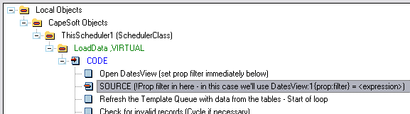
You'll need to check the DatesView name, as it is given a template
instance number (this will be evident by viewing the source).
2.10. The TIP string is not displaying the whole
TIP that I am setting it to. Why is this?
Answer: The TIP length has been set by eqTipLen
equate in the HotDates.inc file (about line 60 or so). You can increase
this if you wish (you will need to set this after every HotDates
re-install), but you need to bare in mind that as you increase it, this
will add 150x each byte to each WeeklyPlanner and DayScheduler row (as
there are 150 cells in each row). Currently, each cell consists of a
Description (50), icon (4), style (4), Tip (200) and ID (4) for a total of
262 bytes per cell (*150) = 39300 bytes per row.
2.11. My styles (in my legend) are all black - what
am I doing wrong?
Answer: Your colours are all 0 - otherwise you
may be using the colors file, without doing the lookup when HotDates is
populating the styles. Check
UseFul
Tip
10 for more details.
2.12. I want to retrieve the
legend record when the user clicks on it (to display more information).
Answer: This can be a little tricky as the style
ID may not correlate directly to a record in the table. Probably the
easiest would be to use the ExtraField in the StyleQueue queue and store
the extra info in this field when populating the legend queue.
In your application in the Filter Embed (on the Styles tab of your
HotDates control template) 'Before adding Styles to the palette', enter
the following:
self.styles.ExtraField = MyVarForExtraDetail
2.13. I need to put some code in
on a successful record update (insert, change or delete). Where must I
put this code?
Answer: The run method is used to call the
Update form used to update a record. In your run method, you will find a
call to the update form that handles the record change, what you want to
do is put code in (check for successful update first) after this call.
Typically the code generated in the template would look something like:
GlobalRequest = Request
UpdateTripLog
if GlobalResponse <> RequestCancelled then
self.reset(1)
end
You would place your handcode in the embed point immediately after this:
if GlobalResponse <> RequestCancelled then
case Request
of InsertRecord
!Do stuff here when a record is inserted (probably best to call a
routine or procedure)
of ChangeRecord
!Do stuff here when a record is changed
of DeleteRecord
!Do stuff here when a record is deleted
end
end
You will also need to put code into the TakeDropEvent method to handle
Paste and Drop of records. You need to do this in the 'HotDates - After
Saving record to dropped (or Paste) position' embed point (which is inside
the TakeDropEvent derived method). For example:
if pCopy
!Do the same stuff here as when a record is inserted
else
!Do the same stuff here as when a record is changed
end
2.14. My calendar takes a long
time to refresh - how do I optimize the time taken for the calendar to
load?
Answer: Optimization will vary from case to
case, but here are some guidelines:
If you have more than one calendar on a procedure, then copy the procedure
to another one, and remove all calendars except one, and repeat until you
find the calendar that takes the long time to load. If all the calendars
on the window are taking a long time, then you'll need to work on each
calendar, but work on each individual calendar one at a time, so you can
measure each optimization step.
One of the most likely causes is your view filter is not setup (correctly
or at all). This will especially affect SQL applications (but TPS as
well). In the HotDates calendar templates on the data tab, there are 2
Filter entries - the one for a client side filter "Filter:" and the other
for a Server side filter "View Filter". The client side filter filters
records after they are retrieved from the backend. This is useful for
additional filtering, but should not be your primary filter. The View
Filter sets the filter for the view (i.e. limits the records fetched from
the database). Any variables that are not used in the files in the view
must be bound (using the Bind Fields button). (You can also handcode the
filter - see below).
Once you've optimized the filer, the next most likely cause is you're not
filtering out unwanted styles. For each cell (of each calendar) - HotDates
needs to work out the top priority style to display in a particular cell,
and by allowing the user the flexibility to prioritize styles they want
to, this means that there's a lot of looping going on (relating to styles)
for each cell. Use the Filter Embed in the Styles tab of the hotDates
calendar template to filter out styles that aren't needed - and this will
make a dramatic difference to the load time of the calendar.
Another likely case for taking a long time to load is an inefficient view.
Take a look at the view structure that HotDates is generating for you.
DatesView:4 �
VIEW(Yearly_Alerts),ORDER('YAlerts:Alert_date,YAlerts:AnotherField')
JOIN(JOBvehicles:Key_ID,YAlerts:Vehicle_ID)
JOIN(CLI:Key_ID,YAlerts:Client_ID)
END
END
END
HotDates will attempt to use the date field to order the view by (as this
will 99% of the time be the most efficient way of fetching the data for
the calendar). If your data is in a TPS backend, then the best way to
optimize this is to make sure that the date component(s) used in the ORDER
statement are contained in a key in the table used in the View. So in the
above case the Yearly_Alerts table should have a key with the following
structure:
KeyAlertDate �
key(YAlerts:Alert_date,YAlerts:AnotherField),DUP
The key can have other components after the above two, but the key detail
is that the fields used in the ORDER statement of the view must appear in
order as the primary components of the ORDER statement.
Next thing is to place a handcoded filter statement just after the view
open so that only the records in the date range required are loaded (see
2.9. Can I use prop:filter on my HotDates views? for
more details on where to put this statement):
DatesView:1{prop:filter} = 'YAlerts:Alert_date
>= ' & self.firstdate & ' and YAlerts:Alert_date <= '
& self.lastdate
Note: Don't be tempted to use Clarion
commands in the filter statement (like inrange) - because these will be
very inefficient for SQL processing (if you decide to convert your
application to SQL at a later stage).
2.15. How do I distinguish
between a drop, copy and paste action?
Answer: The easiest way to check if the function
is a copy, check the pCopy flag in the TakeDropEvent or ValidPaste
methods. If it's set, then it's busy with a copy, otherwise it's either a
paste or a drop.
If you want to differentiate between Cut and Drop, then probably your
easiest, would be to check the pID as follows:
if len(pID) > 4
case pID[1:4]
of '[Cut'
!Cutting
of '[Cop'
!Copying
else
!Dropping
end
2.16. I wonder to perform a
function when the user clicks on a cell. Where's the best place to do
this?
Answer: The best place is in the derived
SetClickedInfo method after the parent call. This will have the correct
values for ClickID, ClickDate, etc.
2.17. My HotDateSettings aren't
being restored at app startup.
Answer: You are setting your datapath too late
in the Program Setup. You need to do this before the call to the
HotDatesGlobalSettings.init().
2.18. How do I reset my calendar
to a specific date on the fly?
Answer: For the MonthViewer and YearPlanner
classes you need to use the following:
ThisCalendar.ScrollToDate(DateToScrollTo)
For the DayScheduler use the following:
ThisCalendar.ChangeDateTo(DateToScrollTo)
where ThisCalendar is the name of the hotDates class, and DateToScrollTo
is the value of the date you want to reset to.
2.19. How do I keep the double-click drill
down/up, but disable the popup menu?
Answer: The easiest is to put a case/if-statement around
the popup menu addition in the embed code (this is in the ThisWindow.init
code):
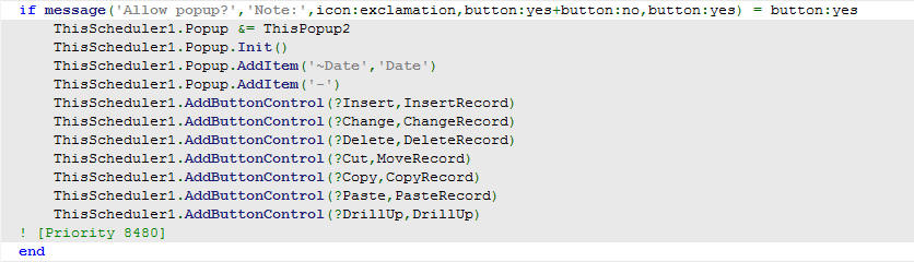 2.20. How do I get the date that
the user clicked on?
2.20. How do I get the date that
the user clicked on?
Answer: Use the property: ThisCalendar.clickdate
(This must only be used after the ThisHotDates.TakeEvent has been called)
3.1. I am not getting any data displayed in my calendar.
Answer: Check:
- That the tables that you are using are correctly setup in the Table
Schematic. If you look at the legdemo example app, you'll see that the
TripLog is the primary table (this has the dates in it) - and the
relating table (Vehicles) is a secondary table. The relationship
between the Dates (i.e. the TripLog) and the legend (i.e. the
Vehicles) is established through the table relationship of these 2
files. This relationship (i.e. between calendar dates and the legend)
must be established in order for it (the HotDates calendar) to work.
- That the tables do in fact have data in the date range that you are
viewing.
3.2. How do I display today's date
in the calendar?
Answer: First thing - where your styles are
added by the template (in the ThisYearx.PopulateLegend), add today's date
style (check AddStyle method in the docs for details):
self.AddStyle(253,'Today''s
Date',16711680,16777215,16777215,16711680)
Next - In the LoadData derived method (after generated code):
self.AddStyleToDate(Today(),253)
3.3. How do I scroll to a
particular date?
Answer: There's a method to do this:
ThisCalendar.ScrollToDate(<datetoscrollto>) �
!Where
datetoscrollto is the date to scroll to.
3.4. I want to control the
resizing of the legend and button controls. How do I do this?
Answer: On the Options tab of the HotDates Calendar
control template, check the 'HotDates must not resize the Legend'. Now in
the window editor, resize the Calendar Group control to just include the
calendar controls.
3.5. How do I call a PrintPreviewer when printing
my calendar?
Answer: Create your previewer procedure. It must receive
a PrintPreviewFileQueue type for the first parameter and a Report type for
the second parameter. It must return 1 to print the report, and 0 to
cancel. In your calendar procedure, select the Print Previewer procedure
on the options tab of the HotDates calendar template.
3.6. How do I drilldown on
double-click?
Answer: You need to set your drill down
procedure in the Calendar template (on the Options tab), and check the
"Double-click to Drill down" checkbox.
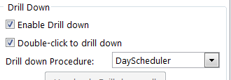
You must also add the Calendar Update Controls to the window (hide the
buttons and disable the edit options if no editing is required).
3.7. How do I trap a click
on the calendar to refresh some data?
On the TakeNewSelection method (after the parent call), you can enter your
code to populate the data:
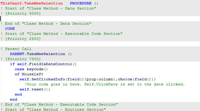 4.1. My update is not selecting the correct record.
Answer: You probably have not enough fields in
your key to ensure that HotDates selects the correct record. For example:
if your key does not have a time related component and you have 2 fields
for the same day (in the same column), then HotDates will always pick the
one record. The key is to have a unique key in the table used for the cell
data so that HotDates can make sure that the correct record is fetched
from the file.
4.2. I would like to add a total column. How do I do
this?
Answer: Simply go to your Data tab on your
Scheduler control template's prompts, and check the
Add
a totaling (Counter) column checkbox (not available yet).
4.3. How do I sort the order of
the columns?
Answer: The headers are populated from the
Header table. Whichever key you use will determine the order in which the
columns are sorted. Columns are not dynamically sortable at this stage.
4.4. When the number of records
(used for the column headers) changes, the number of columns does not
increase.
Answer: You're using ThisWindow.reset instead of
ThisWindow.Reset(1) when resetting the calendar (i.e. applying the dynamic
filter for the data for the column headers).
4.5. I want a AllDayEvent field
(so that I don't need to stipulate time for certain events). How do I
implement this?
Answer: In the Data tab (of the DayScheduler
template) - you will find a 'Filter Embed' which takes you to the LoadData
method. Between the 'Check for invalid records' and the 'Adding data to
the Template Queue' embed points, put the following source:
if
PRE:AllDayFieldYN='Y'
DatesQueue:1.Start1 = 1
DatesQueue:1.End1 = 8640000
end
You're basically forcing the start and end times before inserting into the
template queue.
4.6. How do I display info
pertaining to the clicked record on the window?
Answer: This is demonstrated in the example
abcdemo application. Normally you'd want to display a field from the
specific table, or else get a record from a relating table and display a
field from that. In the DayScheduler's derived TakeEvent method (after the
parent call), put the following:
if self.FieldIsDateControl()
DisplayString = ''
if self.Update(self.clickdate) = 0
DisplayString = TRI:TripNotes !Put code in here to fetch other
table's records if required.
end
display(?DisplayString)
end
4.7. The time block finishes at
12:00 - but does not show the 12:00-12:30 time block included in the
display range.
Answer: Normally, if you have an appointment
from 11:30 to 12:00 (with the DayScheduler set to display 30 minute
blocks) - you would only want to show 1 block - i.e. 11:30: 11:59:59. This
is because your next block starts at 12:00 for the next half hour block.
If you would like it to include the subsequent block when displaying the
appointment, then you can simply check the
Include the
end time block in the display checkbox in the DayScheduler
template (on the
Data (Time) tab).
4.8. Only 50bytes of my data is
displayed in each cell. How do I increase this?
Answer: The queue field (used in the
planner/scheduler to display the cell data) is 50 bytes long, you can
change this in the
clarion\accessory\libsrc\win\HotDates.inc
file as follows:
eqDataStringLen equate(50) ---> change to 255
(or whatever your require)
This will increase your queue size quite dramatically (150 cells in a row,
so that's 150x205Bytes per row increase) - so you need to be aware of the
knock on the memory usage.
4.9. The names of the months are
not translated in the DayScheduler.
Answer: That's because the datepicture is using
@d18 - your windows default date picture, and your language (Windows
setting) is set to English. You can change this picture in the template
(Headers tab, Date Format (in Header)) - or set your computer's default
language to your language.
4.10 How do I get the record of
the cell that I click on?
Answer: The dayscheduler and weekplanner use 2
queues for the data - one to display on the list itself, and the other to
store the necessary data required by the list. Each cell has the data
required for that cell (tip, text, styling, etc) and an ID. The ID is a
pointer to the data queue which contains all the field values required for
that cell. So basically, when you get a drag/drop/click, then you use the
self.ClickID to get the row that matches that cell from the dataqueue.
Here's from the example (in the update method):
ThisScheduler1.Update PROCEDURE (Long p_d)
ReturnValue Long
CODE
ReturnValue = PARENT.Update (p_d)
get(DatesQueue:1,self.ClickID)
if ~errorcode()
TRI:ID = DatesQueue:1.TRI:ID
self.UpdateID = TRI:ID
return access:TripLog.fetch(TRI:KeyID)
end
self.clickID will have the ID loaded of the record on event:accepted,
drag, drop and selected. If there are other events that you are trying to
get the record ID then you will need to load the ClickID from the list
queue.
4.11 How do I fix the column widths to a
specific value?
Answer: You need to code the following at the end of the
ThisWindow.init method:
ThisScheduler.RootWidth = <YourColumnwidth>
ThisScheduler.ZoomChanged(0)
You might also want to disable/hide the zoom in and zoom out buttons.
4.12 How do I post a double-click event from
the calendar to a control?
Answer: In the Scheduler template's prompts (on the options
tab), you must set the control to receive the event:
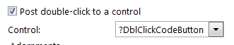
You can use the clickdate, and clicktime properties to post to your
routine. Upon returning from the procedure, you can use the
ThisScheduler.refresh(1) to force a refresh if your routine changes data.
You must also add the Calendar Update Controls to the window (hide the
buttons and disable the edit options if no editing is required).
4.14 If I go to the form
from the scheduler and change the date of the calendar item there, how
do I change to the new date of the item after closing the form?
Answer: In your form, return the change date variable, and then
in the calendar, immediately after calling the form (if returns with
requestcompleted), check if the date has changed, reload the data, and
then reset the calendar:
If NewStartDate <> pStartDate !NewStartDate is the date returned
from the form.
pStartDate = NewStartDate
ThisScheduler6.LoadData()
ThisScheduler6.ChangeDateTo(NewStartDate)
End
ThisScheduler6.reset(1)
5.1. How do I sort my child (or row data) into a better
order?
Answer: You can set this up in the
control
template to be ordered in the way that you would like.
5.2. My window takes a long time to load. Can I make it
quicker?
Answer: HotDates makes use of a view to load the
data into a queue which is used to populate the data into the Planner
queue. The view can be quite an inefficient way of reading data from a
file.
- First - if you have Replicate added to this application, then
turning off Replicate during the LoadData method will make a
significant impact on loading time. You can do this in your HotDates
control template's Options tab.
- If you don't have Replicate added, or you are still not satisfied
with the speed that your calendar loads, check that you don't have a
filecallback on any of your tables used in the calendar template's
tables (this could be a 3rdparty template).
- You can optimise the way the data is read in a couple of easy steps
- provided that your child files have a Date component in a Key with
the relating parent fields in it.
- Limit your tables (in the HotDates Planner view) to one.
- Manually add the necessary fields into the template created
queue (see the Planner
Template - Queue Tab). These should include the child fields
used for display data, icons and styles, as well as fields that
link the child to the parent. According to the example code below,
the DAT:Date and DAT:ID will need to be added to the template
generated queue fields.
- In your Planner
Template - Queue Tab select to sort row data by 'Other'.
- Now create a loop for each child table inside the view loop by
adding the following (example) code below the Local Objects |
CapeSoft Objects | ThisPlan1 | LoadData | CODE | Refresh the
template Queue with data from the tables - Start of loop embed
point:
DAT:Date = self.FirstDate
DAT:SalesmanID = SAL:ID
set(DAT:SalesmanIDKey,DAT:SalesmanIDKey)
loop until access:Data.next()
if (SAL:ID <> DAT:SalesmanID) or |
NOT (inrange(DAT:Date,self.FirstDate,self.LastDate))
break
end
- To end the loop, and create the sort order, place the following
(example) code in the CapeSoft HotDates: x | Manual Sorting embed:
end
sort(DatesQueue:1,DatesQueue:1.SAL:Firstname,DatesQueue:1.SAL:Lastname
,DatesQueue:1.DAT:Date,DatesQueue:1.DAT:ID,DatesQueue:1.Style)
- This is not built into the DayScheduler template (yet). You can
override the LoadData method manually if you like (i.e. put your
queue population code loop in before the template generated one
and then return before the template generated code). You'll need
to code the loop as above, without using the view (which in some
cases is the time costly aspect of the loop).
5.3. I cannot get more than about 150 cells per
row - is there a limit?
Answer: There is a limit of 150 cells per
row. Each cell requires 262 bytes (the description, icon, style, ID
and Tip fields) - this means that each row is 39Kbytes of RAM. This is
fine for a handful of rows but for a couple of thousand, this can head
towards a chunk of memory usage. We've tried to reach a compromise
between those using lots of rows, and those using lots of cells.
5.4. Is that
possible for me to fix the date’s header width in a planner?
Answer: You need to set the following
properties before (or in fact you could derive the init method and
place it in there) the Hotdates.Init method.
ThisCalendar.ZoomSteps = 1
ThisCalendar.MinColWidth = 20
5.5. How can I restrict the
header to only display one row (of date header details)?
Answer: you need to code the following
around the parent call to the GetColumnHeader method:
if p_Row = 1 then
MySavedRows = self.rows
self.rows = 1
! Parent Call
ReturnValue = PARENT.GetColumnHeader (p_Col,p_Row)
! [Priority 6000]
self.rows = MySavedRows
end
6.1. How do I print out my
Monthviewer?
Answer: In versions prior to 1.29 printing
out was not support in the MonthViewer, so you need to either:
- delete the MonthViewer control template (please make a note of
all your template settings so that you can re-apply them
correctly), quit and save - and then add the MonthViewer template
back onto your window again. This will include the Print button.
- OR -
- add a button to the window, and then in your source just before
the ThisMonthViewerx.Init call enter the following code:
ThisMonthViewerx.PrintControl =
?MyPrintButton
6.2.
How
do I make my dates more prominent?
Answer: This is a setting on the Control
Template of the MonthViewer. On the Options tab, in the Date Indicator
group you can change the color, proportional size, and orientation of
the date indicator string to suit your needs. The date indicator
string is a string control that floats on top of the list box control.
When the listbox is selected (i.e. scrolling, etc.) the listbox will
have the focus and will swap to the front of the string control -
thereby making the date invisible during the scrolling.
6.3. How do I get the table
record of the item in the Queue that I've clicked on?
Answer: You need to use the
ThisMonthViewer.Update method (check the template code to see what it
puts in the derived method). It basically fetches the data from the
queue and fetches the respective records from the queue of the day
that was last clicked on. You must have populated the
MonthViewerUpdate control template as well in order for the derived
code to be placed in the procedure.
6.4. How do I make the font
smaller when printing out the calendar?
Answer: Printing the calendar makes use of
the styles queue to obtain the font attributes (style, color, size,
etc). You could alter these on the way into the PrintNow method (i.e.
before the parent call) - and then reset them on the way out (i.e.
after the parent call).
In your LocalData, add an array to store the fontsizes:
YourStyleArrayToStoreOriginalStyleSizes long,dim[255]
In your MonthClass.PrintNow method (before the parent call):
loop x = 1 to 255
get(self.style,x)
if errorcode() then break .
YourStyleArrayToStoreOriginalStyleSizes[x] = self.styles.FontSize
self.styles.FontSize = 4 (or whatever)
put(self.style)
end
In your MonthClass.PrintNow method (after the parent call):
loop x = 1 to 255
get(self.style,x)
if errorcode() then break .
self.styles.FontSize = YourStyleArrayToStoreOriginalStyleSizes[x]
put(self.style)
end
Compile
and Trappable Runtime Errors associates with HotDates
This is a warning of a bug in Clarion6.1 (some versions) where the
relate:file.open does not open all the files in a relationship.
This causes your data not to be displayed because the view cannot
be opened. You can solve this by adding the tables to the Other
Tables branch in the tables tree on your window where you have
added the HotDates control template.
You probably have a multi-DLL application. This error indicates
that you have 2 DatePicker procedures in your data-DLL, which both
have the same external name and are both exported. In your
data-DLL application, delete the DatePicker procedure that you
don't require. HotDates ships with 2 DatePicker windows (depending
on your preference) - in a single application, the two can live
happily side-by-side - the one unused. It's only a problem in a
Multi-DLL application because both have the same external name.
You have a multi-DLL application that is requiring the use of the
DatePicker. You DatePicker name (set in the global extension
template) does not match the name of that in the Data-DLL. This
must match the exported name (not the physical procedure name) in
your Data-DLL.
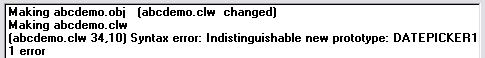
You have a multi-DLL application that is requiring the use of the
DatePicker - but you have Multi-Proj and HotDates added to this
application. Both are creating the map to the external DatePicker
procedure, so you need to set the Dont
automatically map to the external DatePicker checkbox in
the HotDates Global Extension template.- Missing Procedure Definition:
SetGlobalSetting(HotDatesGlobalSettings,String,?)
If you have a multi-DLL application, then you're probably missing
the compile directives ABCDLLMODE and ABCLINKMODE in one of your
DLLs.
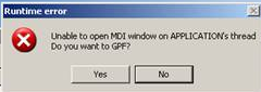
This is not a HotDates error per se, but can occur in one of your
HotDates windows if it does not have the MDI-child attribute
turned on.
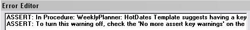
The WeeklyPlanner template will extract your data much more
efficiently if you have a key that has the date field as the first
component in that key. You can turn this assert off in the
HotDates extension template in the procedure indicated, but it's
better to add a key to your dates table (it does not have to be
unique) that contains the date field as the first component.
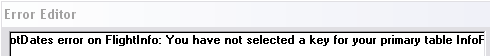
You have not selected a key in the Table tree on the Procedure
where the YearCalendar exists. For example:
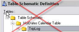
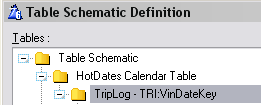
License & Copyright
This template is copyright © 2013 by CapeSoft
Software. None of the included files may be distributed. Your programs
which use HotDates can be distributed without any HotDates royalties.
This product is provided as-is. Use it entirely at your own risk. Use of
this product implies your acceptance of this, along with the recognition
of copyright stated above. In no way will CapeSoft Software, their
employees or affiliates be liable in any way for any damages or business
losses you may incur as a direct or indirect result of using this product.
Source Code Policy
We have chosen to ship HotDates as source code, rather than as a compiled
DLL. This makes it much easier for you to modify, but it also makes it
much easier for you to pirate. We ask you to please consider the effort
involved in writing this product, before you choose to hand it on to any
other developers.
If you received this program illegally (i.e. if you didn't pay for it, or
you didn't buy it from CapeSoft, ClarionShop, or one of their respective
dealers) then we ask you to contact us so that we can remedy this
situation. Without the revenue generated from products such as this it is
impossible for us to create new products.
This next bit is optional - and is included for the benefit of programmers
wishing to inspect, or alter, the HotDates object.
We welcome any suggestions from users regarding new features that might be
added to HotDates.
| CapeSoft Support |
| Email |
 |
| Telephone |
+27 87 828 0123 |
| Fax |
+27 21 715 2535 |
| Post |
PO Box 511, Plumstead, 7801, Cape Town, South Africa |
HotDates may be purchased from:
| CapeSoft Sales |
| Web |
www.capesoft.com
|
| Email |
 |
| Telephone |
+27 87 828 0123 |
| Fax |
+27 21 715 2535 |
| Post |
PO Box 511, Plumstead, 7801, Cape Town, South Africa |
Installation
Run the supplied installation file.
What the Users are saying about
HotDates
Henry Manney (in a email on 6 December 2004)
This product is awesome - I have
integrated it with a Task scheduler and it is phenomenal.
In an email 15 March 2005 (Annon.)
HotDates seems to me the product that is most likely to become the next
killer accessory from CapeSoft. Lot's of stuff is cool, but this is indeed
useful too. I've been looking forward make a weekly planner for quite some
time now, but never really had room in my schedule. With HotDates combined
with InMemory driver and a little handcode I now have a plan showing all
employees and other resources, their notes, plans, and time registrations,
including update functionality. All in one window, complete overview in
one look. The templates are close to self explanatory and as usual the
docs wipe out any confusion. Keep OOP the good work!
Version History
Download latest version
here
Version 2.01 : Released 24 May 2021
Version 2.00 : Released 8 September 2020
- Change: The property DrawClass was renamed to Draw. The property
type changed from Draw to DrawClass to be compatible with Draw version
4.22 (to be compatible with Clarion 11.0.13622)
- Change: Conditional compile changed from _DrawIsHere_ to just _DRAW_
Version 1.99 : Released 17 March 2020
- Fix: Allow DayScheduler, WeeklyPlanner and MonthViewer update
templates to include the Editing Options on the options tab.
- Global Extension template: Use HScroll to scroll between tabs.
- Fix to allow non-numeric styles (auto add style number to them).
Version 1.98 : Released 18 Sept 2018
- Add: Clarion 11 to install.
Version 1.97 : Released 16 March 2016
- Update: Utility template to import Settings procedures now supported
in Legacy apps.
Version 1.96 : Released 7 February 2016
- Fix: All Calendars created with Hot Dates GPF on opening the window
in C10 IDE later than 10.0.11897
Version 1.95 : Released 25 February 2015
- Clarion 10 install
- Fix for multi-date selection when fromdate is after todate.
- Fix for dropping. Was not comparing multi-select correctly for
dropping. Also provides a template override if check must not occur.
Fix for Deleting - in case we want to delete the record if there is
one that already exists, but we're copying a range that contains a
blank.
- Check if numeric style addition outside range of 1-255 (style IDs)
and cater if necessary.
- RemoveStyleFromDate method (where YearCal has multiple styles on the
same date.
YearCalendar and WeeklyPlanner templates - additional embed points in
the Drag And Drop - SetUpdateID method.
Version 1.94 : Released 16 January 2014
- Fixed regression in 1.86 - increasing and decreasing start/end time
and duration in the DayScheduler was not working. Add
Object.ResetRows=1 when requiring the rows to reset.
- LegendOrder byte increased to 1024 (was 256). It is theoretically
possible to have multiple legends use the same style (of which there
are 256).
Version 1.93 : Released 21 October 2013
- Feature - ability to post double-click to the drill down procedure
(requires addition of the Calendar Updates control template to work).
- DayScheduler feature - ability to post a double-click on the
calendar to a control.
Version 1.92 : Released 10 October 2013
Version 1.91 : Released 7 October 2013
- Style Tab: Use the HotDates Colors Table - checkbox to use the
styles from the HotDates colors table. You must still add the colors
table to the Other tables when utilizing this feature.
- Update control template: If a key must be selected for the updated
table, then the key drop list must be displayed.
- Update control template - PrimeFields for copy also - check to prime
this variable for a copy as well as an insert.
- Class fix - for styles where stylenumber is a string and is blank.
- Defaults time picture in the DayScheduler to '@t4'
- Day Scheduler Template change - does not generate Column Header data
equate if template prompt is left blank (to set the column header
data).
- Day Scheduler and YearCalednar Template change - improved control
template size (for calendar placement).
- Template buttons to import the DatePicker and HotDates settings
windows.
- Global template option to set the HotDates colours fields for use as
defaults in the local templates.
Version 1.90 Gold: Released 30 May 2013
- Update: Updated integration to Cape Template to 4.04 level. Fixes
problem with global object in Legacy programs.
Version 1.89 Gold: Released 2 May 2013
- Fix for Clarion 9 - drag and drop (regression introduced in 1.87)
Version 1.88 Gold: Released 2 May 2013
- Clarion 9 compatible build
- Fixed regression from 1.87: Removed name attribute from various
template embed point code (was not generating embed code in the
correct embed points)
Version 1.87 Gold: Released 14 March 2013
- Changed to Ver4 object/template management system. IMPORTANT
READ
THIS.
- Add: support for Multi-Proj in C8
Version 1.86 Gold: Released 4 January 2013
- DateClass fixes - legendorder field for the legend queue;
SetClickedHistory (TakeDragEvent method) only set after first clickrow
set; SetDropID fix - longupdateID cleared on drop; RefreshEvent only
posted if drop thread is different to drag thread (was refreshing
twice); TakeAccepted - SetUpdateID for LongUpdateID if necessary; use
LongUpdateID in PasteControl (set UpdateID if still old short UpdateID
is used in code).
- DateClass and PlannerClass new method ResetFromLegend - creates a
slightly different way of refreshing if it's the plannerclass.
- DateClass new methods - SetUpdateID allows a derived method to place
code just prior to calling the form; ExtractUpdateIDValue sets the
LongUpdateID; ChangeUpdateIDHex - decodes or encodes the updateID to
hex (uses new methods AsciiToHex, HexToAscii).
- CellsClass new methods - GetID and GetTip: A method to
programmatically get the ID/tip of a particular cell; FreePlanQ frees
and clears the planQ; LoadACell - loads the details for a particular
cell (if only one cell must be loaded); ClearCells - replaces clear()
with an intelligent clear ensuring each property is set to either 0 or
''.
- CellsClass.Reset method optimized - Only free planq and resetstyles
when ResetRows is set, only setHeaders when firstdate changes.
- YearClass.Resize method - improved support for column width
resizing when windows are resized.
- PlannerClass.AddDateToSelected method - work around for GPF when
array pointer goes out of bounds.
PlannerQueue - 4 Description fields added for user storage, and
lastrow flag (for a total).
- Template change - Don't automatically Declare the view switch allows
you to declare the view used to populate the calendars.
- Template fixes - use equate for ID separator (rather than constant);
TakeDropEvent generated code changes
Version 1.85 Gold: Released 17 November 2010
- TPL Change - include dates01.tpw 1.68 - work-around for duplicate
external errors in C7 (for the methods with the NAME attribute
declared in the global module).
- TPL change - set control positions to relative in the DatePicker
control template.
Version 1.84 Gold: Released 9 November 2010
- TPL Change - include Object01.tpw 1.67 - fix regression in some apps
the global class procedures were not being generated.
Version 1.83 Gold: Released 9 September 2010
- Translation method implemented.
- TPL Change - include Object01.tpw 1.66
- TPL regression fix (from 1.82) - Uses a copy of %GlobalUseABCClasess
(for C55 support).
Version 1.82 Gold: Released 3 September 2010
- TPL Change - include Object01.tpw 1.65
- TPL change - enable use of Popup class in legacy (for popups on the
calendar - only C6 and up).
Version 1.81 Gold: Released 31 August 2010
- TPL fix - Create filter based on date was filtering out columns in
the DayScheduler (regression in 1.80)
- TPL fix - TPL generated DatePicker map was incorrect prototype.
Version 1.80 Gold: Released 16 August 2010
- Class change (YearCal) - Optimized SetStyle method. Calls
AddStyleToDate and SetStyleToDates methods.
- Class Change (CellsClass) - first time in (for no zoom) then use the
mincolwidth.
- Class Change (CellsClass) - Allow Left Column to be justified
independently.
- Class Change (DateClass) - SQ static queue changed to property
StyleMaps queue. Maps a style to a number.
- Class Change (DateClass) - Icon is also clickable.
- Class Change (DateClass) - CallCalendarPopup method allows the
CalendarPopup to be overridden at runtime.
- Class change (YearCal) - Resize of legend control can be overridden
and handled separately.
- Class change (YearCal) - SetStyleToDates allows a style to be set to
a date range (rather than one date/style at a time).
- Class change (YearCal) - ValidPaste - allows derived code to
override a Valid Paste (with some other condition).
- Template change - Popup menu has finer control (of what items to add
to the popup).
- Template change - ViewFilter prompt allows a server side filter to
be used before the Set(View) (and a Bind Fields button enables fields
used in the filter to be bound). The date range required is added to
the view filter automatically.
- Template fix - DateDuration - the duration was not set correctly
when editing.
- Template fix - support case insensitive order in the view.
- Template control - LegendFilter - allows a legend to be placed on a
browse for dynamic browse filtering.
Version 1.79 Gold: Released 24 May 2010
- Class change - call SetEditButtonStates in Reset method (means that
SetEditButtonStates are called on procedure start up for MonthViewer,
WeeklyPlanner, and DayScheduler).
- Class change - NoHScroll property in the CellsClass allows the
WeeklyPlanner and the DayScheduler to not scroll (if set)
- Clarion7 fix - Stylequeue and LegendQueue (HotDates Queue equates)
renamed to HDStyleQueue and HDLegendQueue for Clarion 7 lib local
compatibility with other 3rdparty products.
Version 1.78 Gold: Released 31 August 2009
- Class change - if only one zoom step is used, use the rootwidth.
- Date Planner Class change - set leftcolumnwidth to -1 to use a 0
width (i.e. hide the left column).
- Date Planner Template change - option to hide the left column.
- Template change - totaling uses the same code for the StoredAs date
as the stored as FromDate-ToDate.
Version 1.77 Gold: Released 20 April 2009
- Fix - regression in 1.76 causing syntax error.
Version 1.76 Gold: Released 17 April 2009
- Templates - change the embed points inserted to use the
activatetemplateparent (for the updatecalendar templates) rather than
the object name (to test where to put the code). More accurate. This
will not affect handcode as the embed points are not moved.
- Year template fix - use %Object rather than the compile time
#declared %o variable to call the print.headertext.
- Object - new ScrollToDate method (for MonthViewer, YearClass, and
DayScheduler). Allows you to programmatically scroll direct to a
particular day. Omit the date to scroll to today().
Version 1.75 Gold: Released 13 January 2009
- MonthViewer Template - change the priority of the init to before the
ABC Resize stuff. This prevents a GPF when used in conjunction with
the ABC resize template
Version 1.74 Gold: Released November 10, 2008
- Clarion 7 compatible install.
Version 1.73 Gold: Released September 23, 2008
- Template change - was not displaying a 0 time-range correctly in the
Scheduler.
Version 1.72 Gold: Released September 20, 2008
- Template change - returns the correct prototype (interference by
xFiles, etc).
Version 1.70 Gold: Released November 21, 2006
- Extra embed point after the LoadData loop (and before sorting the
template queue) for adding additional entries into the list.
- String header lengths use an equate (making it easy to change).
- Refresh ClickTime if the user clicks on the left column of the
DayScheduler.
- Reformatted template prompts to fit in the window when viewed on a
control's properties.
- DayScheduler - SQL requires an ID field to link the data in the
calendar back to the SQL tables (cannot use the pointer() function
used in flat files).
Version 1.69 Gold: Released November 8, 2006
- Fix - When DayScheduler is set to Date Stored As (Date) and Time
Stored as (FromTime-ToTime) - then a compile error was introduced,
because the ToDate was being used for valid time checking.
- Fix - increase Item picture used in the MonthViewer list to the size
of the DayList item.
- Feature - added extra field to StyleQueue for reference purposes.
Version 1.68 Gold: Released August 1 , 2006
- Fix - When DayScheduler should increase cols, stays fixed at the
reduced number (decrementing was working fine).
Version 1.67 Gold: Released July 28 , 2006
- Fix - flash in DatePicker when it opens (in different position) -
moved init call to after restore from INI.
Version 1.66 Gold: Released July 24 , 2006
- Fix - date display of today in MonthViewer.
- Feature - styles added in key order will initialize in the order
added to the Legend queue. Existing applications require the 'Sort
styles in Key order' checkbox checked in order to utilise this
feature.
- Fix - button tips on the MothViewer's legend prioritization buttons.
Version 1.65 Gold: Released July 5 , 2006
- Fix - regression in 1.64 (no data was displayed - because methods
were not being populated).
Version 1.64 Gold: Released June 30 , 2006
- Fix - legacy was duplicating function declarations (tweak to
Object01.tpw - was not doing a case insensitive methodIDs check)
Version 1.63 Gold: Released June 22 , 2006
- Feature - implemented HotDates Settings table into the template.
This means using the HotDates Settings table is much easier. No
handcoding required. (check out Using the HotDatesSettingsTable (to
store multiple sets of Translation and other global settings))
Version 1.62 Gold: Released June 5 , 2006
- New Dates01.tpw (sub template version 1.51) - fix for interference
with other templates (using the Object01.tpw template)
- In YearCalendar template - assert if no style is entered in the
template.
Version 1.61 Gold: Released May 29 , 2006
- Fixed regression in 1.60 - prime the DragIDs with 'UniqueDragID'
instead of UniqueDragID (without the quotes).
Version 1.60 Gold: Released May 22 , 2006
- Template font - removed template font so that PCs with clear-type
fonts disabled will display the settings correctly.
- Planner Template - prime the Loc:StartDate with the passed startdate
- Update Templates - prime the DragID so that Drag-Drop, and
Cut|Copy|Paste is supported by default.
Version 1.59 Gold: Released March 22 , 2006
- Fix - when using a different FirstDayOfWeek, selected days were not
being highlighted correctly.
Version 1.58 Gold: Released January , 2006
- Feature - DayScheduler, allows Date Header format (new property
HeaderFormat, and setting in the template).
Version 1.57 Gold: Released December 9, 2005
- Fix - WeeklyPlanner when no Update used - was not declaring some
fields in the template queue in some circumstances.
- Fix - DatePicker Lookup - when no default required was causing
compile errors.
Version 1.56 Gold: Released December 7, 2005
- Fix - Legend: when Save and Restore is unchecked, and Use checkbox
to select is checked, the queue was not being populated correctly.
Version 1.55 Gold: Released November 3, 2005
- Fix - For multiple calendars on the same window, selection of the
correct calendar after drag and drop was not functioning correctly.
- Change - assert warning if no key is set for the primary file
(YearCalendar).
- Feature (MonthClass) - new property TodaysImageColor property -
allows highlighting of today's date in the Month Viewer Control
Template.
- Change - Update method (in the CellsClass) returns a 1 - assumes it
can't find the record, and template code must find the record and
clear it if there is no error - rather than the other way 'round.
Version 1.54 Gold: Released October 19, 2005
- Fix - Date-Duration in Month, and Year control templates. DataRange
uses Duration instead of EndDate.
- Fix - When Date-Duration is selected, then style, icon, etc.
template prompts are displayed.
- Fix - Read EnableDrillDown checkbox to determine whether DrillDown
is required (instead of DrillDownProcedure value). Similarly with
EnableDrillUp.
Version 1.53 Gold: Released October 6, 2005
- Feature - Allows QuickEdit of records (without having to go to the
form) (New method: CanQuickEdit)
- Fix - Allow icons to be set in the Planner.
- Fix - Allows the calendars to be locally and globally disabled.
- Fix - When Date Duration is set (for data display), then Last date
is Date + Duration, not Date + LastDate.
- Feature - embed points after ValidPaste.
Version 1.52 Gold: Released August 23, 2005
NB: You will need to re-import the DatePicker
windows (using the ImportHotDatesDatePicker Template utility)
- Feature - New LocatorEntry control template (for date locators for
browses/lists).
- Feature - DatePickerLookup class - allows associated lookup button
for entry control.
- Feature - DateLookups allow global Decrement and Increment (Day,
Month, Year) hotkeys.
- Feature - DateLocator and DateEntry controls have TestNewValue to
allow range limiting.
- Feature - Drag-and-Drop range select (mouse only range selection).
- Fix - UpdateID cleared on a successful drop event (allows
Drag-and-Drop range selection).
- Feature - Globally setable Zoom keys (as apposed to fixed minus and
plus keys).
- Feature - DatePicker has extra two parameters to allow range
limiting (also colorization options in the template).
- Feature - DatePicker has an additional style for Today (if passed
date is not the same as Todate) - setup in the template.
- Fix - DatePicker list is resized after window opening (so line
spacing is improved).
- Fix - legacy MonthViewer and YearCalendar resized (when window is
resized).
- Fix - DatePicker year is correctly wrapped when month is
incremented.
- Fix - Scrolling is initialized at 4 if 0 (prevents incorrect date
comparisons of 0 from dates)
- New methods (DatePicker class) - HandleNewYearValue and
HandleNewMonthValue (code was duplicated in 2 methods).
Version 1.51 Gold: Released August 10, 2005
- Fix - allow drag to time - where EndTime = StartTime of next entry.
- Fix - EndTime = round-off time (in range selection) as apposed to
15:59:59
- Change - In DayScheduler: TimeDuration includes the duration of the
last cell (checked by default)
- Fix - WeeklyPlanner - If cells are ordered by display data, then
test whether style is active in legendbox.
Version 1.50 Gold: Released August 5, 2005
- Feature - Allow justification of column headers (DayScheduler and
WeeklyPlanner).
- Template change - Embed point in LoadData derived code to allow
prop:filter on the VIEW.
- Feature - Greenbarring in Planner and Schedulers (only use Underline
if Greenbar not required).
- Feature - grid color set.
- Feature - Line height setting for Legend lists and Planner and
DayScheduler controls.
- Feature - generate equate for switching compile-mode for HotDates
specific handcode.
- Feature - new template utility to easily add the Colors and Settings
procedures to your application. This is accompanied by the TXD file
with the Colors and Settings table declarations which you can import
into your dictionary.
- Feature - Set default keys to appropriate buttons (CtrlX to Cut,
CtrlC to Copy, CtrlV to Paste, Plus Key to Zoom, Minus Key to zoom
out, etc.)
- Feature - included a Hand cursor - added to region control (of
DayScheduler) and the DatePicker list.
Version 1.38 Beta: Released July 28, 2005
- Change - Inform on template that icons are required in order to use
Cell Tips in the Scheduler and Planner templates.
- Change - Provide Embedbutton on the options tab for validate paste
functionality.
- Fix - DatePicker (where drop list is used for month selection) -
scrolling without selecting was not refreshing the month displayed.
Version 1.37 Beta: Released July 27, 2005
- Feature - ValidPaste method
- Change - Reset moved from template derived code to class in
TakeDropEvent method.
- Change - FromClickID set in the .Update method for dragging
internally (Planner and Scheduler) (and reset in the .reset method).
- Fix - GetStyle was treating passed parameters as variables (Planner
and Scheduler)
- Feature - YearClass validatestyle changed to allow checking of style
irrespective of legend.
- Fix - Planner and Scheduler list longs correctly cleared in the
LoadPlan method.
- Feature - check in range methods to allow data validation for
dropping\pasting (in order to make use of this feature, you need to
handcode a ValidatePaste routine).
- New properties - ClickRow and ClickColumn for use across methods for
validPaste.
- Fix - DayScheduler - when dragging a record spanning midnight -
adjust EndDate and EndTime values accordingly.
Version 1.36 Beta: Released July 22, 2005
- Feature - Use an ID for Cut|Copy|Paste to ensure that only valid
info is pasted onto a recipient control.
- Fix - resolved Unknown %EnableDrillDown template variable error.
- Feature - allows omission of Year from Date info in 1 to 12 month
calendar and MonthViewer (useful for Birthday's and public holidays,
etc.). This means that the LoadData method derived code (from the
template) was altered quite a bit.
- Fix - TakeDrop derived code where Date-type data storage is not
FromDate-ToDate.
- Fix - more embeds provided in the TakeDrop derived code.
- Fix - DrillDown control deleted from the DayScheduler.
- Fix - For a Multi-DLL application - DayScheduler uses the correct
DatePicker procedure name (specified in the Global Extension
template).
Version 1.35 Beta: Released July 20, 2005
- Feature to DayScheduler\WeeklyPlanner\MonthViewer\YearCalendar -
supports drag and drop (internally and across windows).
- Fix - ClickDate was not being set correctly when day changed in
DayScheduler.
- Feature to DayScheduler\WeeklyPlanner\MonthViewer\YearCalendar -
supports Cut/Copy/Paste (note that you will need to delete your
Calendar_Update template and add it in again to support this
functionality - make a note of your settings before you do this).
- Warn if DatePicker incorrectly prototyped (DayScheduler).
- YrCalendar - make update fields the same format to the other
calendars.
- Ability to set HotDates refresh event globally (particularly useful
in Drag and Drop and Cut/Copy/Paste operations) - which allows a
parent calendar to be refreshed once an operation is performed on
another calendar.
Version 1.34 Beta: Released July 6, 2005
- Fix for DayPicker - when a spinbox is used to select the month, and
jump to today, then reset the month in the spinbox control.
- Updated Demo.
- Fix for Year Calendar - resets correctly (VIEW opened and closed in
LoadData method).
- Tips for control template controls.
- Fix for templates - auto reset after drill down\up in order to
refresh the calendar with changes made in drill down\up procedures.
- Fix - if no Region control in the DayScheduler, then don't set the
tip.
Version 1.33 Beta: Released July 5, 2005
- Fix - when a day other than Sunday is the first day of the week,
then in the YearCalendar the update buttons were not correctly
enabled/disabled, and the Record was not correctly selected.
- Updated examples and demo.
- Fix - when using filters in the DayScheduler for limiting the number
of columns.
- Fix - WeeklyPlanner passes on the correct startdate (to drill
down/up) if no cell is selected before drilling.
Version 1.32 Beta: Released July 1, 2005
- Prevents GPF when cells in a row is > MaxP (at this stage MaxP is
150) (limits columns to MaxP/cells in row).
- Supports Replicate disabling during data reset (this speeds up the
loading process significantly).
- Improved DatePicker's today button - keeps Today text and returns
today if today's date (i.e. current month and year) is displayed.
- Enhances Multi-Proj support by not mapping the DatePicker procedure
in non-Data DLL applications.
Version 1.31 Beta: Released June 21, 2005
- Supports optional legend refreshing after record Update (in all
calendars) - modifications to the Update Control templates.
- Supports directional key navigation (from the keyboard)
(SetClickedInfo methods restructured to support this change).
- Supports Drilling (Down and Up) in Planner control template.
- Supports handcode call to Drill (Down and Up) procedures in the
Control templates (allows additional parameters/optional calling).
Version 1.29 Beta: Released April 29, 2005
- Fix - Use of icons in the DayScheduler.
- New feature - balloon tips in MonthViewer, DayScheduler and
WeeklyPlanner templates (the latter two require icon usage as well).
- Multi-DLL - set DatePicker hotKey and firstday of week in Data DLL
only. (new Global Settings class to make this possible)
- DatePicker hotkey and First day of week can be set on the fly (i.e.
at runtime).
- Simplify translation - translation occurs in one place (also in
Multi-Dll applications) for all calendars.
- Fix - NAME: equates renamed to HD_Name: - resolves a clash with some
ABC equates.
- New feature - Print the MonthViewer (you will need to remove and
re-add the control template into your application because of the extra
button required).
- Tip on the DayScheduler to inform users they can click on the header
to select a date to view.
Version 1.28 Beta: Released April 25, 2005
- Fix - ValidateStyle was returning a byte instead of a long.
- New feature in the YearCalendar - balloon tips for additional
detail.
Version 1.27 Beta: Released April 20, 2005
- Scheduler template - support Date-Range selection.
- Fix - was occasionally not selecting the correct time.
- DatePicker template utility updated to include the features
introduced in v1.26
Version 1.26 Beta: Released April 18, 2005
- Support for an exported DatePicker (from the data DLL) in a
Multi-DLL environment.
- DatePicker displays the sent date, as well as weekend days in a
specified style (new method - ValidateStyle).
- MonthViewer - support for Date-Range selection (some extensive
restructuring in the MonthListClass in order to make this possible -
New methods: SetClickedInfo, GetClickDate, FieldIsDateControl,
SetClickedHistory, GetClickedRow, ResetStyles, ResetBlankRows, Resize,
AddDateToSelected, AddListControl).
Version 1.25 Beta: Released April 14, 2005
Basically this release contains fixes to regressions in v1.24
- Fix - DatePicker alert on MouseLeft (to select the date).
- Fix - Time display picture in the Day Scheduler.
- Fix - If no PrimaryKey selected in the Planner template table tree,
then set by the Primary file.
- Fix - if Other sorting is selected (for the Planner template queue)
then don't sort the queue.
Version 1.24 Beta: Released April 14, 2005
Basically this release contains some improvements to the Planner template.
- Fix - formatting of > 71 cells.
- Allows up to 150 cells (increase from 100).
- Fix for cell formatting where >2 cells per row.
- Fix GPF where cell limit is exceeded.
- TakeEvent method deleted (in CellsClass)
Also in the MonthViewer:
- MonthViewer - Vertical scrolling to show hidden records.
In all templates:
- No alert on MouseLeft (this was preventing resizing in the Scheduler
and Planner templates) - this is handled on the TakeAccepted method
instead.
- PreTakeAlert method deleted.
Version 1.23 Beta: Released April 6, 2005
Basically this release is a fix for some regressions that have crept in as
well as a bit of class restructuring that was required. Here are some
details:
- Fix - incorrect array reference in YearClass.PrimeQueue
- YearClass.TakeAlerted method superannuated (functionality
genericised and moved to the DateClass)
- Fix - check in PreTakeAlert that the alert is not on the
LegendControl
- Fix (in PreTakeAlert) - SetClickedHistory was being called
incorrectly (for MouseLeft and MouseLeft2)
- Fix - Don't {prop:column} in SetControl (PlannerClass)
- Fix - alert on ShiftMouseLeft (Planner) moved to the template (so
user can set whether it's required or not)
- CellsClass.TakeEvent superannuated (will be removed in the next
release).
- New method: OutsideSelectedRange - allows TakeAlert code to be moved
to DateClass (so each class will have it's own method of determining
if the click is in the Selected range or not).
- Fix - SetEditButton states when right-click before popup is called.
- Fix - Refresh selection if ShiftMouseLeft on original date.
- Fix - GetClickDate (in Planner Class) is set to 0 if nothing
clicked/invalid click.
- Change - SetClickedInfo works out which field was clicked (instead
of having this passed).
- Fix - display refresh added in AddDateSelected (YearClass).
- Change - ResetStyles only resets all the styles (not a partial
refresh)
- Change - LastClickDate set in SetClickedHistory
- Fix - CellsClass.ResetStyles and PlannerClass.AddDateToSelected were
using an incorrect variable in the array addressing (causing GPF).
- Fix - RightClick in planner - selects cell correctly.
- Template Fix - Usefile in DayScheduler was not being called if
LazyOpen was used.
Version 1.22 Beta: Released April 4, 2005
- Date-range select in the Planner templates.
- Fix - Column selection in Planner (when returning from Update).
Version 1.21 Beta: Released March 16, 2005
- Fix - allow for INNER join specification. Note: if you had an
automatic INNER join in either your Planner or Scheduler templates,
then this will no longer be the case. You need to manually stipulate
if you have an INNER join.
- Fix - MonthView files not opened correctly in C6 ABC (regression in
v1.19).
- Feature - allow you to set left column width in the Planner and
Scheduler templates, as well as permitting alternative Time picture in
the Scheduler template's left column.
- Feature - allow alternative date picture for headings in the Planner
template (also allow American date format for abbreviated dates in
headings).
- Improved support for translation - more on this in the next release.
Version 1.20 Beta: Released March 15, 2005
- Fix - If no icons required in the MonthListClass, then don't indent
the text.
- Fix - If Date must have no date value primed, then when cancelling,
return 0 from the DatePicker (using the HotKey Lookup introduced in
v1.18).
- Fix - Month and Planner refresh after updating (Open and Close View
moved to LoadData method)
- Fix - Header expanding with blank header rows (in Planner template).
- Feature - (Planner template) Allow child data to be sorted in
different orders.
- Support for 0-Hazzle compatibility.
Version 1.19 Beta: Released March 11, 2005
- Feature - Allow you to set the first day of the week for your
HotDates calendars (set in the HotDates global template).
- Fix - Refresh MonthView and Planner templates correctly (after
update)
Version 1.18 Beta: Released March 10, 2005
- Fix - Data to display is optional.
- Feature - Support for a DatePicker HotKey (addition of the Date
Picker HotKey Lookup extension template is required to the windows
where you require this).
Version 1.17 Beta: Released March 9, 2005
- Allows customizable zoom capabilities for the Planner and Scheduler
templates (set in the HotDates global template).
Version 1.16 Beta: Released March 8, 2005
- Date range selection in Year calendar (for FromDate-ToDate and
DateDuration data).
Version 1.15 Beta: Released February 15, 2005
- Work around for the regression in Clarion 6.1 where Relate:File does
not open the tables in the relationship that are required in the view
(generates an assertion).
- Open view once in Year, Month and Weekly Planner templates
(increased stability in C5.5).
Version 1.14 Beta: Released February 11, 2005
- Fix in the Year Calendar when totaling is used (regression
introduced in 1.13).
Version 1.13 Beta: Released February 8, 2005
- The new Scheduler template and class - which allows you to do Day
scheduling.
- The planner template is reset correctly after updating.
Version 1.12 Beta: Released January 5, 2005
What's Changed:
- Class fix (Month) - make created controls have the boundary group as
their parent control.
Details
- TPL fix: Sheet on separate line from control (Planner TPL).
- PLanner TPL change: Move zoom buttonstuff to cmn tpl.
Version 1.11 Beta: Released December 3, 2004
What's Changed:
- Split Planner class into 2 in prep for DayScheduler class.
- Fixed Array out of range GPF in Planner class.
Version 1.10 Beta: Released November 15, 2004
What's Changed:
- Class Change - DatePicker returns the sent date (i.e. null or sent
date) if DatePicker window is cancelled/aborted.
Version 1.09 Beta: Released November 15, 2004
What's Changed:
- Template Change - fix for disable of HotDates (undeclared Template
variables)
- Class fix - index out of range in AddStyleToDate and ValidateStyle
methods.
Version 1.08 Beta: Released October 27, 2004
What's Changed:
- Template fix - regression for DateRange selection in Year Calendar
template.
Version 1.07 Beta: Released October 26, 2004
What's Changed:
- Template fix - misplaced Template variable.
Version 1.06 Beta: Released October 22, 2004
What's Changed:
- Template fix - was not always selecting the correct record to edit
(in the Month and Planner classes) if the selected key was not a
unique key.
- Class fix - Set MonthClass's ClickDate to SentDate initially (drill
down before clicking was creating a 0 dated Planner screen).
- Introduce Totaling into Year templates. Optional totaling can be by
Count, Sum, Average, Maximum or Minimum.
- Fixed bug in DatePicker - when DropDown used to select a month.
- New look template.
Version 1.05 Beta: Released October 19, 2004
What's Changed:
- Fixed template file list. Sometimes template files were not added to
the ProcFileList template variable.
Version 1.04 Beta: Released October 18, 2004
What's Changed:
- Created a new DatePicker window. You can now use either the Spin box
design or the button design.
- Template Makeover.
Version 1.03 Beta: Released October 5, 2004
What's Changed:
- Fixed template where a Filter is used (in the Date type or Duration
type range selection)
Version 1.02 Beta: Released September 17, 2004
What's Changed:
- Revised the template generated ReadDate method for the planner
control template. Cycle does not invoke an infinite loop.
Version 1.01 Beta: Released September 17, 2004
What's Changed:
- Support for Legacy applications (1 to 12 Month Calendar,
MonthViewer, Planner, Date Picker).
- Some fixes - alert not setting enable state of update buttons in
MonthV and Planner ; Planner information not always displayed
correctly ; Planner not refreshing correctly when NoOfDays viewed
increased.
- New control template - Lookup button to call the DatePicker
- Corrected the manner of fetching the displayed record from the
Planner for Update (primes parent correctly).
Details:
- AddButtonControl to popups omitted for legacy (support for this will
be included at a later date)
- NewMethod - DateClass.PrimeRecord - Called from the .Run method when
inserting a record.
- PlannerClass - alerted double-click (for quick access to edit a
record) and MouseLeft and MouseRight
- PlannerClass - calls parent.TakeNewSelection from itself. - was not
allowing legend checking.
- PickerClass - Init into 2 methods to handle legacy compilation.
Version 1.00 Beta: Released September 14, 2004
