General Tab
Disable All Recent Lookup Features
This disables the Recent Lookup template, and no template code will be
generated into the application. This is useful for debugging.
Saving Tab
Table
The RecentLookups table in the dictionary.
Fields Key
The key which contains the following fields; Favorite, User, Table and
Keyfields.
Time Key
The key containing Favorite, User, Table, Date and Time fields.
ID Field
A unique ID string field for the table - acts as the unique row
identifier (primary key) for the table.
Favorite Field
Reserved for future use.
User Field
A string containing the user ID field for your application. This
allows different users to have different recent values selected for
each table.
Table Field
A string to contain the name of the table the lookup was done on.
Date Field
The Date field, stored as a LONG, in the table.
Time Field
The Time field, stored as a LONG, in the table.
Key Field 1 ... Key Field 10
Up to 10 key fields, which means support for up to 10 components in a
lookup key.
Options Tab
Use Secwin User
If you are using Secwin in this program, then tick this option on to
automatically associate the lookup history with the currently logged
in Secwin user.
Use Super Security User
If you are using Super Security (from BoxSoft) in this program, then
tick this option on to automatically associate the lookup history with
the currently logged in Super Security user.
Logged In User
If you are not using Secwin then enter an expression here to identify
the current user.
Activate
RecentLookups on
Set this to "All browses with a Select button" to automatically enable
the functionality on all browses with a Support button. You can
override this setting at the local template level.
Include Section Headers
Tick this option on to include Section Headers on lookups where recent
selections exist. This adds a line for RECENT and another line for
ALL.
Sets the number of rows visible when a drop-list is activated on an
Entry field. The default is 5 rows. This setting is used for all
lookup fields, which do not have a specific drop list value of their
own.
Styles Tab
Headers
Set the style, which will be applied to the list control, for the ALL
and RECENT header lines.
Recents
Set the style which will be applied to all Recent values added to the
lookup. This can be useful to differentiate the recent values from the
normal values, if the headers are not used.
Drop Button Tab
Icon
Specify the icon to use on the drop button. This defaults to
tDown.ico, but you can use any other icon that you prefer. Leave this
field blank if you prefer to use text on the button rather than an
icon.
Text
Instead of an icon you can place text on the button. Typically a
single character as the button is very small. This can be useful
though if you are using a pictoral font, like WingDings.
Font Name
If you are using text, then enter the Font name here, if it is not the
default font for the window.
Flat
Tick this on to set the FLAT attribute on the button.
Background Color
If the FLAT attribute is not set, then you can set the background
color for the button here.
Lookup Button Tab
Hotkey
The hotkey which when pressed on the entry field will automatically
trigger the lookup. This defaults to the F2 Key (113). This is in
addition to the ? key which which also acts as a hot key for the
lookup.
The other settings on this tab are the same as for Drop Button (see
above), but applied to the Lookup button.
Auto Complete Tab
Chars before auto-complete
The number of characters which are typed before the automatic
auto-complete list appears.
Translate Tab
All
Used to indicate the ALL section in a lookup.
Recent
Used to indicate the RECENT section in a lookup.
Edit Warning
This warning will appear if the user attempts to call a form for a
Recent item. recent items cannot be edited, the user must edit from
the ALL section of the lookup, if indeed Editing is available at all
from the lookup.
Multi-DLL Tab
This is part of a Multi-DLL Program
Tick this on if this application is a DLL or EXE which is part of a
multi-app suite of apps.
Export Recent Classes from this DLL
Tick this on only if this is the data dll in the suite of apps.
Classes Tab
Class Version
An internal version number.
General Tab
Enable This Template
Set this to one of Default (ie the
global
setting will be used) or Yes, or No to override the global
setting.
Control
The list control to attach this template to.
Queue
The Queue which is used to populate the selected list control.
Header Field
Lets you select which field in the list control will be the designated
Header column, used for the ALL and RECENT headers.
Options Tab
Class Tab
Object Name
The name of the object which will be generated.
Class Name
the class to use for the object. Defaults to SelectRecentManager.
Options Tab
Disable this template
Turn this on to not generate any code for this control template. This
can be useful for debugging purposes.
Table
Select the remote table here. This is the table the user will be
selecting from.
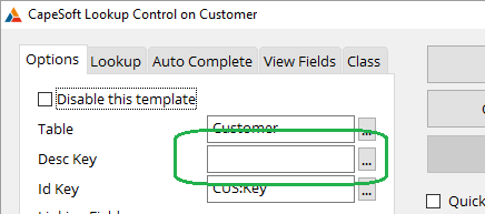
Desc Key
Enter the Description key for the remote table here. This field is
optional, however having a key on the description field(s) in the
remote table will improve the functionality of the control.
Id Key
Enter the remote table's ID Key here. This is usually the primary key
of the remote table.
Linking Fields
Match up any unmatched fields here. Typically each item in the remote
table's ID key appears in this list, and must be matched to a field in
the local table.
More Assignments
If you are fetching data from the remote table, that is not in the
primary key, then add those assignments here.
Show Lookup if Entry invalid
If this options is on and the user enters an incorrect value, and the
field did not contain a correct value before, then the Lookup window
is automatically displayed.
Allow Invalid Entries
If this option is on and the user types a value into the field, which
is not located in the lookup, then accept the value as correct.
Allow Blank Entries
If this option is on, and the user clears a field, then allow the
field to remain cleared. This allows the field to be either a valid
value, or blank.
Call Reset After Lookup
If this is on then the
Reset method
(ABC) or
RefreshWindow routine (Legacy)
will be called when the contents of the lookup field changes. This is
useful for fields which are acting as filters for other fields on the
window, like browses.
This button goes to an embed point. When the user enters an invalid
value a method (AskAllowInvalid) will be called. By default this
method returns true. However you can enter embed code here to validate
the entered value. You can then return False to reject the value. This
allows invalid codes to be entered, but only if the code conforms to
some specification.
Lookup Tab
Activate Lookup
Turn this on to include a lookup button, and functionality with the
control.
Lookup Procedure
Select the name of a Lookup Procedure here. When the user clicks the
lookup button, then this procedure will be called, using normal
Clarion lookup calls. This lookup can have, but does not have to have,
the Recent Browse Extension added to it.
Parameters
Optionally enter any additional parameters that the procedure may need
here.
Optionally enter a variable here to accept a value returned by the
Lookup Procedure.
Auto Complete Tab
Activate Auto-Complete
Tick this on to activate Auto-Complete functionality on the entry
field.
Chars before auto
The number of characters to type before the auto-complete search is
done.
Order (csl)
The default sort order for the auto-complete results is the
Description fields. If you wish to customize the sort order, then
enter it here as a comma separated list.
Filter
If you wish to apply an additional filter to the auto-complete
selection, then enter the filter here.
Turn this option on if the filter contains an expression rather than a
constant string value.
Display
By default the description fields will be displayed in the drop down.
If you wish to customize the fields displayed in the drop list then
enter an expression here.
The auto-complete can search using a CONTAINS search or a BEGINS-WITH
search. Choose the one appropriate to your situation. The default is
CONTAINS.
If this option is on then the filter created during the auto-complete
will be sent to Debugview for debugging purposes.
Additional Search Fields
By default the search (for the letters the user has already typed)
spans across all the code, and description fields. If you want the
search to apply to other fields in the remote table as well, then
enter them here.
The maximum number of items to read from the table to display in the
auto-complete list. The default vlaue is 100. The higher this value
the longer it can take to read the possible options.
Sets the number of rows to display when the drop-down button is
pressed. If left blank then the global default value is used.
If left blank the width of the Entry control is used to set the drop
list width. However if you want the drop list have a minimu width, and
hence be wider then the entry field then you can enter an expression
here. If the entry is wider than this expression then the entry width
will be used for the drop list, otherwise the value entered here will
be used.
ViewFields Tab
Remote View Field
A VIEW structure is generated to populate the Auto-Complete list. If
you are using fields in code, or in the DISPLAY setting, other than
the ID and Description fields, then enter those fields here.
Class Tab
Object Name
The name of the object. Defaults this ThisLookupX where X is a number.
Class Name
The name of the class that the object is instantiated from. the
default class is LookupManager.


