- Documentation Guide
- General Information
- Getting Started
- Trouble Shooting
- Intermediate Level Graphs
- Advanced Level Graphs
- Some How To's
- Programmers Corner (For those who want to do something a bit out the
ordinary)
- Version History
Introduction
For a long time now we have been wanting a tool which easily allows us to
draw graphs in our Clarion programs. Our ideal tool should have both a
strong drawing engine and a template for linking the graph to the data in
the dictionary. Up to now, however, none of the tools provided were
sufficiently capable on the template side of making adding a graph to our
applications simple.
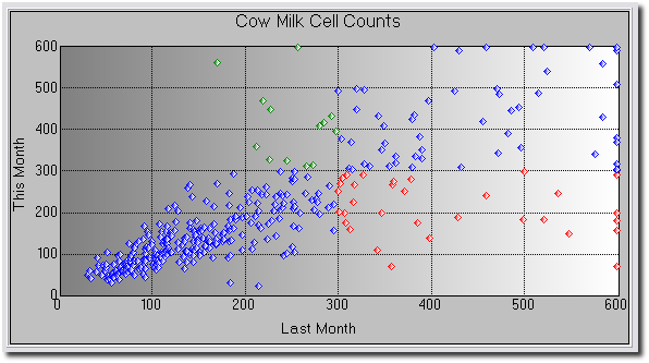
This is a pity, because a graph is an incredibly powerful way of managing
large clumps of data. Many browse windows can be enhanced with a simple
graph, and it's much easier to spot trends and anomalies on a graph than
on a plain browse screen or report.
Late in 1999 a Clarion programmer (we'll call him "The programmer formerly
known as Mike") showed us a really nice engine written entirely in
Clarion. We encouraged him to complete the job by writing the necessary
template. He asked us to do it, and of course we can't resist a challenge.
After rather more work than we expected, the template is now here.
Actually, we quite like it - it contains some features never before
implemented in a Clarion Template, including a
Dynamic
User Interface (i.e. the template makes fewer options available
to a beginner than to an advanced user).
We think you'll find that the power of this template truly does make
adding graphs to your applications simple, with no hand-coding required.
Rather than listing all the features here, though, we refer you to the
section entitled
Features.
Because we've broken new ground in the way some aspects of the template
work, we've also had a large number of bug reports where the "bug" is
actually a feature. So, before you report a bug, please read
One
Man's Bug is Another Man's feature.
BETA Notes: For a list of features added
during the beta program, see the
Version
History. As a beta user you will be entitled to free upgrades for
Insight Graphing 1 for the duration of the beta program, and also the Gold
release.
Upgrading from Beta 6
Every effort has been made to make sure that upgrading from beta
6 to beta 7 (or later) goes as smoothly as possible. There are however
some
cases where your manual intervention is required. If you have been
referred
here by the generated code then check the Reference Number next to each
point
to see which item applies to you.
| Reference 1 |
Reports: Up to beta 6 the "control"
used on the report has been the 'box' control. This allows you to
put a border around your graph. From beta 7 onwards there also
needs to be an image control. Your options are:
a) remove the Insight Graph and repopulate it (a lot of work) OR
b) make the following manual change to the report format:
- Go to the Report Procedure in the application tree, and
bring up the text version of the
report structure by clicking on the ellipsis button next to
the report button.
- Find your graph control. It will be a BOX control, and the
#ORIG setting should be #ORIG(?Insight). Just after this line
add another line to create an IMAGE control. Note that the SEQ setting should be set the same, and
the AT of the control should be set
the same.
The Image control will need a unique USE
equate. By convention just tack the word Draw onto the Box's
equate. Example :
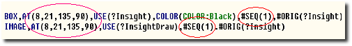
Note : This change will have no
affect on your ability to go back to Insight Beta 6 if necessary.
i.e. the image control will remain, but the old version of Insight
will simply ignore it. |
Support
Your questions, comments and suggestions are welcome.
| CapeSoft Support |
| Email |
 |
| Telephone |
+27 87 828 0123 |
| Fax |
+27 21 715 2535 |
| Post |
PO Box 511, Plumstead, 7801, Cape Town, South Africa |
Insight Graphing 1 is no longer available for purchase, however you can
purchase the either the upgrade or the full version to Insight Graphing 2
from:
| CapeSoft Sales |
| Web |
www.capesoft.com
|
| Email |
 |
| Telephone |
+27 87 828 0123 |
| Fax |
+27 21 715 2535 |
| Post |
PO Box 511, Plumstead, 7801, Cape Town, South Africa |
License & Copyright
This template is copyright © 2000-2013 by CapeSoft Software and Mike
Berkeley. None of the included files may be distributed, except for DLL
files which are required by your application. Your programs which use
Insight can be distributed without any Insight royalties.
Each developer needs his own license to use Insight Graphing.
This product is provided as-is. Use it entirely at your own risk. Use of
this product implies your acceptance of this, along with the recognition
of copyright stated above. In no way will CapeSoft Software, their
employees or affiliates be liable in any way for any damages or business
losses you may incur as a direct or indirect result of using this product.
Distribution
If you are compiling your application in
Stand-Alone mode
(which means that you
are shipping the
Clarion runtime DLL's), you will need to ship the Insight DLLs as well
as your EXE (and other Clarion DLL's). The exact names of the files to
ship depends on your version of Clarion:
| DLLs required |
| Clarion Version |
DLL required |
| Clarion 5 |
C5IGX.DLL, LIBPNG.DLL and ZLIB.DLL |
| Clarion 5.5 |
C55IGX.DLL, LIBPNG.DLL and ZLIB.DLL |
| Clarion 6 |
C60IGX.DLL, LIBPNG.DLL and ZLIB.DLL |
If you are compiling in
Local mode (which means you end up with
one all-inclusive exe), then you only need to ship the LIBPNG.DLL and
ZLIB.DLL files.
Installation
1. Run the supplied installation file.
Features
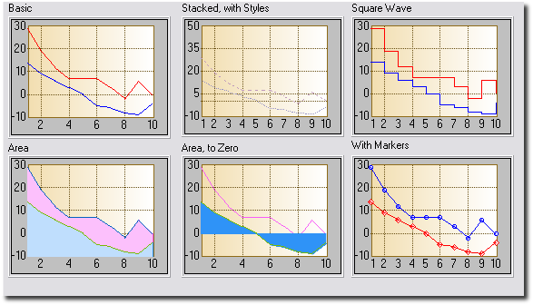
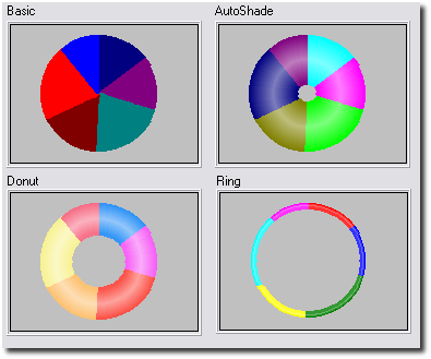
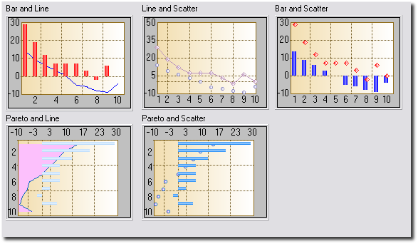
Graphing Engine
- Support for Bar, Pareto, Line, Gantt, Time, Donut, Hi-Lo, Candle
and Pie Charts
- Full control over the look and feel of the graph, and the data
- 20 built-in Axis styles, 12 built-in Data Styles
- Automatic Y-Axis Scaling
- Multiple Y-Axis Labelling
- Supports Data-Point Labelling
Template
- Dynamic Interface, exposes more options as you learn.
- Directly interfaces to the tables in your Dictionary
- Supports the Graphing of Fields or Expressions
- Supports the Counting, Summing, and Averaging of records
- Supports dynamic labelling based on the data in your tables
- Uses Views for efficient access to the
data, regardless of the File Driver
- Supports plotting data from Queues and
Memory Variables as well
- Supports Multiple Views per graph, and Multiple Fields per View
- Supports dynamic (changing) numbers of data sets
- Supports drilling down from one graph to another based on the
point clicked on in the first graph
Graphing on Windows
- Allows Graphs on all Windows including Browses, Forms etc.
- Allows multiple graphs on the same window
- Allows for Mouse-Over information
- Allows for a Right-Click menu including options like Zoom In, Zoom
Out, Print, Save As, Drill Down, Back Up, Select Graph Type and so
on.
- Allows for a default Left-Click action to be set
Graphing on Reports
- Allows automatic placement of Graphs at the beginning or end of
the report
- Allows placement of graphs during the report, based on your
criteria
- Allows graphs to be added to existing reports
- Allows graphs to be placed next to or above each other
- Allows multiple graphs on one detail
General
- No Hand-Coding required
- Allows you to set the "look" of your graphs from one global
extension, but also allows you to override the look for every
individual graph
- Supports Clarion 5, 5.5 and 6
- Supports Legacy and ABC templates
- Supports EXE and DLL apps
- Supports 32 bit (not 16 bit) programs
One Man's Bug is another Man's Feature
- Look Up Fields: All bug reports are
welcome at However there is one "bug" which has
been reported numerous times, but which is in fact a feature. However,
because Insight behaves differently to what you might expect, it can
appear to be a bug at first glance. This bug centers around the use of
the ... button to look up fields. When you
click on this and select a field, you probably expect the old contents
of the entry to be cleared and the selected field to be put in its
place. With Insight this doesn't happen. This is because Insight
allows you to build expressions into almost all these fields. For
example, say you wanted to sum all the sales for a particular month.
Your key, on the Invoice file, is naturally by Date. But you want to
sum on the Month, not the Date, so the Parent field would be set to Month(Inv:Date). By the way: If you
reported this bug and were directed to read this bit of the docs,
don't feel bad. You're not alone <grin>.
- Legends: Another often-reported bug is
simply something we don't support. When making legends you have 3
choices to make:
- Legend position ( where it is in relation to the graph)
- Legend type (Stacked or Inline)
- Font Angle (0 or 90 degrees)
There are two combinations of the above that we don't support, because
they simply are not useful. If either of these two combinations
is set, the legend is will not be displayed. They are:
- Position Left or Right (4 or 6), Inline = 1 and Font Angle = 0
- Position Top or Bottom (8 or 2), Inline = 1 and Font Angle = 90
Both of these legend combinations would essentially leave no space for the
graph itself.
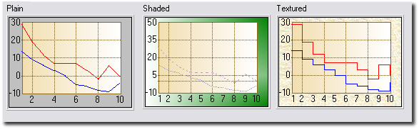
Tip: A good place to experiment with the legend properties
is in the
included school example. Click on the
Grand Tour button on the toolbar and keep clicking next until you reach
the legends example.
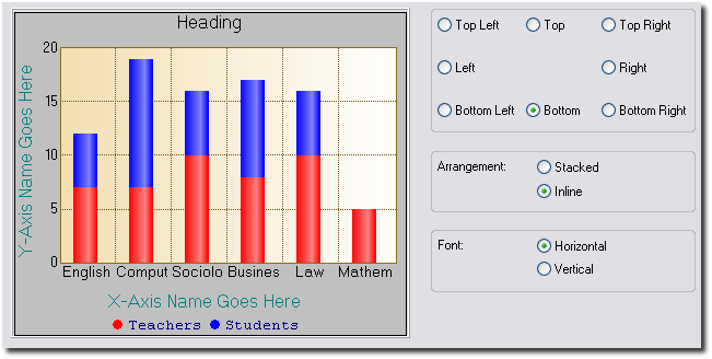
A Bit of Background
Like all things, it helps to understand a little bit of the terminology
used in the template before you get going. Probably the best way to start
is with a diagram:
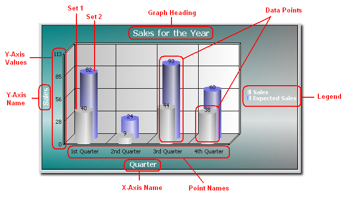
- Graph Heading: The heading of the graph.
In this case, "Sales for the Year".
- X-Axis Name: The name of the x-axis. In
this case, "Quarter".
- Y-Axis Name: The Name of the y-axis. In
this case, "Sales".
- Y-Axis Values: These are the values next
to the y-axis. In this case they are 0, 27, 55, 82, 109.
- Data Points: Each bar on the chart above
is a (data-) point. In general, "data points" refers to the actual
points plotted on the graph.
- Set: A set is a collection of data
points. In the above graph, there are two sets, each drawn in a
different color. So, in this example, the first set consists of all
the data points drawn in gray, and the second consists of all the data
points drawn in blue.
- Legend: The legend appears to the right of
this graph. It lists the color of each set next to its description.
- Point Numbers: These are the x-axis
values. One can also see the point numbers as the x-coordinates of the
data points. Usually, what appears as labels beneath the x-axis are
not the point numbers, but the point names (note that it is possible
to use the former as labels), since these are usually more
informative. See below.
- Point Names: The point names usually
appear below the x-axis. A point name is a (very) short description
for a point number. In this case the point names are "1st Quarter",
"2nd Quarter", "3rd Quarter" and "4th Quarter".
As you work through the various template options you'll see these words,
especially Data Points, Sets and Point Names, a lot. Feel free to refer to
the above diagram until you are comfortable with the terms.
Jump Start
In this section we give a step-by-step example that will guide you through
creating your first application containing an Insight Graph.
Code Example: There is a copy of the source
code of this example in your
Clarion?/3rdParty/Examples/Insight/JumpStart
folder.
What we are doing: Our aim is to create a
simple window containing a graph control that will refresh every time new
data is loaded. Our end-result will look something like this:
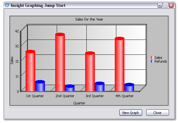 (1)
(1) Open Clarion 5, and create a new
application. Add the Active Insight Functions Global Extension. In the
Template Level dropdown
list, choose Advanced. Click OK.
(2) For the main procedure, create a generic
window and add a close button. Add to the local data of this procedure the
following fields (leave the window formatter, right-click on the Main
procedure, choose Data, click Insert):
plottingQueue queue
setNumber
long
setName string(128)
pointNumber long
pointName string(
128)
value
real
end
Give the above queue the prefix "
pq".
(3) Go to the window, go to Populate Control
Template and add an Insight_Graph Control Template to your window. Resize
the region it creates to fit the window, and then right-click on the
region and choose Actions. Enter your Graph Heading on the
Graph
tab ('
Sales for the Year' -
Tip:
Note that for Insight Graphing, every
string
that is not a variable must be included in
single
quotes).
(4) Now choose the
Data
Tab and click on Insert. On the
Primary
Source Tab of the window that pops up, select Queue from the Data
From dropdown list. Select plottingQueue from the Local Data for the Queue
Name. Now choose the
Sets
Tab and click on Insert. On the
Set
Tab of the new window that pops up, enter
pq:setName
as the Set Description. For High Field, choose
pq:value.
Now go to the
Advanced
Tab of this window, check Override Setnumber and select
pq:setNumber
for the value. Click OK and OK again.
(5) Now go to the
X-Axis
Tab and enter the X-axis Name ('
Quarter').
Uncheck Automatically Generate. For Point Name, enter
pq:pointName,
and for Point Number select
pq:pointNumber.
(6) Next, go to the
Y-Axis
Tab and enter a name for the Y-axis ('
Sales').
(7) Now click on the
Legend
Tab and check Override Global Settings, check Display Legend and
choose Right in the Position group.
(8) Go to the ThisWindow.Init Procedure embed,
just after GlobalErrors.SetProcedureName('Main'), and paste the following
code:
PlottingQueue.setNumber = 1
PlottingQueue.setName = '
Sales'
PlottingQueue.pointNumber = 1
PlottingQueue.pointName = '1st Quarter'
PlottingQueue.value = random(1,100)
add(
PlottingQueue)
PlottingQueue.setNumber = 1
PlottingQueue.setName = 'Sales'
PlottingQueue.pointNumber = 2
PlottingQueue.pointName = '2nd Quarter'
PlottingQueue.value = random(1,100)
add(
PlottingQueue)
PlottingQueue.setNumber = 1
PlottingQueue.setName = 'Sales'
PlottingQueue.pointNumber = 3
PlottingQueue.pointName = '3rd Quarter'
PlottingQueue.value = random(1,100)
add(
PlottingQueue)
PlottingQueue.setNumber = 1
PlottingQueue.setName = 'Sales'
PlottingQueue.pointNumber = 4
PlottingQueue.pointName = '4th Quarter'
PlottingQueue.value = random(1,100)
add(
PlottingQueue)
PlottingQueue.setNumber = 2
PlottingQueue.setName = 'Refunds'
PlottingQueue.pointNumber = 1
PlottingQueue.pointName = '1st Quarter'
PlottingQueue.value = random(1,10)
add(
PlottingQueue)
PlottingQueue.setNumber = 2
PlottingQueue.setName = 'Refunds'
PlottingQueue.pointNumber = 2
PlottingQueue.pointName = '2nd Quarter'
PlottingQueue.value = random(1,10)
add(
PlottingQueue)
PlottingQueue.setNumber = 2
PlottingQueue.setName = 'Refunds'
PlottingQueue.pointNumber = 3
PlottingQueue.pointName = '3rd Quarter'
PlottingQueue.value = random(1,10)
add(
PlottingQueue)
PlottingQueue.setNumber = 2
PlottingQueue.setName = 'Refunds'
PlottingQueue.pointNumber = 4
PlottingQueue.pointName = '4th Quarter'
PlottingQueue.value = random(1,10)
add(
PlottingQueue)
(9) Now add a button called ?NewGraph to the
window, and in the EVENT:Accepted embed, paste the above code again, but
preceded by
free(
PlottingQueue)
and succeeded by
ThisGraph1.Reset()
ThisGraph1.Draw()
(12) If you are using
Clarion
5, go to Project Properties and click on the Defines Tab. Enter
_IGDLL_=>0
(11) Compile and Run the application.
When the application launches, click on the New Graph button and see the
Insight magic at work. A new graph will be drawn every time, depending on
the random numbers generated by the above code.
Tips:
- The values in pq:pointName are used
to label each new point on the x-axis.
- pq:value is the value on the
y-axis, and pq:pointnumber is the
value on the x-axis.
- The value of pq:setnumber
indicates to which dataset the value in pq:value
belongs to. Each data set is drawn in a different color on the
graph.
- The values in pq:setName are used
for the names in the legend - they are the names of the different
datasets.
- Checking Override Set Number, as we did above, allows one to draw
multiple datasets on the same graph without having to add each set
individually on the Sets
Tab (choosing the latter route means adding a filter on the Set
Tab of the Set Window for each set to filter out all points in the
queue not belonging to that set).
- The fonts of the legend and headings can be changed by going to the
Fonts Tab.
Pie Graphs
Pie Graphs are a little different than the rest of the graphs. There will
only be one set, and each slice in the pie is seen as a point on the
X-Axis. So, supposing you had a queue where each record in the queue is a
new slice, you would have to take the following steps (see the
JumpStart
above r.e. more specifics on how to get to the mentioned windows and
tabs):
- Add your queue as a data source on the Data Tab.
- For your data source, add one Set. Go to the Set Tab on the Set
Window. There is no need to give it a description.
- In the "Field" entry for the set, enter the field containing the
value to plot. You can now close the Set Window.
- If you have fields in the queue containing the slice numbers and/or
names, you should go to the X-Axis Tab and enter them in the point
name and number fields (untick Automatically Generate).
- On the Data Tab you can set what information should be displayed for
each slice. On the Legend Tab you can do something similar, but the
information will be shown next to the graph as opposed to in labels
for the slices.
To make Insight use different colors for the slices other than the
defaults, we need to override the colors for the points, not the sets.
Lets suppose you had a field in your queue that specified the color for
that point/slice. We need to take the following steps:
- Go to the one set you created for the pie, and go to its Colors
Tab.
- Click Insert for the "Conditional Point Overrides" listbox.
- Enter "true" for the condition.
- Tick "Use Variables for Colors".
- Enter the queue field containing the slice color in the provided
fields.
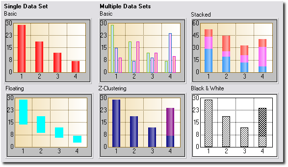
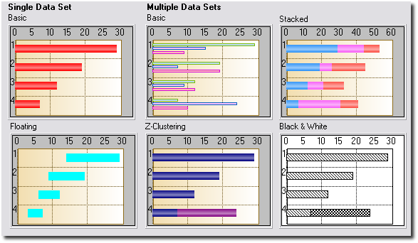
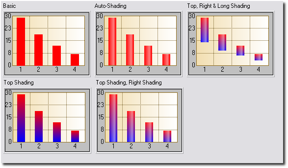
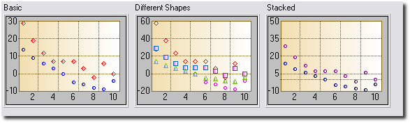
Graph Gallery
Adding Insight to your Application
Adding Insight to your Application is easy.
- Open your application and click on the Global Button.
- Click on Extensions, and add the Activate Insight Global Extension.
- You don't have to set any of the values, the defaults will all be
fine. When you want to, read up on the Global
Template Settings to see all the power you have.
Adding an Insight Graph to a Window
The hardest part of adding the Graph is deciding on
what exactly the Graph is going to show. In other words the data is
probably right there in the dictionary, but you need to get the
relationship right in your mind first. After that it's easy.
- Go to the Window Editor
- Either
Click on the Populate menu and select Control Template, and then
choose the Insight Graphing Control.
Or
Place a Region Control on the screen. When asked, select Insight Graph
for the region.
- Go to Actions for the control. Set the various graph properties
here. There will appear to be quite a lot to do at first glance, but
after you've done a couple it will get easier.
Remember, the interface is dynamic - as you get the hang of it go back
to the global extension and increase the Template
Interface Level in order to see more options.
A complete list of all the settings, and what they all do, can be
found in Options
for the Insight Graph Control Template.
Adding an Insight Graph to a Report
Printing Insight Graphs on reports is supported. There is however a
problem.
Due to the nature of report writing in Clarion it is likely that you've
either
a.
used the
standard report templates,
b.
used a 3rd
party report template, or
c.
hand-coded the
report yourself.
In addition to this, the placement of graphs on a report will obviously
differ greatly from one report to the next. We have therefore tried to
make the template for placing a graph on a report as flexible as
possible.
Using the Standard Report
Templates
If you are using the standard report templates, we recommend
the following steps for adding a graph to your report:
- Make a new report band.
- Give the band a name (for example, Graph) and a use equate (for
example ?Graph).
- Populate the Insight Control Template onto the band. Set the size
of the graph as you wish.
- Select from the default options for the graph (Print at Beginning
of Report, Print at End of Report, Other).
- Set the filter for the band. To do this, close the report editor,
click on the Report Properties Button, tab across to the Filters Tab
and select the filter for the Graph Tab.
Tip: If you selected Print at
Beginning or Print at End, set the filter to 1=2. This will ensure that
the report template does not trigger the graph. Instead, the graph
template
will trigger itself.
Tip: If you selected Other then enter
the appropriate filter here. If you want to trigger the graph yourself
by hand-coding then set the filter to 1=2.
Using some other 3rd Party
Report Template
The Insight Template generates four different bits of code for the
report. The first is the View (or Views) for the object, along with the
object
definition. This is done in the Data Section of the template.
The second consists of any overriding methods that may be required by
the template.
The third and fourth pieces are generated together in the Procedure
Routines Section. You need to call the first routine to initialize the
graph. This is done just after the
open(report)command.
You can simply call the routine in the appropriate place, for example:
open(report)
do InitThisGraph1
The second routine actually reads the data from the file or queue and
prints the graph
for you. You call it by simply adding the lines
do DrawThisGraph1
do PrintThisGraph1
where you want the graph to print.
If you have multiple graphs on the same detail, you will need to call
the drawing routine for each of them individually before calling the
printing routine for the last one. Calling the printing routines for the
other graphs is not necessary. For example, your code would look
something like this:
DO DrawThisGraph1
DO DrawThisGraph2
DO PrintThisGraph2
Last, but not least, be sure to kill the graphs when the report closes
to avoid memory leaks:
DO KillThisGraph1
DO KillThisGraph2
Tip: The InsightCPCS example shipped with Insight shows how to add an
Insight graph to a CPCS report.
Hand-Coding The Report Yourself
You can add the necessary code to your report by hand as well. The
easiest way to do this is as follows:
- Create a basic report and populate it as described in Using
the Standard Report Templates.
- Cut & Paste the code from the generated report into the
hand-coded report. This code will consist of two (possibly three)
sections.
- Section 1: The object declaration and
associated Views.
- Section 2: The procedure routines
(DrawGraph, PrintGraph and InitGraph).
- Section 3: (may not be there) The new
methods for the Graph object. These methods only exist if you have
set certain options, so if you can't find them, don't worry.
Examples
All the
Examples Shipped with Insight include
examples of putting graphs onto reports.
Examples
The examples shipped with Insight can be found in the
\Clarion?\3rdparty\Examples\Insight
directory (where \Clarion? is your Clarion 5, Clarion 5.5 or Clarion 6
directory).
Examples include:
- ABC: A single EXE based on the ABC
templates. See \ABC\School.app.
- Legacy: A single EXE based on the Legacy
templates. See \Legacy\School.app.
Intermediate Level Graphs : Making your
Graph Interactive
Now that you've got a graph on your window, you can start getting really
creative. This section assumes that your
Template
Level is set to Intermediate or higher.
Mouse Click Actions
The Mouse Click tab lets you set the default action for the Left-Mouse
click and also the possible actions for the Right-Click menu. Most of the
items need little explanation. See the
Mouse
Click Tab section of the Insight Template Guide for more information
on how to implement these options.
- Zoom In: Allows you to zoom in on the
graph.
- Zoom Out: Zoom out on the graph.
- Cycle Sets: Rotates the order of the data
sets on the graph. Use this if you want to bring a specific set to the
front of the graph.
- Drill Down: This allows you to drill down
to another graph. The idea is that you can create multiple graphs at
the same place in the window, with all of them except the top one
hidden. As you drill down, the current graph is hidden and the new
graph is displayed. The useful thing here is that the data displayed
by the graph you are drilling down to can be made to depend on the
point of the top graph last clicked on. See Setting
Up a Drill Down/Back Up Sequence.
- Graph Type: Allows the end user to change
the type of the graph.
- Remember Graph Type: Save the last-chosen
graph type for this graph in the INI file and restore it the next time
this application is opened.
- Copy: Copy the graph to the windows
clipboard.
- Save As... : Allows the graph to be saved
as a BMP or PNG file.
- Print Graph: Prints the graph on the
current printer.
Mouse Move Actions
As the mouse moves over the graph it is often nice to be able to see the
values of either the current mouse position (line graphs) or the item
under the mouse (bar and pie graphs). This information can then be
displayed on either the status bar, window caption, in the tip, or on a
control elsewhere on the window.
Tip: Only those sets which have a set
name will appear in the values list. To suppress a set, make sure its set
name to blank.
For more information on implementing the mouse over actions, see the
section on the
Mouse
Move Tab in the Insight Template Guide.
Intermediate Level Graphs: Mutiple Y-Axies
You may want each of your data sets to have its own y-axis. The end-result
would look something like this:
Doing this in Insight is easy:
- Make sure your Global
Template Level is on level Intermediate or higher.
- Go to the Y-Axis
Tab and tick the Use a Separate Y-Axis for each Set checkbox.
- Go to the Y-Axis
Tab for each Set, and adjust the settings there.
Intermediate Level Graphs: Setting Up a
Drill Down/Back Up Sequence
Insight has an exciting new feature allowing you drill down from one graph
to another.
Say, for example, that you had a bar graph representing the total sales of
the twelve departments in your store. Suppose also that you can break down
the sales of each department into several smaller categories, depending on
the department. Suppose now that right-clicking on a bar and choosing
Drill Down makes the graph display the sales break-down for the department
to which the bar belongs. Insight makes this possible in just a few easy
steps.
- Add a graph to your application and configure it to display the data
of the top graph - lets call this the Level 0 graph (displaying the
total sales of each department in your store). Suppose its formal name
is ThisGraph0.
- Now add a second graph over the first, and make sure that this
region is invisible - lets call this the Level 1 graph. Suppose its
formal name is ThisGraph1.
- Configure the second graph to display the relevant data - we will
fill in the filter on the data below.
- Note that for each graph with name ThisGraphN
in your application, the template automatically creates the following
local variables:
ThisGraphN:ClickedOnPointName string(255)
ThisGraphN:ClickedOnPointNumber real
ThisGraphN:ClickedOnPointName contains
the point name of the point on which you last clicked on ThisGraphN. ThisGraphN:ClickedOnPointNumber works
similarly.
- Now Set up the Filter on the Primary
Source Tab of the Level1 Graph by making use of the ThisGraph0:ClickedOnPointName
and ThisGraph0:ClickedOnPointNumber
local variables. If, for example, MySource1:DepartmentName
holds the department name for the data to be displayed by ThisGraph1,
then you could set the filter to be MySource1:DepartmentName
= ThisGraph0:ClickedOnPointName to get the desired result.
The DrillOnStores procedure (the Stores menu item on the Specific
Configurations menu) of the
Included
School Example has implemented the above steps to give you a working
example.
Advanced Level Graphs: International
Language / Translation Support
Note: The
Template
Level on the global extension has to be set to
Advanced
for you to make use of this feature.
Insight makes it possible for you to translate the right-click menu
options to any language of your choice. To do this, go to the Global
Extension, and then to the
Global
Advanced Tab. Enter the text you would like to be displayed as your
menu options here. Note that if you are entering a fixed value then you
must use quotes. You are also allowed to use variables here.
Advanced Level Graphs: Manually
Printing Screen Graphs
Note: The
Template
Level on the global extension has to be set to
Advanced
for you to make use of this feature.
There are 3 ways to make a graph appear on paper at the printer. The first
is to make a report with a graph on it (See
Adding
Graphs to Reports). The second is to use the "right-click" Print
feature (See the the section on
Mouse Click
Actions above). The third is to call the
PrintGraph()
method. The SetReportProperties() method has been supplied to be used in
conjunction with this method call.
The PrintGraph() method takes four parameters. The syntax is:
PrintGraph (string
DeviceName, long ProgramerId=0,
long Width=220,
long Height=170)
The
DeviceName is the name of the printer
you would like to print the graph. If blank, the graph is sent to the
current default printer. The
ProgrammerId
is there purely for the benefit of the programmer (it comes in handy if
you use the SetReportProperties method, discussed in a moment.) The
Width and
Height
parameters set the width and height of the graph control on the page.
The SetReportProperties() method is called from inside
PrintGraph()(after
the internal report structure is opened). SetReportProperties() is there
to allow you to set additional report properties (for example the paper
size, report orientation, and so on) before the internal report is printed
by
PrintGraph(). The
code to do this can just be embedded in SetReportProperties(). The syntax
for the method is:
SetReportProperties (long
ProgrammerID)
In your embed code you'll have access to the
ProgrammerID.
This is the same number as was passed to the
PrintGraph()
method. This allows you to have multiple behaviors in the
SetReportProperties() method. Note that the right-click Print option calls
this method with a
ProgrammerID of
255.
To generate this method so that you can embed your own code in it, go to
Actions of the graph control, and then to the
Advanced
Tab. Tick the option named Generate SetReportProperties on. Then use
the embeditor to add any code you'd like.
Examples:
ThisGraph1.PrintGraph('')
ThisGraph1.PrintGraph('Laser Series Printer')
ThisGraph1.PrintGraph('',1,100,100)
Tip: The
GraphSales
procedure in the Insight School Example
(\clarion?\3rdparty\examples\insight\abc\school.app) has a print button
that uses these techniques.
Advanced Level Graphs: Adding to the Available
Fonts List
Note: The
Template
Level on the global extension has to be set to
Advanced
for you to make use of this feature.
There is the danger when working with fonts that the font your program
requires will not be present on the end-user's computer. Therefore,
instead of presenting you with a list of all the fonts available on your
computer in the templates, we present a subset consisting of the most
common fonts. These include Arial, MS Sans Serif, Times New Roman, and so
on.
There are however cases where you would want to add a font to this list.
For example, you may need to use a font which supports a different
character set, or you may want to use your favourite exotic font.
Fortunately, we have a way for you to do this.
To add fonts to the available list, follow the two easy steps below:
- Using Notepad (or any other text file editor), create a file called
Fonts.Ini in the \Clarion?\3rdparty\Bin
directory.
- Inside this file put a list of the fonts you would like to include.
Note that this file isn't actually an INI file, so section headings,
etc. are not required. Your file might look something like this:
Verdana
Tahoma
Comic Sans Ms
Note that the items in this list are added
to the standard Insight list, so you don't have to add the standard ones
here too. You only have to add your new special ones.
Tip: Please remember - you need to enter
the name of the font exactly as it appears in Windows. And also remember,
if you use an exotic font, then you need to make sure it is on your
customer's machine as well.
Advanced Level Graphs: Using a Variable
Number of Sets
Note: The
Template
Level on the global extension has to be set to
Advanced
for you to make use of this feature.
Consider the following graph:
You have a Invoicing type program where the different products are broken
up into departments. The number of departments and their names are set by
the user and can vary from site to site.
Now you want to graph the total sales for each month of the year, but you
want to include all the departments on the graph as different sets.
Clearly, the number of departments in this example will vary, and up to
now we have only seen how to define the sets in the template. Insight does
however cater for this phenomenon of a variable number of data sets, and
setting this up is actually quite easy.
Before continuing, let's review the existing methods for creating graphs
with a fixed number of sets. First, you can add multiple entries to the
Data Tab. That would
look something like this:
You can also create multiple entries on the
Sets
Tab:
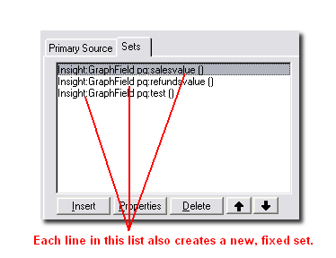
Using filters and ranges it is possible to create a fixed number of sets,
and it's easy to put the data in the right set.
In the case of a variable number of sets, though, the secret is to create
just one set, and then to use the
Override
Set Number facility on the
Advanced
Tab:
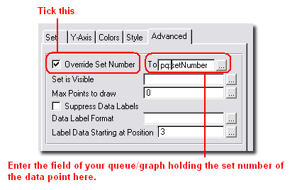
By setting the Set Number explicitly to a variable or expression, you can
send the data to different (and a variable number of) sets.
Note that all Sum, Average and Count functions should work fine, even in a
variable set environment, and even if the the data is not ordered.
For a more detailed example on how to implement this, see the
JumpStart
section in this document. The source code is available in your
c:\clarion?\3rdparty\examples\insight\jumpstart
folder.
Advanced Level Graphs: Drawing on your Graph
Some users find it useful to be able to draw their own shapes and write
their own text on the graph area. With Insight this is possible by making
use of some
low-level
drawing methods.
To start drawing on your graph, you first need to make sure that your
Global Template Level
is set to Advanced. Now go to the
Advanced
Tab of your Insight control, and tick the
Generate
Draw() checkbox. This tells the Insight template to generate the
.Draw() method.
All you need to do now is to embed the code needed to display the objects
and text you want on your graph in the
.Draw()
method,
after the parent call. Make sure you
call
.Display(). after
adding all the text and objects to your graph, as otherwise your changes
will not reflect onscreen.
Note that if your desire is to draw horizontal or vertical lines on your
graph, one or two calls to
.AddSpecialAxis()
may accomplish what you need. Note that this method does not fall under
the low-level drawing methods, though. Here, you only need to make your
calls to
.AddSpecialAxis()
followed by a call to
.Draw()
at an appropriate place in your code.
An example illustrating the use of the low-level drawing methods can be
found in the
included school
example - see the PreDrawn window under the Advanced menu.
How to Know When to Use a Pie Graph
We thought it might be worth mentioning some tips and tricks regarding how
best to represent your data, especially with respect to pie graphs.
Firstly, a pie graph is expected to have around six slices. If there are
many more slices, it is usually because there are a number of very small
slices. In the latter case, it is advisable that these get combined to
form one slice labeled "Other". Doing this will not only make the pie
chart easier to understand, but the labels for the pie slices will also
have more space and will therefore be more legible.
Another thing we also recommend is that you order your pie slices from
largest to smallest . Again, this will impart more information to the
reader by making the slices more easily comparable.
Playing around with certain pie properties, such as
PieAngle
and
PieLabelLines,
may also improve the way your graph looks to some extent. For example,
Insight tries its best to calculate the optimum number of lines over which
the data label for each pie slice should be spread. You might, however,
find that the graph layout improves when setting
PieLabelLines
to 2 when insight is choosing 1. In cases where the left-hand side of your
graph looks cluttered, you can also try setting
PieAngle
to merely 1 or 2 (degrees), especially if your last slice is tiny. This
will move the small slice and its label to the right, making more space
for the rest of the data labels on the left.
If none of the above suggestions make your pie chart seem any friendlier
to the eye, it may be that a pie is not the optimal representation for
your data. Bar charts are often better representations in these cases.
How to Use the Standard Windows
Colors
The good news is that Insight now supports the use of the Standard Windows
Colors. The way they have been implemented is that the template creates a
number of local variables (actually belonging to a group) which contain
these values. They are populated when a window or report containing an
insight graph is initialized. You can use them anywhere in the Insight
template or in the rest of your program in the same way you would use the
usual color equates (e.g.
COLOR:Aqua). Note
that for every insight object another such group is created.
Tip: Note that you are actually using
variables here, and not equates. Hence, In some cases, such as on the
Colors Tab of a
Given Set, it might be necessary to tick the
Use
Variables for Colors checkbox.
Note for Hand-Coders: See the
.GetWindowsColors()
method in the Insight Technical Guide.
The available colors may vary depending on the version of Windows you are
running. The names have to a large extent remained the same, except where
Clarion does not allow it - so, for example, 3DFace has become Face3D.
Assuming your Insight graph object is called
ThisGraph1,
the available colors are as follows:
ThisGraph1:Color:Scrollbar
ThisGraph1:Color:Background
ThisGraph1:Color:ActiveCaption
ThisGraph1:Color:InactiveCaption
ThisGraph1:Color:Menu
ThisGraph1:Color:Window
ThisGraph1:Color:WindowFrame
ThisGraph1:Color:MenuText
ThisGraph1:Color:WindowText
ThisGraph1:Color:CaptionText
ThisGraph1:Color:ActiveBorder
ThisGraph1:Color:InactiveBorder
ThisGraph1:Color:AppWorkSpace
ThisGraph1:Color:Highlight
ThisGraph1:Color:HighlightText
ThisGraph1:Color:BTNFace
ThisGraph1:Color:BTNShadow
ThisGraph1:Color:GrayText
ThisGraph1:Color:BTNText
ThisGraph1:Color:InactiveCaptionText
ThisGraph1:Color:BTNHighlight
ThisGraph1:Color:DKShadow3D
ThisGraph1:Color:Light3D
ThisGraph1:Color:InfoText
ThisGraph1:Color:InfoBK
ThisGraph1:Color:HotLight
ThisGraph1:Color:GradientActiveCaption
ThisGraph1:Color:GradientInactiveCaption
ThisGraph1:Color:MenuHighlight
ThisGraph1:Color:MenuBar
ThisGraph1:Color:Desktop
ThisGraph1:Color:Face3D
ThisGraph1:Color:Shadow3D
ThisGraph1:Color:Highlight3D
ThisGraph1:Color:HiLight3D
ThisGraph1:Color:BTNHiLight
How to Use Insight in a Multi-DLL Application
Simply make sure you add the Insight Global Extension to every DLL,
program or anything else that makes use of Insight Graphing.
Special Information for Clarion 5 Users
It is our goal to support Clarion 5 for as long as is possible. However,
Clarion 5 does not offer all the facilities that Clarion 5.5 and later
offer. Thus there are occasionally small additional tasks required if you
are using Clarion 5.
1. Define needed in Local Mode
If you are compiling in
local mode , then you
need to add the following define to your application:
_IGDLL_=>0
Failure to do this will result in a GPF on any procedure that contains a
graph.
To add the define to your application:
- Open the app
- Click on the PROJECT button
- Click on the PROPERTIES button
- Click on the DEFINES tab
- Enter
_IGDLL_=>0
Common Errors
1. The xxx.Exe file is
linked to missing exportyyyyy
This means that you have an old Insight DLL in the
application directory or in the path. Check your machine for C60IGX.DLL
(or C55IGX.DLL, or C5IGX.DLL, depending
on your Clarion version).
2. The Right-Click, Left-Click or MouseOver
functionality has stopped working.
The IMM (Immediate) attribute has been turned off on the Insight
control.
3. I'm using Clarion 5 and my APP GPF's whenever I get
to a window with a graph.
See the
Special Information for Clarion
5 users section.
4. When I try to add an Insight Graph to my window, I
get a whole lot of messages of the form "Unknown Variable
'%GlobalGridVGridColor'.
Before adding an Insight Graph to your application, make sure you
have
Added the Global
Extension.
5. When compiling my
application, I get errors of the form "Syntax error: Prototype is:
SETPOINTNAME(INSIGHTROOT, long)
" and "Syntax error: Procedure doesn't belong to module:
THISGRAPH1.SETPOINTNAME".
This often happens when one embeds code in a procedure that appears
when the Source is being edited, but that is not actually included in the
generated source module. For the above error in particular, the problem is
solved by entering a '+' in the
Point Name field on the X-Axis Tab. For other methods, check the specific
entry under the
Embed
Points Section of the Technical Guide.
Tips & FAQ
1. Clarion Versions: Insight
is available for Clarion 5, 5.5, 6.1 and 6.2. There is no upgrade charge.
However, you will need the correct installer to match the version of
Clarion that you are using. Download the correct version from
www.capesoft.com\insightd.htm.
2. Does Insight use an OCX? Insight does not
make use of any external OCX or other installed component. Insight does
use a DLL containing pure Clarion code, which you can ship with your
program. See the
Distribution section.
3. Does Insight have to use the DLL, or can you make a
single EXE? Insight uses a DLL when you are compiling in
Stand-Alone mode (in this mode you are shipping Clarion Runtime DLL's as
well). If you compile in Local mode, the Insight code is linked into your
single EXE.
4. Is there any limit to the number of sets on a graph?
None, other than practical screen real-estate issues.
5. Is there any limit to the number of graphs on a
window or report? Not that we're aware of. On a window only
visible graphs are loaded and drawn, so performance is not an issue.
6. Can graphs be placed side by side on a report?
Yes. There is no limit to the number of graphs on a detail, and no limit
to the number of details containing graphs.
7. Can you add graphs to existing reports? Yes.
The template supports automatically placing graphs at the beginning or end
of the report. With a line or two of code (explained in the section on
Adding Graphs to Reports) you can put the
graph wherever you like.
8.The templates seem to imply that I need two or more
related files. What if I just want to graph points from a single file?
You can ignore the Related Files Tab.
9.The range and/or filters for the graph are not
working. If you are using your own variables (i.e. not file
fields) in the range or filter, and these variables do NOT appear on
either the Local Data button or the Global Data button, you will need to
BIND the fields yourself:
- If you are using ABC, go to the ThisWindow.Init method and for each
variable embed the code BIND('variable',variable)
- If you are using the legacy templates, go to the PrepareProcedure
routine and embed for each variable BIND('variable',variable)
10. Making your own point names: There are cases
where you will want to insert your own code for setting or formatting the
point names. For example, you might want to convert a month number (1 to
12) to a name (Jan, Feb and so on). The method for doing this is a two
step process:
- On the local extension's X-Axis
Tab, set the Point Name to + (yep,
that's just a single plus sign). This tells the template to generate
the correct embed point for you.
- Go to the Embeditor for the procedure, and look for the
SetPointName() method (it'll be right near the bottom). Enter your
code here. At this point the fields being graphed and any hot fields
are 'live'. So your code might look like this:
execute
month(fil:date)
ReturnValue = 'Jan'
ReturnValue = 'Feb'
ReturnValue = 'March'
ReturnValue = 'April'
ReturnValue = 'May'
ReturnValue = 'June'
ReturnValue = 'July'
ReturnValue = 'Aug'
ReturnValue = 'Sept'
ReturnValue = 'Oct'
ReturnValue = 'Nov'
ReturnValue = 'Dec'
end
And then the generated
Return ReturnValue
11. Why are the number of x-axis grid lines less than
what is specified on the Grid Tab? On the
X-axis
Tab there is a check-box labeled
Optimize
X-ticks. If this has been checked, Insight will automatically
calculate and use the optimal number of grid lines. For the quantity
specified on the
Grid
Tab to be used, the Optimize X-ticks check-box on the X-Axis Tab has
to be unticked.
12. Why is my flat button not being displayed as flat?
Go to the
Advanced
Tab of the template (the global extension must have its
Template
Level set to Advanced) and uncheck the "Enable window buffering
mode" checkbox. If this option is checked, the line of code
window{
prop:buffer} = 1 is generated and called
directly after the Insight Init() method.
13. Why does my graph take so long to load when the
window starts up? Go to the
Advanced
Tab of the template (the global extension must have its
Template
Level set to Advanced) and uncheck the "Reset graph on window reset"
checkbox. If this option is checked, the graph is reset every time the
window's Reset() method is called.
14. In my 3D pie chart with custom colors the drop
colors are not the same as the slice colors. How can I change this? The
color used by Insight to draw the drops is the Shadow Color - this is
changed on the same tab as the Fill Color that you customized (see the
Insight Control's
Colors Tab). If you leave the shadow color to
COLOR:None,
Insight will use the default colors for the drops, which explains why they
don't match up to your customized colors.
15.
My report that includes an Insight graph takes
forever to produce. The problem is that the graph gets redrawn
way more times than is necessary. To prevent this, the DrawThisGraph
routine needs to be filtered out in the TakeRecord() method. To do this,
go to the Procedure Properties of the report, click on the big Report
Properties button, go to the Filters Tab, choose the Graph entry and enter
"1 = 2".
16.
My Y-Axis is not being scaled as I specified. Firstly,
note that the default number of y-axis grid lines is 5 (you can change
this on the
Grid Tab).
Insight always draws the exact amount of grid lines specified. If you
specify the max (and min) value for the y-axis and the step value, and
these three values don't all line up perfectly, Insight will change some
of your specified values to allow it to draw the graph. For example, it is
impossible to draw a graph with 5 y-axis grid lines, a max value of 50, a
min value of 0 and a step value of 15, and Insight will modify at least
one of these values before drawing the graph. Note that using multiple
y-axies complicates this further, because all the y-axies must have the
same number of grid lines.
17. When there is an x-axis point with no data values
plotted at that point, Insight just leaves it out. I want to see every
x-axis point, even if there is no data for it. You need to
specify the point numbers (and names) yourself. If you don't, Insight will
do this for you automatically and this will result in empty x-axis points
being ignored. To do this, go to the
X-Axis
Tab and fill in the
Point
Number (and
Point Name)
(untick Automatically Generate).
18. How can I change my graph header at run time? Embed
the code
self.
headername
= 'New Header Name'
in the ThisGraph.Reset() method. Note that, if you have set the
Graph
Heading in the template, the code for the header is also generated
in the ThisGraph.Reset() method. Therefore, either make sure you leave the
heading in the template blank, or embed the above line of code after the
parent call.
19. At a given x-axis point, how do you make sure all
the bars touch each other? Set the
Point
Width on the
Set
Tab to 100.
20. I have four numeric variables I want to plot on a
pie chart, but it only shows the first variable - the pie is one big red
circle. What am I doing wrong? There are two things you need to
make sure of when using variables to plot your pie graph: Firstly, make
sure you have filled in the Point Name and Point Number for each variable
on the
X-Axis Tab
of the Set Window - note that this is NOT the main X-Axis Tab.
Because you are using variables, and since these tend to be single-valued,
Insight does not know which point on the x-axis to plot the value in the
variable for. For the first variable you can fill in 1, for the second 2,
and so on. Then you must also make sure Insight knows that all the values
in these variables belong to the same set - by design, a pie graph
consists of slices that are points belonging to a single set. To do this,
for each variable go to the
Advanced
Tab of the Set Window (make sure the
Template
Level is set to Advanced on the global extension), click
Override
Set Number, and fill in 1.
21. I have a variable number of data sets in my graph.
However, when there are just one or two sets present, all of the data
sets are still listed in the legend and point summaries. What
happens is that the legend and point summaries use the data sets that have
nonempty set descriptions. Every time the graph is reset, the sets are not
cleared or deleted, as this would result in all the information you have
saved regarding the sets being deleted, e.g. the color, pattern, y-axis
information, data-label formats, etc. If you are not concerned with this
information, you could use the
.ClearSetQ()
to delete all the sets.
The safer option is to embed in the .
Reset
method, before the parent call, code that calls
.SetSetDescription(Set, '') for each Set. For example, the code
will look something like this:
set(Graduates)
loop until Access:Graduates.next()
self.setsetDescription(Graduates.year, '')
end
The sets appearing in the graph will have their descriptions added by the
parent call, so you need not worry about that. For a working example, see
Variable Sets under the Specific Configurations menu in the
included
School Example.
22. Why does my pareto graph not have the same number
of x-axis grid lines as specified on the Grid Tab? On the
X-Axis
Tab, if
Optimise
X-Ticks is on, Insight will calculate the optimum number of x-axis
grid lines and ignore the number specified on the Grid Tab.
23. I would like to add a note to my graph giving a
more detailed explanation of its contents. How can I do this?
Make sure that your
Global
Template Level is set to Advanced. Then go to the
Advanced
Tab of your graph and tick the
Generate
Draw() option on. Then go to the embeds of your graph control and
insert code that resembles the following in After the Parent Call:
self.SetFont('',
12, font:bold,
Color:White, 0)
self.Show(x, y, 'SampleText', 0)
self.Display()
See also the PreDrawn window of the
included
School Example, and the
SetFont(),
Show() and
Display()
methods.
24. Is there any chance of adding a horizontal scroll
bar to my graph? Go to the
Properties
Tab of your graph. You will see there are two General Properties,
WorkSpaceWidth and WorkSpaceHeight. Set these properties to the width and
height you would like your graph area to be. If these are larger than the
dimensions of the graph region you have put down, scroll bars will appear
where necessary.
25. Is there a way to add extra horizontal and vertical
lines to my graph? Use
AddSpecialAxis().
26. How can I get rid of the grid lines on my graph?
Go to the
Grid Tab
and enter 1 for the quantity.
27. The data label nearest to the left edge of my graph
is not being displayed. There is not enough space for the label
to be displayed without writing over the y-axis. You will probably find
that, on a graph like this, the rest of the data labels are overwriting
each other and the bars/lines/etc. The best solution is to go to the
Fonts
Tab, double click on the Data Labels entry and change the Font Angle
to 90.
28. In my line graph, if I override the default colors,
the line color changes but the legend retains the shape color. Besides
the Line Color, you also need to change the Fill Color (see the
Colors
Tab of each set). You will see that if you have shapes at the data
points of your graph, they are colored using the Fill Color. Similarly,
the colored blocks in the legend are colored using the Fill Color.
29. I have filled in two data sources on the Data Tab,
but only the sets of the first data source are being graphed. You
more than likely have filled in the fields for the x-axis point numbers
and point names on the
X-Axis
Tab using a field from one of your queues or files entered on the
Data Tab. This will be
problematic if the other file or queue gets the point numbers for its data
from a different place (probably from a field in this same file or queue).
In this case, what you need to do is tick the
Each
Set has its own Point Names and Numbers check box on the X-Axis Tab
and then go to the
X-Axis
Tab on the Set Window for each set and fill in the point name and
number for each individual set there.
30. I named a trial app I was doing Insight.app This
generated an error when compiling: missing procedure Draw(Insight). The
insight graphing class file is called insight.clw - so by creating a
insight.app, this will mean the default name is insight.clw - hence the
name clash. Rename your app to something else.
31. How do I change the colours and styles of points in
a Total/Average/Count graph based on the current parent field?
Note that a point gets drawn only when the parent field changes, i.e. the
parent field will already have its next value by the time the point gets
drawn. Hence, if you want to use the value of the parent field in your
condition, you need to compensate for this. If your parent field
increments by 1 every time, this can be done by using ParentField - 1 in
the condition. Otherwise you will need to save the value of the previous
parent field in a variable or in your queue/data source and use that in
the condition.
Programmers Corner: Labels
It may happen that you one day decide that you want to do some fancy
tricks with the x-axis, y-axis and data labels. The aim of this section is
to give you more information on how these work in Insight.
Label information is stored in the
LabelQ
property. The
LabelQ is a queue with the
following declaration:
LabelQ
QUEUE
Type LONG
Set LONG
Point LONG
DisplayText STRING(50)
DisplayText2 STRING(50)
DisplayText3 STRING(50)
OriginalText STRING(50)
X LONG
Y LONG
W LONG
H LONG
StartAngle REAL
EndAngle REAL
END
The
LabelQ stores all the labels
including y-axis labels (
Type=1), x-axis
labels (
Type=2) and data labels (
Type=3).
A specific Queue entry can be located using the
.GetLabel()
method. The
LabelQ is cleared completely
by the
.Reset() method.
Y-axis labels are cleared and recalculated by the
.Draw()
method. Therefore these labels cannot easily be overridden.
Data labels are not usually stored in the queue. However, if a data label
does exist in the queue it will override the calculated label.
The
.Draw() method
ultimately causes the labels to be drawn on the graph by calling
.LabelAxis() (which is responsible for drawing x- and y-axis labels - it
calls .LabelXAxis() and .LabelYAxis() to create the labels and then
positions them), .DrawDataLabels() (which is responsible for drawing the
data labels) and .LabelPieData() (which is responsible for drawing the
labels on a pie chart).
Version History
Download latest version
here
Version 1.97 - 24 May 2021
- Build including DLL for Clarion 11.1
Version 1.96 - 25 September 2018
- Build including DLL for Clarion 11
Version 1.94 - 25 February 2015
- Build including DLL for Clarion 10
Version 1.93 - 21 January 2014
- Build including DLL for Clarion 9.1
Version 1.92- 29 August 2013
- Build including DLL for Clarion 9 10324. You must update your
Clarion 9 to 10324.
Version 1.91- 9 May 2013
- Fix: When drawing background grid, the x-grid properties were being
used instead of y-grid properties.
Version 1.90- 24 April 2013
- Build including DLL for Clarion 9
Version 1.89- 18 Jan 2013
- Custom formatting of y-Axis labels was not working.
Version 1.88 - 19 July 2011
- Fixed incorrect versions of the binaries for C8.
Version 1.87 - 12 July 2011
- Maintenance release for Clarion 8 compatibility.
Version 1.86 - 25 April 2011
- Fixed format issue on Open / Close values in tooltip on Hi-Lo
graphs.
Version 1.85 - 12 April 2011
- Fixed: Calculation of Y-Axis bounds when graphing mixed Hi-Lo /
Lines on very low values was allowing for incorrect allowances.
Version 1.84 - 4 April 2011
- Fixed: Duplicate Symbol error in Clarion 7
when used in conjunction with CapeSoft Draw.
Version 1.83 - Released 5 February 2011
- Fix bug where point symbol did not display on first point on line
graphs after a break for missing data.
Version 1.82 - Released 21 July 2010
- Separate-Y-Axis property was not set if Display X-Axis-Labels was
suppressed.
Version 1.81 - Released 27 May 2010
- Resolves Duplicate symbol: $DATASTORE error occurring in C7.1.7118
in local mode.
Version 1.80 - Released 07 April 2010
- Resolves duplicate symbol error in C7.1 in local (lib) mode for apps
using the Topspeed and DB4 file drivers with FileExplorer,
OfficeInside and Insight Graphing.
Version 1.79 - Released 22 March 2010
- Tweaks for C7 support in Local mode.
Version 1.78 - Released 7 October 2009
- Removed spaces from example app name (C7 doesn't like spaces)
- Fixed bug in C7 EXP file - caused "Unresolved External" errors
Version 1.77 - Released 25 Sept 2009
- fixed bug in drawing a Special Axis where the Axis was 1 pixel
longer than it should be.
- fixed gantt mouse tips so they show both the start and end date.
Version 1.76 - Released 17 April 2009
- A collection of speed improvements.
- Smarter determination of the graph x-Axis boundaries in some cases.
- Removed STOP left behind in version 1.75
Version 1.73 - Released 11 February 2009
- Template change - Remove obsolete previewer code (which was causing
problems in C7 loading an application).
Version 1.72 - Released 5 January 2009
- Template tweak to include the correct lib file into a converted
C6-C7 application (for c7).
Version 1.71 - Released 7 November 2008
- Added properties to allow overriding of text on tooltips (High:,
Low:, Open: and Close:). Properties are HighText, LowText, OpenText
and CloseText respectively.
- Made some changes to the way the grid works for Pareto and Gantt
charts
- Some changes made to the way the view is generated in some cases -
used to join report tables to the graph tables, not anymore
- In some cases the line styles were not working correctly
- Clarion 7 compatible
Version 1.70 - Gold released 22 January 2008
- Tweaked some default template settings relating to graph subtypes
- Shipping data with the Insight CPCS example now
- For pies, the Point Name fields now stays enabled even though you
don't want any labels displayed (so you can use those values in the
legend)
- Fixed some bugs relating to y-axis labels being positioned
incorrectly
- Fixed the mouse-over display for time charts
- Sometimes time charts with a lot of data looked choppy - fixed this
- Mouse-over info for pies display correctly now
Version 1.69 - Gold released 22 October 2007
- Special Axies added to the x-axis were not appearing in the right
place
- Special Axis labels were not being coloured because of changes made
in the previous version
- Added a feature allowing the user to move the position of the label
of a special axis by a specified number of pixels - added these values
as paramaters to AddSpecialAxis
- Special Axis labels were only showing up on the x-axis when there
were whole numbers
- Added a parameter to AddSpecialAxis
allowing you to specify that the label overwrites any x-axis labels
that are there already - the default behaviors is that the normal
x-axis labels wont be drawn if the special label is positioned over
them. Set to 1 to draw them anyway.
- When x-axis labels weren't being drawn but special labels were, the
special labels weren't being justified correctly
- Added XOffSet and YOffSet properties to the LabelQ
- the label will be moved up according to these offsets
- Added an embed point in the generated Graph View just before the
end statement
- Could not override the shape of a point in a line graph even if the
pattern was set to empty
- Fixed some issues regarding scaling of the y-axis in Gantt Charts -
you could not set the y-axis min or max up to now
- Some graphs were taking forever to draw (it would appear as though
the program is hanging) because of issues with setting the label fonts
Version 1.68 - Gold released 24 August 2007
- Added fields to
the Labelq to allow the user to set the font for each individual
X-Axis and Y-Axis label. Created the new procedure, SetLabelFonts,
in which you can loop through the LabelQ to set these font properties
for each label. You need to tick the available option
on the Advanced Tab to make sure this procedure is generated,
though.
- You'll notice I dutifully updated the docs to reflect the above
changes.
- Updated the docs with some more info on how
to create pie graphs
- Created a right-hand margin for the legend in certain positions
- In the case where the set number is overridden, the data labels can
now be switched off on the set's advanced tab (that wasn't working
before)
- The X-Axis Labels weren't being synced with the grid lines once you
showed the labels only every so many points for line graphs. Fixed
this.
- Created the LineFromZero
property to make life easier for line-graph users - switch this on to
draw the line graph from 0 on the x-axis instead of the traditional 1.
- Added functionality allowing you to display the data as percentage
values (on the y-axis) by ticking a single checkbox/setting a single
property. See the Use as Total
for 100% checkbox on the Set Advanced Tab or the PercentSetNum
property.
- Created a bit more space between the left side of the graph region
and the Y-Axis name.
Version 1.67 - Gold released 24 April 2007
- Fixed a y-axis labelling bug
Version 1.66 - Gold released 27 March 2007
- Fixed Autoshading - it was arbitrarily switching off on some graphs
(actually the Highlight Intensity was changing arbitrarily).
- Edited the template to stop the graph from crashing in reports when
there are no records
- Included a new example showing how to use Insight with CPCS reports
(see the InsightCPCS folder)
Version 1.65 - Gold released 17 November 2006
Version 1.64 - Gold released 8 November 2006
- Fixed some pie legend problems - in some cases legend items were
accumulating values from previous items
Version 1.63 - Gold released 7 November 2006
- Created SetMirrorText()
to allow text mirroring in the graph image for right-to-left
orientated windows
Version 1.62 - Gold released 27 October 2006
- Some fixes to the Highlight Intensity for Data Point Overrides
- For printing, created the UnlockThreadForPrint
property which can be set to 0 (Init sets this to 1). Basically, set
this to 0 if you are using FixIT and all your other threads freeze
while or after you are printing your graph.
- Japanese and Arabic text space issues were fixed
- Japanese and Arabic text rotation issues were fixed
Version 1.61 - Gold released 2 October 2006
- Made small change to SetShade() to stop Insight from GPF'ing
(regression in 1.60)
- Added support for Japanese and Arabic text - test phase 1.
Version 1.60 - Gold released 29 September 2006
- Introduced Highlight
Intensity on the Set Colors Tab. See also DataQ,
SetQ and SetSetColors()
in the Technical Guide.
- Fixed GetSystemMetrics API call - renamed to ISGGetSystemMetrics
- Introduced the Insight:Empty
equate in the case you want no pattern on your black and white graph.
Version 1.59 - Gold released 22 September 2006
Version 1.58 - Gold released 20 September 2006
- Minor fixes to shipped school example
- Added support for mouse-over values in the case where
workspacewidth and workspaceheight have been set
- Edited the SwitchControls()
function - gave it another optional parameter, pImageControl. If
specified, Insight uses this image control to draw the graph on as
opposed to creating a new image within the specified region.
Version 1.57 - Gold released 18 August 2006
- Fixed some issue that popped up with the previous release i.e. the
initial drawing of black-and-white graphs
- Fixed the new SwitchControls()
procedure so that it does not change the background color back to the
default
- The SaveAs window now saves your file as the correct type (png or
bitmap) if no extension is supplied (thanks George)
Version 1.56 - Gold released 8 August 2006
- If the stacked property
has any non-zero value other than 1, it works properly now too
- Created the SwitchControls()
procedure - to change the region in which an Insight object draws its
graph.
Version 1.55 - Gold released 7 July 2006
- Fixed a bug in the template regarding the PRINT() statement for
reports without prefixes
- Fixed the Global Colors Tab for the case where you create your own
global default color schemes
- Pie graphs now display the labels for 100% slices correctly
- Version 1.54's version numbers were never updated
Version 1.54 - Gold released 24 May 2006
- Fixed the Y-Axis scaling for in the case where StackLines
is switched on.
- When BlackAndWhite is switched on, made sure that all fonts on the
graph appear in black
- Updated the Changing Properties Window (ChangingTypes procedure) in
the shipped School example to contain all properties on the Properties
Tab.
Version 1.53 - Gold released 26 April 2006
- Introduced the StackLines
property. Set this to 1 if you want line or scatter graphs to be
stacked when the Stacked property is on, 0 otherwise.
- Minor updates to template (the short data labels check box is no
longer greyed out)
Version 1.52 - Gold released 17 January 2006
- The Max Points
to Draw feature on the Advanced Tab of the set should now be
working correctly.
- Note that for pie graphs, if the above value is more than zero,
Insight creates an "Other" slice incorporating the last slices into
one.
Version 1.51 - Gold released 7 December 2005
- Note: Changed the way iColor works.
It is no longer a global variable. Every graph object will from now on
have its own iColor group, and if your graph object's name is ThisGraph1,
it will be called ThisGraph1:Color.
See the Using
the Standard Windows Colors section on how to use it.
Version 1.50 - Gold released 30 November 2005
Version 1.45 - beta released 28 November 2005
- Made sure the Insight DLL is rebased for Clarion 6.2
- Improved the mouse-over information accuracy for line graphs
Version 1.44 - beta released 22 November 2005
- Minor updates to documentation
- Fixed some minor issues relating to labelling special axies on the
x-axis at 90 degrees
- Minor tweaks to the included school example
- Made the stacking of line graphs on a line chart possible
- Fixed the drawing of pie slices for certain special cases
- Pie drops are now correctly aligned with their respective pie slices
- Label lengths are now being correctly calculated, thus label
positioning on the x- and y-axies work better now
- When the number of x-axis grid lines are being calculated
automatically for line- and scatter graphs, this number is now such
that each point falls on a grid line.
Version 1.43 - beta released 15 November 2005
- Updates to documentation
- Now compatible with CapeSoft
EZHelp
- Tiny pie slices are no longer making the rest of the pie disappear
- Fixed some issues that .AddSpecialAxis()
had with separate y-axies
- Special Axies can now have labels wherever on the graph the are
placed (not just on the grid lines)
- Stopped a GPF caused by the labelling of empty y-axies
- Made formatting
the y-axis labels for gantt charts easier and more user friendly
- Fixed some issues relating to the labelling of pareto and gantt
y-axies at 90 degrees
- Fixed the mouse-over information displayed for line graphs when all
sets are to be included in the summary
Version 1.42 - beta released 3 November 2005
- The global variable iColor was not being created by the template for
applications containing only reports and no windows with graphs on
them. Fixed this problem.
Version 1.41 - beta released 25 October 2005
- Fixed the zooming functions for time charts
- Fixed some x-axis labelling issues for time charts
- Fixed some formatting issues relating to y-axis labels
- Display variables (such as entries and text fields) now display
mouse-over information correctly (whereas before they did not display
anything at all)
- You are now actually able to fill in an exact x-axis label count,
whereas before the spin box was constantly disabled
- Filling in an Exact
X-Axis Label Count when Spread
X-Axis Labels is on now gives you the correct number of labels
(hand-coders, see the ShowXLabelsCount
and SpreadXLabels
properties)
- Mouseover information was being displayed incorrectly when the
y-axis did not start at zero - not anymore.
- Fixed some Drill Down issues - top graph was not always disappearing
- Updates to documentation
- Updated the included example to include a drill down/back up example
- see the DrillOnStores procedure
- Made available the standard windows colors (e.g. Color:Window,
Color:BTNFace, etc.) for use with Insight graphs - see the How
to Use the Standard Windows Colors section (hand-coders, see .getWindowsColors()).
- Created the new PieLabelLines
property (hand-coders, see PieLabelLines
in the Technical Guide)
- .GetPointSummary()
now returns the correct values for when the y-axis does not start at
zero (so now the mouse-over information is correct in this case)
Version 1.40 - beta released 11 October 2005
- In 1.39, Insight was orphaning some embed points because they were
renamed (sorry guys). Made it stop.
Version 1.39 - beta released 10 October 2005
- Very small bars are now being drawn correctly
- Added a New
Property on the Y-Axis Tab allowing you to specify that Insight
should ignore invisible sets when auto-scaling the y-axis (see also
the YIngoreInvisibleSets
property).
- Created some extra embed points - one in the .Reset()
method just before the parent call and one for each Insight Event
before the generated code.
- Fixed some zoom-related issues - when the application looses focus
and then regains it the zoom is now restored (added a new ZoomPoint
property; however, this is mostly for internal use).
- Fixed some Gantt chart y-axis labelling issues
- Fixed some issues with Remember
Graph Type
- Fixed some issues we were having with graphs on reports in Clarion
6.2
- Tiny pie slices no longer ruin the entire pie
- FONT:Underline is now working correctly in the headers
- Created the .ToClipBoard()
method, and added a Copy
option to the right-click menu
- Created the PieLabelLineColor
property
- Note: Changed the way the ClickedOnPointName
and ClickedOnPointNumber local
variables work: Instead of there being only those two variables for
the entire application, there is now a YourNthGraph:ClickedOnPointName
and YourNthGraph:ClickedOnPointNumber
for each graph called YourNthGraph in
your application. YourNthGraph:ClickedOnPointName
contains the point name of the point on which you last clicked on YourNthGraph. YourNthGraph:ClickedOnPointNumber
works similarly.
Version 1.38 - beta released 15 September 2005
- Fixed some pareto x-axis and y-axis labelling issues
- Fixed some problems with the alignment of pareto x-axis labels
- Added a new tick-box
to the Mouse Click Tab giving you the option to save the graph
type the user might have picked using the right-click menu
- Fixed some template issues relating to global variables in the
dictionary not being bound properly
Version 1.37 - beta released 05 September 2005
- Stopped a GPF from happening on resize
- Removed some template errors and problems relating the the automatic
binding of global variables
- Gantt bars can now be viewed in 3D
- Removed the ugly rim around pies
- Fixed some data labelling issues
- Introduced a Point Value Format on the Mouse Move Tab
- Introduced a check box on the Advanced Tab of each set you can use
to indicate that a set's data label format should be used for
formatting its point values in the mouse over information
- Made pie graphs draw more in the centre of the graph region
- Fixed some pie labelling issues relating to 0% pie slices
- Fixed some issues relating to .GetPoint working incorrectly with
pie charts
- Fixed more pie labelling issues relating to pie labels appearing
outside of the graph region
- Made sure 3D pies always draw within the graph regions - pie drops
were being ignored
- Stopped application from crashing in the case of an entirely empty
pie
- Introduced the ability to format the percent value displayed in the
pie data labels
- Stopped pie labels from overwriting legend
- For BlackAndWhite graphs, made sure the legend and backborders all
draw in black and white, and that the legend boxes are all filled with
the correct patterns
- Also made sure the shapes on BlackAndWhite time graphs were filled
with the correct patterns
- Note: Time graphs now default to
drawing shapes at the data points, whereas before there were by
default no shapes but just lines. This was done to make it consistent
with the way line graphs work.
- Short y-axis labels now have negative signs when they need to
- Fixed some major issues relating to the y-axis grid lines of pareto
graphs
- Decreased the amount of space between pareto charts and their y-axis
labels
- Improved the alignment of pareto y-axis labels
- The y-axis label format is now also used in the case that short
y-axis labels are being used
- Fixed some labelling issues relating to mixing scatter graphs with
pareto graphs
- Added and extra Set parameter to .AddSpecialAxis - this enables you
to specify which set a special axis belongs to, and hence
.AddSpecialAxis can be used even when there are separate y-axies
- Note: Fixed some y-axis
auto-scaling issues - it used to always start from 0 but now starts
the y-axis higher up if there are no values near zero to be plotted on
the graph
- Increased the gap between the bottom of a pareto chart and the
bottom of the graph region
- Stopped unused labels from being drawn in the top right-hand corner
of some graphs
- Some more tweaks to the template appearance
Version 1.36 - beta released 28 June 2005
- Made some major updates to the documentation - almost completed
- The Suppress Data Labels check box on the Advanced Tab of the Set
Window was not working - fixed that
- Insight now allows you to specify a step value for the y-axis even
when you enter your own min and max values
- Fixed some issues regarding data labels being too far from the data
points
- Made sure that lines, scatter graphs, legend boxes and y-axis labels
are also drawn in black and white when the BlackAndWhite property is
true
- Made sure the legend boxes are filled with the correct patterns when
BlackAndWhite is set
- For multiple y-axies, when suppressing a y-axis for a set, moved the
rest of the y-axies up to fill the gap
- Introduced an alternate
data labels feature - allows you to specify which point in the
set data labelling should start at
- When suppressing a y-axis, its settings used to be grayed out - not
anymore, because although it is invisible, it is still there and the
graph gets drawn according to its settings
- Fixed some y-axis labeling and scaling issues
- Made sure that run-time changes in the BlackAndWhite and PieAngle
properties are reflected on-screen
- Fixed the fact that 3D pie drop-colors were sometimes incorrect -
note that if you are customizing your colors you should set the fill
color as well as the shadow color, as the latter is used for the drops
- Fixed some issues relating to specifying the color of a set using a
variable
- Stopped pie labels from overwriting each other in some cases
- Lots of minor tweaks to the template presentation
- The last data label on a line or scatter graph used to disappear -
not anymore
- Stopped the template from generating blanks instead of window names
in certain special cases
- Fixed some issues relating to mouse-over functionality - stopped
point names and y-axis values from being displayed if they were
outside the show range (between ShowFromPoint and ShowToPoint)
- Also eliminated erratic behaviour sometimes occurring with the
mouse-over functionality
- Changed the names of the Clarion 6.2 DLL and LIB files to match
previous standards
Version 1.35 - beta released 28 April 2005
- Fixed issues with compiling a program containing a graph in local
mode - no more crashing
- Some updates to the docs
- Adjusted template to generate embed points for events generated by a
graph
- In the MouseMove tab, added an option allowing you to specify
whether values should be displayed for all sets or only for the set
the mouse is over
- Fixed issues regarding incorrect values being displayed on a mouse
move
- Increased the speed at which graphs load on window startup in some
cases
- Minor tweaks and updates to the template
- Created a ClearSetQ() method that frees the setq - watch out, as it
wipes out all the information relating to all of the sets
- Fixed some x-axis labeling problems for scatter graphs
- Added a checkbox to the advanced tab of the template allowing you to
prevent Insight from switching on the buffering property of the window
- if you have flat buttons that aren't being displayed as flat,
uncheck this.
- Added the .pieAngle property, allowing you to specify the angle at
which the first pie slice should be drawn - note that 0 degrees is at
12 o'clock and the angle increases while moving clockwise
Version 1.34 - beta released 9 March 2005
- Fixed some bugs regarding mixing graph types and incorrect bar sizes
Version 1.33 - beta released 3 March 2005
- Minor tweaks and updates, minor updates to the docs
- Fixed legend being displayed incorrectly
- Fixed some x-axis labelling issues for time graphs
- Fixed the fact that the base of a very short bar was sometimes not
on the x-axis
- Added a Jump Start
- Updated the Example to include a Time Graph
Version 1.32 - beta released 12 May 2004
- Minor tweaks and updates
- Fixed pie slices going invisible where Size = Start
- Fixed resource leak when drawing lots of graphs
- Better support for European Character Sets
Version 1.31 - beta released 10 March 2004
- Better support for variables when doing "set number overrides"
- Better support for formats when doing separate Y-Axis labels
Version 1.30 - beta released 9 March 2004
- Fixed problem with errant Pie Slices
- Suppressed adding of Sets with Set Number < 1
- Added support for variable Set Descriptions when Override Set Number
on.
Version 1.29 - beta released 27 February 2004
- Fixed problem when changing Y-Axis values at runtime
- Fixed GetPoint method for Pie graphs
- Fixed possible problem with Graph label for top left slice.
- 1 slice, 3D pies, now have a drop height
- Fixed bold & italic font settings
- Fixed problem with SetQ.Type set to Insight:Line on Line Type graph
- Better support for European characters
Version 1.28 beta released 15 January 2004
- correctly primes Point names if data value 0
- some fixes to pie charts
- fixed possible gpf on resize
- hard-coded maximum shape size, when based on point width.
Version 1.27 beta released 9 December 2003
- Drill down & backup behavior improved
- More space allowed around vertical X-Axis labels
- Fixed funky bullet hole in pie slices > 99%
- Fixed Scatter graph template bug
- Fixed template bug : now Total/Average/Count applies to Queues &
Hand-Coded Views
- Fixed pie shading regression
- Y-Axis displays correctly even if all sets are invisible
- Lines set as invisible are now correctly hidden
- Stacking of sets takes invisible sets into account
- Lines now behave better when mixed with bars
Version 1.26 beta released 20 November 2003
- Corrected problem when saving to PNG's
- Added AddSpecialAxis method
- Scaling of fonts now takes note of client DPI windows settings
- Added Hi-Lo graph type
- Restored shading to Pie graph
- Corrected some mouse-over tips issues
Version 1.25 beta released 13 November 2003
- fixed code in Reset method for separate Y-Axis settings
- Added RightBorder property to template
- Corrected Pie-Slice Shading
- removed extra line, and properly clipped, mousemove "tips"
- Added GetMousePos method
- Added MouseOver on line graphs
- Zoom method completed
- Fixed PrintPortrait property
Version 1.24 beta released 28 October 2003
- Fixed GPF when drawing thick lines
- Added BackBorder and BackPicture properties
- Added PieLabelLineColor property
- Fixed Template bug with Variable Point Colors
- Renamed all VGrid properties to XGrid
- Renamed all HGrid properties to YGrid
- Added YAxisStep property. (Forces all Y-Axis labels to be a multiple
of this value.) Set on the template on the Y-Axis tab.
- Added the AutoYGridTicks property. (Only applies if a YAxisStep is
set. Only if not using separateYAxis. Determines the optimal values
for YGridTicks). Set on the template on the Y-Axis tab.
- Added PrintPortrait property - forces the PrintGraph method to print
the report in portrait mode.
- rewritten pie slice function
- pie labels try better not to be on top of each other. Especially
very small slices in the top, left corner of the pie.
- re-instated longshade functionality
Version 1.22 beta released 1 September 2003
- Corrected bar graphs when low value is zero
Version 1.21 beta released 29 August 2003
- Optimized Y-Axis scaling to make graphs fill more space.
- Moved data labels on bars up a fraction to create more space around
the number.
Version 1.20 beta released 28 August 2003
- Fixed GPF in Local mode compiles
Version 1.19 beta released 20 August 2003
- Moved setting of HeaderName property to the .Reset method so that
variables in HeaderNames are applied.
- Moved setting of Y-Axis Min and Max values to the .Reset method for
the same reason.
- Adjusted .SetSetYAxis so that if AutoScale is set to -1 then the
parameter is ignored.
- If sets are cycled, then the SetQ is cleared when .Reset is called.
Ideally thus, if CycleSets is offered, any handcode to change SetQ
items should be coded in the .Reset method, after the Parent call.
- Fixed ShowXLabels property
- Added DLL attribute to class declarations. Conditional on _IGDLL_.
- Filled Line graphs are not moved to the front in the drawing
sequence.
- Fixed GPF bug when drawing non-solid vertical tick lines
- Fixed GPF on resize.
- Improved Cylinder drawing
- Allowed for a small gap at the top if no header, if Y-Axis labels
are on.
- Fixed crowding of X-Axis labels into left corner on Time graphs
Version 1.18 beta released 1 August 2003
- fixed problem with ActiveInvisible graphs not drawing properly.
- added ActiveInvisible property to the template.
- fixed B&W legends when drawing triangles or squares.
- CycleSets now keeps cycling until it hits a visible set.
- Fixed, and documented, .SetSetYLabels method.
- X-Axis labels, when vertical, moved up slightly.
Version 1.17 beta released 30 July 2003
- fixed problem when saving BMPs from after resizing workspace
- .GetPointSummary now excludes invisible sets by default (optionally
included if .SumariseAllSets =1)
- .GetPointSummary applies the SetQ.DataLabelFormat
- fixed problem with CycleSets stutter
- .AddSetQ now adds in sorted order
- added more space around pie data labels
Version 1.16 beta released 28 July 2003
- Changed drawing order of mixed graphs, so Lines draw last regardless
of Set number
- Added "RainFall" procedure to example
- Extended Labels limit from 50 chars to 100 chars
- Corrected issues around plain 3D bars drawing in the wrong order.
- Squeezes more legends onto a single line
- Added .GetPointSummary
method
- Fixed problem with .GetPointName
Version 1.15 beta released 24 July 2003
- fixed placement of data labels when some sets invisible
- fixed placement of data labels when mixing lines & bars
- fixed placement of sets when some sets are invisible, or lines.
Version 1.14 beta released 23 July 2003
- Pareto X-Axis labels line up correctly
- More space put around axis labels, and the heading
- Correct resizing of fonts when more than 1 font is used on a graph
- Even more improvements to the font sizing and location
- Added .PaperZoom property - but only for testing purposes
- changed School example to use Tahoma as default font. Using MS Sans
Serif is not good 'cause MS Sans Serif is not a True-Type font.
Version 1.13 beta released 16 July 2003
- fixed template layout issue on Data tab
- fixed template error %DataSetName when adding new graphs
- fixed various problems with font size, and location.
- .SetStyle method
documented
Version 1.12 beta released 8 July 2003
- fixed problem where .ShowToPoint was not being reset correctly.
- added .MinPointWidth
property
- fixed template layout issue on x-Axis and Y-Axis tabs
- invisible sets removed from the legend
- bars now don't take invisible sets into account when scaling
- diamond shape on legend fixed
- legend on bar graphs defaults to all square if shape:auto is set.
- fixed problem when all bars had negative values.
- fixed problem on line graphs where large numbers of points are
drawn.
- fixed missing Y-Axis names
- Fixed problem when adding a graph to a graph that never had Insight
before
Version 1.11 beta released 1 July 2003
- Fixed problem with linewidth property on line graphs if Shapes are
drawn.
- Changed prototype of .GetPoint, .GetPointName and .GetPointValue
methods.
- Fixed .GetSetDescription returning the opposite boolean (caused
problem with MouseOver)
- Fixed .SpreadXLabels property for Time graphs
- Fixed problems with Font settings on the template.
- Moved all local font settings to the Fonts tab.
- Fixed Right-Click "Set Graph Type" if starting type is Pareto
Version 1.10 beta released 27 June 2003
- Added a Scattergram example to the school.app example
- Added "SpreadXLabels" property
- Fixed problem with legend shapes
Version 1.09 beta released 26 June 2003
- Fixed problem with fonts on machines that have ClearType turned on.
- Changed Scattergrams to allow multiple values per point.
Version 1.08 beta released 25 June 2003
- Limited "Right-Click" / "Change Graph Type" functionality to graphs
of the same functional type. ie Line/Bar/Pareto ; Pie ; Time / Gantt
- Optimized many internal loops, resulting in generally speedier
performance
- Fixed problems with X-Axis on Time graphs
- Fixed problem with really really tiny pie slices
- Added .Visible property to .SetQ queue.
- Added .GetSet and .GetLabel methods. Deprecated .GetSetProp and
.SetSetProp methods. Generally re-organized label drawing methods.
- Added .WorkSpaceWidth
and .WorkSpaceHeight
properties.
- Released C6 version
- Dropped 16 bit, and Clarion 4 support.
- Plus a whole bunch of other stuff, way too much to mention.
Version 1.00: Beta 7j released 22 November 2002
- fixed micro-text appearing on some graphs
- added .Kill method call to report procedures. (NOTE : Hand-Coders
& 3rd party report template users need to make sure this routine
is called !!)
- fixed data labels missing from the very right of bar graphs
- added ActiveInvisible
property
- fixed gpf for graphs on reports that were too small for the legend.
- fixed case where some text, using the "default" color doesn't
display. Default color is now always black.
- fixed WriteToPNG functionality. Note that ZLIB.DLL is no long
required. However if you want to be able to write PNG's then you must
distribute LIBPNG.DLL (even if you compiled in Local mode)
- fixed gpf when the Clarion IDE closes after editing some graph
properties.
Version 1.00: Beta 7i released 10 Sept 2002
- Fixed problem drawing large first pie segment
- Added Embed point for adding Drawing commands
- Added PreDrawn procedure to ABC School example
- Fixed problem if 3D pie only contains 1 segment
- Fixed label-connector-line if pie only contains 1 segment.
- Set pie depth limit to 1/8th the horizontal diameter.
- Added .MaxPieRadius property
- Added .LegendText, .LegendValue, .LegendPercent properties for pie
graphs
- fixed memory leak when printing a graph on a report
- optimized non-shaded graphs - now use 256 color BMPS.
- fixed problem of floating "0" data label on bar graphs
Version 1.00: Beta 7h released August 28 2002
- Fixed pie labelling (again...)
- Fixed Pie's sometimes exceeding their boundaries
- Fixed LegendAngle template bug
- Template generates into GreBar CrossTab procedures.
- Fixed report when printing the same graph on a report multiple times
- Fixed Right-Click, Print bug
- Added FillToZero property for Area-Line graphs (see Other Graphs,
Stress Diagram in ABC example).
- Added support for 5.5F (G&H) regression.
- Corrected property misnamed as ShowDataLabelEvery - should be
ShowDataLabelsEvery
- Corrected drawing bugs in Pie graph.
- Corrected problem where very tiny bars not drawing correctly
- Added support for vertical data labels
- Added support for "drawing" on top of the graph
- Worked-around "view order" bug
Version 1.00: Beta 7g released
- Fixed problem with Data labels
Version 1.00: Beta 7f released April 5 2002
- Update Zlib.DLL in install to Zlib version 1.1.4
- Font properties - explicit Font:Regular supported.
- Thin black line on right and bottom of image removed.
- Fixed problem when running app multiple times over a network.
- Added switch to Advanced tab to override Reset when Window resets.
- Added .BorderColor property. Set to the same color as the Box on
reports.
- Corrected Gantt Y-Axis labeling issues.
- Made more space for last label on Line, Time and Gantt charts.
Version 1.00: Beta 7e released 15 March 2002
- Fixed problem with Pie Legend when graph redrawn.
- Vertical text - color:none equated to color:black to be consistent.
- Updated X-Axis tab to include Font Angle, Font Justify and X-Axis
position.
- Updated Y-Axis tab to include Font Angle, Font Justify and Y-Axis
Position.
- Much improved resolution on printed reports
- Should take care of the "disappearing Y-Axis" bug
- Added .RightBorder property
- Fixed color-shifting in SaveAs PNG format.
- Added support for saving very big PNG pictures.
Version 1.00: Beta 7d released 11 March 2002
- Included update TEX dll's. (not needed for distribution.)
- Removed 'stop' in the graph draw method.
- Completed support for new Y-Axis Scaling options in the template.
- turned the "back shading" of the graph area back on.
Version 1.00: Beta 7c released 8 March 2002
- Fixed regression in .PrintGraph method
- Added new .SaveAs
method. (Note support for WMF's removed for now. Support for BMP and
PNG added)
- Updated template with new Y-Axis scaling options. Basically finer
control over the auto-scaling.
- Fixed problem where X-Axis names were being truncated.
- Documented changes needed to reports. (see the Upgrading
from Beta 6 section.)
- Changed Previewer so that it's more obvious how to run it.
Version 1.00: Beta 7a released 21 Feb 2002
- Fixed Resizing regression by adding new .Resize
method
- Minor improvements to ISGPreview
Version 1.00: Beta 7 released 20 Feb 2002
- Major changes to underlying engine, including;
- Implementation of "draw" engine
- Implementation of vertically orientated text
- Improvements to Pie labelling
- Improved auto-scaling
- New "real-time" previewer
- Improved Legends
- Improved support for changing of properties at runtime
Version 1.00: Beta 6b Unreleased
- Fixed translations in Legacy apps
- Made BINDing a bit Smarter when dealing with Local Data
Version 1.00: Beta 6a Released March 12 2001
- Fixed "Unknown variable %Something" errors.
- Fixed "Data Labels Every x points" feature.
- Fixed fixed-range Y-Axis numbers
- Fixed multi-set override Y-Axis scaling
- Low-Level Y-Axis tab moved slightly (tab-order) to be more
consistent.
- Clarified Y-Axis override settings.
Version 1.00: Beta 6 Released March 9 20
- Legends added
- Added Busy Window to PrintGraph method.
- Added SuppressBusyWindows property (to suppress above feature).
- Added DeleteItem method
- Fixed Labels in sorted data sets
- Tweaked position of topmost Y-Axis label
Version 1.00: Beta 5b Private-Released 22 February 2001
- Fixed : Line Graph problem with wide lines & multiple sets
- Fixed : Font problem on Pareto Graphs
- Fixed : Problem when using Prop:Sql
- Fixed : Dialog corruption when using "Totalling" of fields.
- Fixed : Default for Global Grid "Quantities".
- Reverted : Right-Click, Print, back to Beta 4 behaviour. i.e.
Scaling disabled.
- Corrected : Temperatures example.
- Added correction factor if DataLabels are turned on, and AutoScaling
is on, to make space at the top.
- Data Labeling on Bar Graphs tweaked.
Version 1.00: Beta 5a Released 8 January 2001
- Fixed regression on Preview window.
- Fixed Y-Scaling issues.
Version 1.00: Beta 5 Released 5 January 2001
- Added support for non-Z-Clustering. i.e. bars that are clustered
side-by-side rather than behind each other. See here.
- Added support for Stacking. i.e. bars that are stacked one on top of
the other to form a long bar.
- Added support to graph from a hand-coded View.
- Added Prop:SQL support for the View. (Generated Views and Hand-Coded
Views.)
- Added support for "Short Labels". If this is on (for Y-Axis or Data
Labels) then you can shorten labels to only a few significant digits.
For example replace 55634 with 55K or just 55.
- Added start of Language Translation Support. See here.
- Added 3 new Data Styles (10, 11 and 12) which are gray-scale in
nature.
- Added parameters to the PrintGraph method to allow scaling.
- Added SetReportProperties method for fine "printing" control.
- The Preview screen has been enhanced (Global
Extension). The idea is (in the next release) to move the
settings from the Preview back into the template.
- Completed support for Variable Numbers of Sets. See Advanced
: Using a Variable Number of Sets.
- Fixed : Template incompatibility between Clarion 4 and Clarion 5.5.
"%GlobalData"
- Fixed : Variable-Sets support where the number of sets is a single
variable.
- Fixed : Variable-Set support where the data is "out of order".
- Fixed : "End" not generated if "SetType" option turned off.
Version 1.00: Beta 4e Released 26 October 2000
- Changed generated variables from ID and SET to GraphID and GraphSet
in order to be a bit more unique (i.e. less chance of clashing with
existing global variables.)
- Removed debug code that dramatically slowed down drawing speed in
4d.
- Fixed Data Labels which mysteriously disappeared...
- Fixed problem in Clarion 4 of "%GlobalDataLevel unknown"
Version 1.00: Beta 4d Released 23 October 2000
- Fixed problem displaying multiple labels on Y-Axis
- Fixed bug when drawing Pie graphs from memory variables.
- Changed Time/Date handling to support full date/time picture range.
Version 1.00: Beta 4b Released 19 October 2000
- Fixed "Unknown variable %ConditionalPointOverridesText"
Version 1.00: Beta 4b Released 17 October 2000
- Fixed preview problem.
- Fixed : Pareto graph in example caused compile errors
- Fixed Mouse Move on Pareto
- Fixed Graph hanging if data set empty and Auto-Scale on.
- Fixed data labels on Pareto
- Added Gantt Charts
- Added Time (Line) graphs
- Fixed problem of graph not displaying the first time
- Actually Turned on feature "Fixed number of X-Axis labels".
- Added Blank to clear old graphs when window sizing.
Version 1.00: Beta 4 Released 14 October 2000
- Added Filters when graphing from a Queue
- Added a Queue Sort facility (leaves the Queue sorted though)
- Fixed ability to set Y-Axis ranges, even if labels suppressed.
- Added ability to graph from directly memory variables (arrays not
yet supported...)
- Improved support for CPCS (fixes BindFileFields bug)
- Some optimizations for graphs with large numbers of points.
- Fixed bug with secondary files with more than 1 related field.
- Got rid of pesky "Unknown %GraphOptions" in Clarion 5.5
- Added Point level filters.
- Added VGrid Ticks & HGrid Ticks support...
- Fixed Related File Filter bug
- Fixed really obscure problem with BIND and dictionary global Queues.
- Added support for a fixed number of X-Axis Labels
- Added Y-Axis format to Tip value.
- Added support for additional sort fields for the View (Key now
Optional)
- Fixed problem with Conditional Colors being applied to all Sets
- Added Pareto Graph Type
- Improved drawing accuracy (Elliptical bar tops especially)
- Fixed inner-ring color problem with Donut graphs
- Added Graph Gallery section to the docs
Version 1.00: Beta 3b Released 20 September 2000
- Added ability to set point, and set, colors based on an expression.
- Fixed bug on the Graph Heading Font window (unknown %FontSize).
- Hopefully fixed problem occurring on some machines 'Unknown
%everything'
- Added point-coloring-override features to Pie Graphs
- Added ability to make the override-point-colors an expression (i.e.
not a fixed value)
- Fixed problem on Win 2000 and Win NT SP 6 where shading not working.
- Added Inner Radius setting to Pie Graphs (i.e. Donut Graphs)
- Fixed incorrect Global 'Back Shading' template code.
- Fixed 32 bit local compiles under Clarion 5.5
Version 1.00: Beta 3a Released 15 September 2000
- Fixed a problem with the Clarion 5 install which had some incorrect
LIB files.
Version 1.00: Beta 3 Released 14 September 2000
- Added support for fonts to be added to the list (see Adding
Fonts)
- Added support for adding single variables to the graph data
- Report Control : Default Size adjusted to cope with reports set in
THOUS.
- Added support for multiple graphs on the same detail.
- Fixed problem with multiple graphs set to print at the beginning of
the report.
- 'Other' positioning now fully supports normal Detail filter.
- New embeds added to the Print Routines
- Print Routine (in reports) now split into Draw Routine and Print
Routine.
- Support added to "Mouse move over graph" functionality to allow
values to be displayed in the Tip. (Note Not recommended for Versions
of Clarion prior to 5b).
- Added support for rotating sets on the mouse right-click.
- Added Graph Header feature (see Global Options, and Control
Template Options)
- Fixed problem with X-Axis labels 'skipping'
- Fixed rounding problem on Y-Axis labels
- Added support for Formatting Y-Axis and Data Labels (see Options
for the Control template)
- Broke the base class into a number of classes to support 16 bit (and
the IDE Preview). 16 bit is not part of this release but may well be
included in future releases.
- Added support for the ClarioNet 3rd party product. (see www.ClarioNet.com)
- Added support for Floating Bars (see Options
for the Control template)
- Added support for Color Overriding of individual points on the
graph. (see Options
for the Control template)
- Added support for Top-Shading, Top & Right Shading (not
available in C4) and Long Shading. (see Options
for the Control template)
- Added the Browse Temperatures to the example to show the different
shading.
- Added ability to switch off background shading either globally or
locally.
Version 1.00: Beta 2b Released 8 August 2000
- Fixed Mouse support in Legacy apps
- Fixed Mouse support in Clarion 5.5 (and 5.0?) apps
- Fixed Maximize-then-restore leaving errant drawings behind
- Added AutoShade support (only kicks in in 16 bit color mode or
higher) (not in previewer yet)
- Fixed "Unknown variable %ChartDepth" error.
- Added more axis types (21 through 28) but not in preview yet
- Fixed Template Registration in Clarion 5.5.
Version 1.00: Beta 2 Released 3 August 2000
- Added support for CPCS UnivABCReport data declarations.
- Added support for MouseOver on a graph including showing point
information on the caption, status bar, and in fields.
- Added support for MouseClick events on a graph, including Print,
Save As, Drill Down, Back Up, Zoom In, Zoom Out and Select Graph Type.
See new section in docs Making the Graph
Interactive.
- Fixed labelling bug on Pie charts
- Fixed problem where Y-axis sometimes spontaneously auto-scaled.
- Added support for variable Set numbers. See new section in docs Using a Variable Number of Sets. [not
working yet]
- "Other" Tab removed from extension template.
- Bug fixed where 'Range of Values' was being ignored.
- Added ability to Sum, Average and Count records even if they are not
ordered in Set / Point sequence.
- Multi-DLL support Ok.
Version 1.00: Beta 1c Released 21 July 2000
- Added support for embedding in the ValidateRecord, SetRecord,
SetPointName, and SetPointNumber methods.
- Added Background section to docs.
- Extended the FAQ and Tips for the docs
- Added Distribution section to doc
- Other general doc updates.
- Fixed bug handling Groups in File structures
- Fixed a problem where X-Axis, and Y-Axis, Labels refused to display
- Added ValidateRecord method to the template
- Fixed Y-Axis override settings
- Support for Queues back in
- Added support to automatically Bind Range & Filter variables
Version 1.00: Beta 1b Released 14 July 2000
- Fixed (hopefully) "%DataSetDescription has no Instance"
- Fixed "Unknown variable %DefaultObjectName"
- Fixed problem where "Cancel" trashed graph point settings.
- TEMPORARILY REMOVED : Graphing from Queues won't work. (Back in Beta
1c)
Version 1.00: Beta 1a Released 13 July 2000
- Adjusted minor template layout bug.
- Fixed a variety of Install Bugs - including missing files
- Extended ABC example a bit
- Shortened Graphic names to 8 chars to support Win NT
Version 1.00: Beta 1 Released 10 July 2000