|
||||
[Note : This review first appeared in the July 1998 edition of Clarion Online and some of the specifics are out of date.
However the review is still fundamentally correct ]
Makeover 1.3
Gray, gray, gray. Apps are gray. The CW IDE is gray.
Everything is gray. That expensive color monitor on your desk, coupled with
that fancy 16-million color video card, spend most of their time displaying
gray.
Isn’t Windows exciting?
Back in the old days of Clarion for Dos (CFD, not the REALLY old days of
CPD), TopSpeed gave developers the option of having ‘style’ files. These
could be used to dynamically change the look of a DOS application, as the
file specified which colors should be used for the various screen elements.
This was a cool idea, but Lord help your application if the user deleted or
moved the style file (can you say, "screen freaks out and makes me blind?").
With the switch to Windows, though, style files went away and gray ruled the
day.
Unless, of course, you were obsessive enough to manually change the
options for every control on every window in your apps. (Tab,
tab, click, click, tab, click, click, click – one control done, five
thousand to go!)
Yuck. It’s no wonder that everything is gray.
Finally, a mere two or three years after the demise of CFD, someone has
come along to rescue us from the pervasive blah-ness that is Windows – and
that someone is CapeSoft with one of their latest creations named Makeover.
Makeover allows you to separate the visual aspects of your applications
from the Clarion IDE, and gives you the ability to dynamically change
colors, backgrounds and much more in an easy to use and inexpensive package.
Let’s take a closer look…
Major Features
Here’s a basic summary of what Makeover includes:- Automatic detection of color depth on the end-user’s machine, and you can define three versions of each style to accommodate various color capabilities.
- Automatic detection of procedure type, with up to 15 distinct type available. In other words, it will apply one style to ‘Form’ procedures and another to ‘Browse’.
- Completely template driven – no hand code required.
- You have complete control over each style.
- Allows for graphical or colored backgrounds to windows, including MDI frame.
- Allows for making all, or just some, of your buttons 'flat'.
- Allows you to turn your buttons into 'Cool Buttons', CapeSoft’s term for buttons that use a sculpted background image to appear more three dimensional or colorful.
- Allows for colored tabs - including different colors for active and inactive tabs.
- Allows you to set Entry and List box colors for each window type.
- Built-in support for multi-DLL development
- Compatible with ABC and Legacy templates, C4 and C5.
- Source code for everything is included (in C5 format files).
Installation
Starting at the beginning, I downloaded the C5 version of Makeover from the CapeSoft web site as a password protected zip file of about 800k. After extracting the single file install package from the zip, it was only a few clicks before I had Makeover installed on my machine. On the plus side, the install correctly located my Clarion5 folder.I have to confess that I always prefer installations that display the help file as soon as they end, and Makeover’s install didn’t do that. CapeSoft does make a point, though, of telling you in LARGE LETTERS on the final install screen just where the help file can be found.
Implementation
The basic concept behind Makeover is that for each type of procedure in your app (e.g., Browse, Form, etc.) you can define a specific set of colors, button styles, backgrounds and so forth. The combination of all of these items is collectively designated a ‘style’ in Makeover parlance.When your application is run, Makeover dynamically applies the style after the window is opened, but before it is displayed to the user. Thus (and this is important), you design your application in the standard old ‘gray’ way. There is no need for you to laboriously tweak colors and other design elements on each screen so that they match -- you simply layout your windows as needed. When the user runs the application, though, they see the window in whatever style you set.
Even better, since the styles are dynamically applied you can change the entire look and feel of an application on the fly simply by switching styles. So how does this all work?
There are really two components to Makeover and they can be thought of as design-time and run-time. The run-time portions are the templates and object-oriented code that you add to your application. These do the actual work of modifying windows, i.e., applying whatever style you designated in the templates. The other half of Makeover is a utility called ‘Styler’ and, as you might guess, it is a tool to help you create the styles themselves. Let’s look at the templates first.
Adding Makeover to an Application
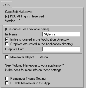
To add Makeover to your apps, you first need to the global extension shown below:
Figure 1: Makeover global extension
Nothing scary there. As you can see, options are provided to make it easy to use Makeover in multi-dll applications, to specify how graphics are handled and more.
One touch that I really like is the template switch to disable Makeover. This can come in really handy if you are having problems that you suspect may be related in some way to Makeover, or simply need to eliminate as many variables as possible when chasing down a bug. You can turn off Makeover without having to remove it from your application. Uncheck the box, and it will be just as it was before.
The next thing you need to do is, ummm… well, there really isn’t anything else that you have to do to your app. Makeover will automatically take care of attaching itself to every appropriate procedure type. If you wish, there is also a procedure extension that you can use to override the default style which Makeover would normally apply to that type of procedure. CapeSoft uses the example of lookups where, even though it is based upon a browse procedure, you want it to look different than your standard browse. In that case, you simply add the procedure extension to the lookup and select the style that it should use.
Other templates let you easily provide options (via menu or toolbar, for example) to allow the user to enable or disable Makeover.
If you create multiple style files, there is also a template that can give the user the ability to switch between different style files (each of which is designated a ‘theme’, similar to Windows color schemes, etc.).
Creating your own styles
OK, now that you have Makeover built into your apps, what next? Obviously, you need to create at least one style file for Makeover to use. This is done using the Styler utility that is provided with Makeover.Styler lets you visually create your styles for each type of procedure and at three different color depths (16, 256, or more than 256 colors). By the way, as mentioned above Makeover will automatically detect the color capabilities on the machine where it is being run and select the appropriate style. This allows you to gracefully ‘degrade’ the look of your app when it is run on low color displays (and if you’ve ever looked at a full color image on a 16 color machine, you know that the results can be absolutely atrocious).
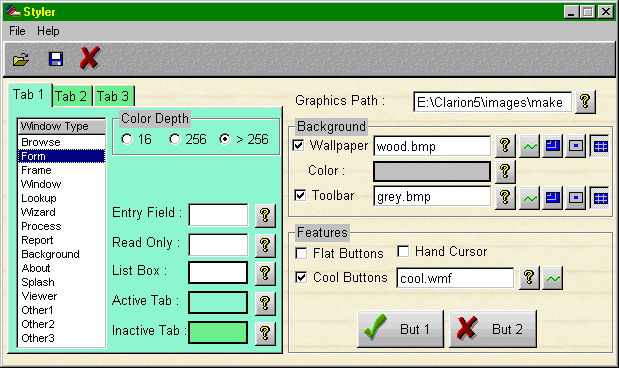
Here is an example in Styler of a ‘Form’ style that the CapeSoft examples use (hey, they’re programmers, not artists!):

Figure 2: A very ‘colorful’ Form to abuse your users with.
Most changes that you make within Styler are instantly reflected on screen, so it is easy to play around with various combinations.
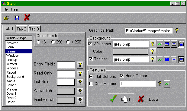
In a bit more ‘refined’ mode, here is the same Styler screen with a more subdued scheme:

Figure 3: Styler with a more subdued set of clothes.
Note how in this example flat buttons are used, and I’ve checked the option to have the cursor turn into a pointing finger every time it hovers over a button. For the wallpaper and toolbar graphic options, you can specify whether images are centered stretched or tiled.
My only real suggestion for the Styler would be to add a few more dummy fields so that you could see the effects of the entry and read-only styles. The third tab (of the three you saw in the images) is empty, so that could be a great place to put them.
In regards to Makeover itself, about the only common screen items that it doesn’t give you control over are prompts and strings (and in their usual inimitable fashion, CapeSoft said they are already coming in a future update).
Keep in mind as well that you get source code for everything, so you can modify and extend it anyway you want.
Performance
I guess I’d have to say that it simply works and works well. I didn’t see any noticeable impact on how quickly screens were displayed, so speed doesn’t seem to be in issue with Makeover.It’s also hard to overestimate the flexibility that you gain by separating the visual aspect of your application from the compiled code. You can, in essence, redesign the entire look and feel of the application after it is done, or even shipped. The possibilities for prototyping, customization and personalization are endless.
Documentation
CapeSoft uses a rather unique approach to documentation in that they provide it as a single page of HTML (i.e., a web page). At first glance it seems that this is rather awkward, but I find that it actually works out quite well. You can keep the document loaded into your browser of choice while using Makeover, and printing it out (including the images, etc.) is a snap. Hyperlinks with the document also let you jump from topic to topic as desired.The only real drawback to this method would be if someone didn’t have a browser, but I think you’d have to look long and hard nowadays to find that.
So, now that I’ve talked about how the docs are presented, what about the contents? In a word, excellent. Written in a rather breezy yet informative way, they do a good job of covering the product from installation through advanced use. Topics include the basics of adding Makeover to your apps, what to ship, how to use it in multi-dll apps, using it with the legacy templates, using the Styler utility, INI files, frequently asked questions and much more. For the inveterate tinkerer, the docs also explain how to modify and build the Makeover object itself, so you really have complete control over the product (if you want to go that far).
CapeSoft also provides a sample application that demonstrates how the various templates can be used.
Technical Support
CapeSoft basically provides support via email (unless you happen to live in South Africa), and I have always found them to be prompt, courteous and open to suggestions. All in all, it’s always a pleasure to deal with them.Summary
Makeover is a tool that falls into the ‘too cool toys’ category. Is it really ‘necessary’? Well, no. Is it an easy (and inexpensive) way to make your apps stand out from the crowd? Absolutely. Could it give your apps a functional leg up on the competition? Quite possibly. It has been proven that judicious use of color can go a long ways towards helping people learn and feel comfortable working in your applications (yes, Virginia, there are colors other than gray).The only real caveat is that it is so easy and fun to use, you might need to restrain yourself lest you create a multi-colored, many-textured monster!
| Category |
Product Score |
| Ability to do the task |
Very Good |
| Ease of use |
Excellent |
| Ease of Installation |
Good |
| Documentation |
Excellent |
| Technical Support |
Very Good |
| Modifies Shipping Templates |
No |
| Black-Box DLLs/LIBs |
No |